
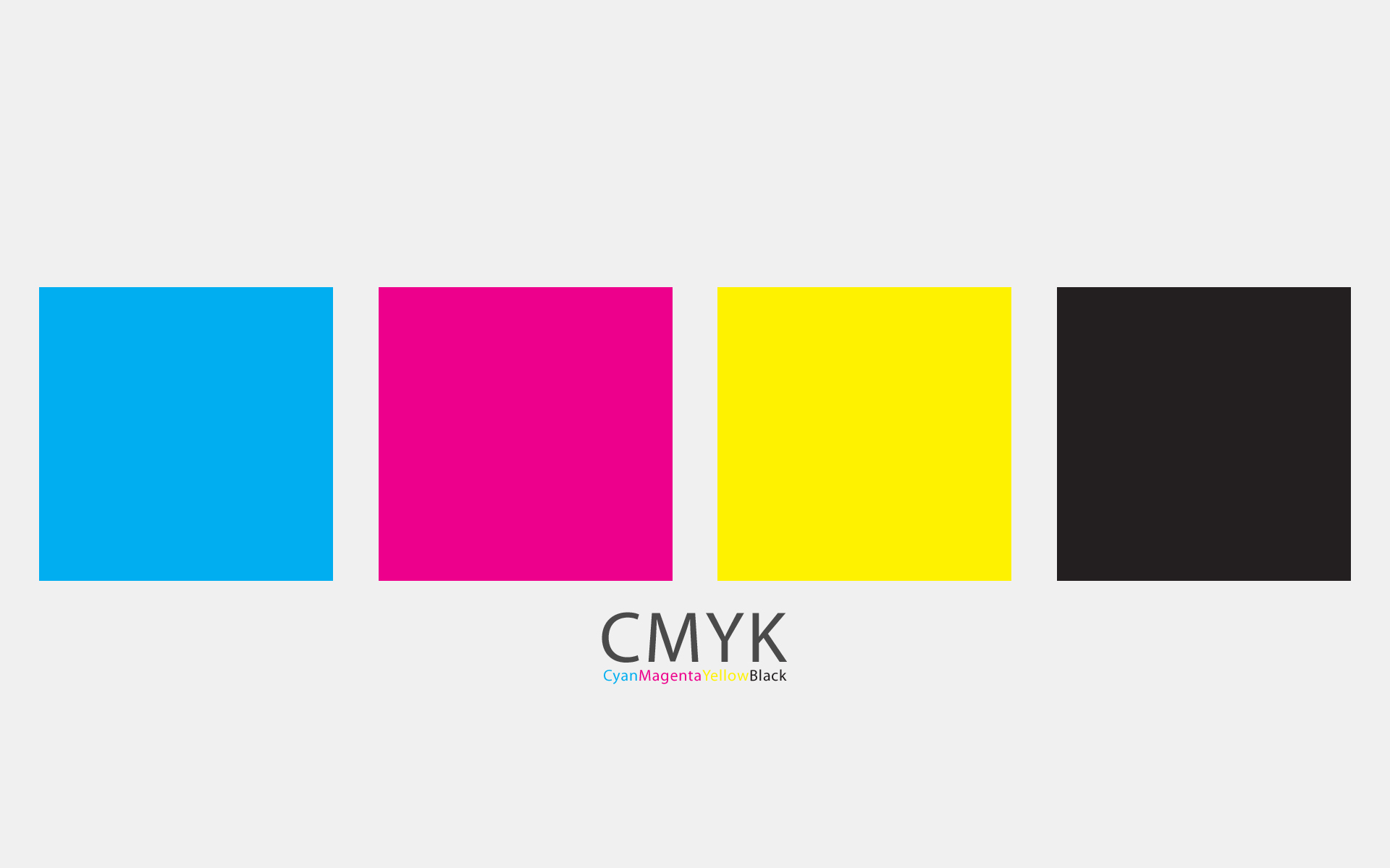
CMYK

The CMYK subtractive colour model- "subtractive" means:
A subtractive color model explains the mixing of paints, dyes, inks, and natural colorants to create a full range of colors, each caused by subtracting (that is, absorbing) some wavelengths of light and reflecting the others. The color that a surface displays depends on which colors of the electromagnetic spectrum are reflected by it and therefore made visible.

CMYK, the colour printing model (Cyan, Magenta, Yellow, Key). Black is referred to as 'key' it is the "key plate" to which the three other printing plates are aligned in the printing process.


The CMYK separations, a demonstration of how the four process colours and overlaid to produce a full colour image. Printing in CMYK separations is also used in screenprinting to define and build up the colours on separate layers by creating halftone dots (see "detail view" image above) which build up for a clear, crisp image- the dots appearing minimal to the human eye.

A photograph here of the process colour PANTONE swatch book- an essential colour matching guide in the printing process to ensure that from design to print the colours used remain 100% consistent.
Short for Cyan-Magenta-Yellow-Black, and pronounced as separate letters. CMYK is a color model in which all colors are described as a mixture of these four process colors. CMYK is the standard color model used in offset printing for full-color documents. Because such printing uses inks of these four basic colors, it is often called four-color printing.
In contrast, display devices generally use a different color model called RGB, which stands for Red-Green-Blue. One of the most difficult aspects of desktop publishing in color is color matching -- properly converting the RGB colors into CMYK colors so that what gets printed looks the same as what appears on the monitor.
The CMYK color model (process color, four color) is a subtractive color model, used in color printing, and is also used to describe the printing process itself. CMYK refers to the four inks used in some color printing: cyan, magenta, yellow, and key (black). Though it varies by print house, press operator, press manufacturer and press run, ink is typically applied in the order of the abbreviation.
The "K" in CMYK stands for key since in four-color printing cyan, magenta, and yellow printing plates are carefully keyed or aligned with the key of the black key plate. Some sources suggest that the "K" in CMYK comes from the last letter in "black" and was chosen because B already means blue. However, this explanation, though plausible and useful as a mnemonic, is incorrect.
The CMYK model works by partially or entirely masking colors on a
lighter, usually white, background. The ink reduces the light that would
otherwise be reflected. Such a model is called subtractive because inks "subtract" brightness from white.
In additive color models such as RGB, white is the "additive" combination of all primary
colored lights, while black is the absence of light. In the CMYK model,
it is the opposite: white is the natural color of the paper or other
background, while black results from a full combination of colored inks.
To save money on ink, and to produce deeper black tones, unsaturated and dark colors are produced by using black ink instead of the combination of cyan, magenta and yellow.
HALFTONING |
With CMYK printing, halftoning (also called screening)
allows for less than full saturation of the primary colors; tiny dots
of each primary color are printed in a pattern small enough that human
beings perceive
a solid color. Magenta printed with a 20% halftone, for example,
produces a pink color, because the eye perceives the tiny magenta large
dots and the white paper between the dots as lighter and less saturated
than the color of pure magenta ink.
Without halftoning, the three primary process colors could be printed
only as solid blocks of color, and therefore could produce only seven
colors: the three primaries themselves, plus three complementary colors
produced by layering two of the primaries: cyan and yellow produce
green, cyan and magenta produce a purplish blue, yellow and magenta
produce red (these subtractive complementary colors correspond roughly
to the additive primary colors) plus layering all three of them
resulting in black. With halftoning, a full continuous range of colors
can be produced.
SCREEN ANGLE
To improve print quality and reduce moiré patterns,
the screen for each color is set at a different angle. While the angles
depend on how many colors are used and the preference of the press
operator, typical CMYK process printing uses any of the following screen
angles:
| C | 15° | 15° | 105° |
|---|---|---|---|
| M | 75° | 45° | 75° |
| Y | 0° | 0° | 90° |
| K | 45° | 75° | 15° |
BENEFITS OF USING BLACK INK
- In traditional preparation of color separations, a red keyline on the black line art marked the outline of solid or tint color areas. In some cases a black keyline was used when it served as both a color indicator and an outline to be printed in black. Because usually the black plate contained the keyline, the K in CMYK represents the keyline or black plate also sometimes called the key plate.
- Text is typically printed in black and includes fine detail (such as serifs), so to reproduce text or other finely detailed outlines using three inks without slight blurring would require impractically accurate registration.
- A combination of 100% cyan, magenta, and yellow inks soaks the paper with ink, making it slower to dry, and sometimes impractically so. This also can cause the ink to bleed.
- A combination of 100% cyan, magenta, and yellow inks often results in a muddy dark brown color that does not quite appear black. Adding black ink absorbs more light, and yields much darker blacks.
- Using black ink is less expensive than using the corresponding amounts of colored inks.
When a very dark area is desirable, a colored or gray CMY "bedding"
is applied first, then a full black layer is applied on top, making a
rich, deep black; this is called rich black. A black made with just CMY inks is sometimes called a composite black or process black.
The amount of black to use to replace amounts of the other ink is
variable, and the choice depends on the technology, paper and ink in
use. Processes called under color removal, under color addition, and gray component replacement are used to decide on the final mix; different CMYK recipes will be used depending on the printing task.
OTHER PRINTER COLOUR MODELS
CMYK or process color printing is contrasted with spot color
printing, in which specific colored inks are used to produce the colors
appearing on paper. Some printing presses are capable of printing with
both four-color process inks and additional spot color inks at the same
time. High-quality printed materials, such as marketing brochures and
books, may include photographs requiring process-color printing, other
graphic effects requiring spot colors (such as metallic inks), and
finishes such as varnish, which enhances the glossy appearance of the
printed piece.
CMYK process printers often have a relatively small color gamut. Processes such as Pantone's proprietary six-color (CMYKOG) Hexachrome
considerably expand the gamut. Light, saturated colors often cannot be
created with CMYK, and light colors in general may make visible the
halftone pattern. Using a CcMmYK process, with the addition of light cyan and magenta inks to CMYK, can solve these problems, and such a process is used by many inkjet printers, including desktop models.
COMPARISON WITH RGB DISPLAYS
Comparisons between RGB
displays and CMYK prints can be difficult, since the color reproduction
technologies and properties are so different. A computer monitor mixes
shades of red, green, and blue to create color pictures. A CMYK printer
instead uses light-absorbing cyan, magenta and yellow inks, whose colors
are mixed using dithering, halftoning,
or some other optical technique. Similar to monitors, the inks used in
printing produce a colour gamut that is "only a subset of the visible
spectrum" although both colour modes have their own specific ranges. As a
result of this items which are displayed on a computer monitor may not
completely match the look of items which are printed if opposite colour
modes are being combined in both mediums.
When designing items to be printed, designers view the colours which
they are choosing on an RGB colour mode (their computer screen), and it
is often difficult to visualise the way in which the colour will turn
out post printing because of this.
CONVERSION
Since RGB and CMYK spaces are both device-dependent spaces, there is
no simple or general conversion formula that converts between them.
Conversions are generally done through color management systems, using color profiles
that describe the spaces being converted. Nevertheless, the conversions
cannot be exact, particularly where these spaces have different gamuts.
The problem of computing a colorimetric estimate of the color that
results from printing various combinations of ink has been addressed by
many scientists.
A general method that has emerged for the case of halftone printing is
to treat each tiny overlap of color dots as one of 8 (combinations of
CMY) or of 16 (combinations of CMYK) colors, which in this context are
known as Neugebauer primaries. The resultant color would be an area-weighted colorimetric combination of these primary colors, except that the Yule–Nielsen effect ("dot gain")
of scattered light between and within the areas complicates the physics
and the analysis; empirical formulas for such analysis have been
developed, in terms of detailed dye combination absorption spectra and
empirical parameters.
HEXACHROME

Adding the two additional colours to the original CMYK four-colour process meant that the printing gammut was increased, and richer, less saturated colours were now available for the first time.

A comparison in print finishes from the CMYK to the Hexachrome six-colour model- a wonderful improvement in tones and colour realisation.

The CMYKOG Hexachrome model- designed and patented by Pantone Inc.
Hexachrome was a six-color printing process designed by Pantone Inc. In addition to custom CMYK inks, Hexachrome added orange and green inks to expand the color gamut, for better color reproduction. It was therefore also known as a CMYKOG process.
Hexachrome was discontinued by Pantone in 2008 when Adobe Systems
stopped supporting their software. While the details of Hexachrome were
not secret, use of Hexachrome was limited by trademark and patent to those obtaining a license from Pantone.
Software
In order to use the Hexachrome process in a digital printing process, Pantone produced a plugin for Adobe Photoshop that allowed the designer to work in an RGB color space more typical of computer work. Using a six-channel ICC profile, this was then converted to the Hexachrome gamut as part of raster image processing.
The plugin was discontinued by Pantone in 2008 because Adobe Systems no longer supported Pantone's Rosetta (legacy) plug-in format.
Definition: Printing process based on use of six coloured inks: orange
and green in addition to cyan, magenta, yellow and black. * It provides a
significantly wider colour gamut than CMYK. * It works best with
stochastic screens.
*I HAVE DECIDED AGAINST FEATURING INFORMATION ABOUT HEXACHROME PRINTING IN MY MANUAL, AS I DO NOT FEEL IT IS AS NECESSARILY RELEVANT AS AS ESSENTIAL A PIECE OF INFORMATION IN DESIGNING FOR PRINT AS IT USED TO BE*
RGB

http://www.regardadesign.co.uk/app/webroot/files/RGB.gif
The colour gamut- RGB (screen colour model) (here demonstrated by the yellow outline shape) is clearly much wider that the design for print colour model, CMYK. Consequently, converting RGB files to CMYK for print can reduce the saturation of a colour dramatically- retaining colour quality is often a challenging process.

The RGB color model is an additive color model in which red, green, and blue light is added together in various ways to reproduce a broad array of colors. The name of the model comes from the initials of the three additive primary colors, red, green, and blue.
The main purpose of the RGB color model is for the sensing, representation, and display of images in electronic systems, such as televisions and computers, though it has also been used in conventional photography. Before the electronic age, the RGB color model already had a solid theory behind it, based in human perception of colors.
RGB is a device-dependent color model: different devices detect or reproduce a given RGB value differently, since the color elements (such as phosphors or dyes) and their response to the individual R, G, and B levels vary from manufacturer to manufacturer, or even in the same device over time. Thus an RGB value does not define the same color across devices without some kind of color management.
Typical RGB input devices are color TV and video cameras, image scanners, and digital cameras. Typical RGB output devices are TV sets of various technologies (CRT, LCD, plasma, etc.), computer and mobile phone displays, video projectors, multicolor LED displays, and large screens such as JumboTron, etc. Color printers, on the other hand, are not RGB devices, but subtractive color devices (typically CMYK color model).
This article discusses concepts common to all the different color spaces that use the RGB color model, which are used in one implementation or another in color image-producing technology.
ADDITIVE COLOUR MODEL
To form a color with RGB, three colored light beams (one red, one
green, and one blue) must be superimposed (for example by emission from a
black screen, or by reflection from a white screen). Each of the three
beams is called a component of that color, and each of them can have an arbitrary intensity, from fully off to fully on, in the mixture.
The RGB color model is additive in the sense that the three
light beams are added together, and their light spectra add, wavelength
for wavelength, to make the final color's spectrum.
Zero intensity for each component gives the darkest color (no light, considered the black), and full intensity of each gives a white; the quality of this white depends on the nature of the primary light sources, but if they are properly balanced, the result is a neutral white matching the system's white point. When the intensities for all the components are the same, the result is a shade of gray, darker or lighter depending on the intensity. When the intensities are different, the result is a colorized hue, more or less saturated depending on the difference of the strongest and weakest of the intensities of the primary colors employed.
When one of the components has the strongest intensity, the color is a hue near this primary color (reddish, greenish, or bluish), and when two components have the same strongest intensity, then the color is a hue of a secondary color (a shade of cyan, magenta or yellow). A secondary color is formed by the sum of two primary colors of equal intensity: cyan is green+blue, magenta is red+blue, and yellow is red+green. Every secondary color is the complement of one primary color; when a primary and its complementary secondary color are added together, the result is white: cyan complements red, magenta complements green, and yellow complements blue.
The RGB color model itself does not define what is meant by red, green, and blue colorimetrically, and so the results of mixing them are not specified as absolute, but relative to the primary colors. When the exact chromaticities of the red, green, and blue primaries are defined, the color model then becomes an absolute color space, such as sRGB or Adobe RGB; see RGB color spaces for more details.
http://www.regardadesign.co.uk/app/webroot/files/RGB.gif
The colour gamut- RGB (screen colour model) (here demonstrated by the yellow outline shape) is clearly much wider that the design for print colour model, CMYK. Consequently, converting RGB files to CMYK for print can reduce the saturation of a colour dramatically- retaining colour quality is often a challenging process.
The RGB Colour Model diagram- unlike CMYK, RGB is additive- in which the colours combined produce a wider variant, and, when combined in equal percentages produce white.
RGB is an abbreviation for "Red Green Blue". RGB is a color
model used on displays where red, green, and blue light are combined to
make millions of colors.
RGB is how colors combine on screens because they are viewed
directly, and not reflected off anything - like colors in traditional color theory which is based on reflective colors usually on paper.
CSS allows you to use RGB codes to define your website colors. To define a color in RGB with CSS, write:
rgb (255, 0, 0)
The numbers go from 0 to 255, and they are listed in order- red, green, blue.
Examples:
RED= (255, 0, 0)
GREEN= (0, 255, 0)
BLUE= (0, 0, 255)
The main purpose of the RGB color model is for the sensing, representation, and display of images in electronic systems, such as televisions and computers, though it has also been used in conventional photography. Before the electronic age, the RGB color model already had a solid theory behind it, based in human perception of colors.
RGB is a device-dependent color model: different devices detect or reproduce a given RGB value differently, since the color elements (such as phosphors or dyes) and their response to the individual R, G, and B levels vary from manufacturer to manufacturer, or even in the same device over time. Thus an RGB value does not define the same color across devices without some kind of color management.
Typical RGB input devices are color TV and video cameras, image scanners, and digital cameras. Typical RGB output devices are TV sets of various technologies (CRT, LCD, plasma, etc.), computer and mobile phone displays, video projectors, multicolor LED displays, and large screens such as JumboTron, etc. Color printers, on the other hand, are not RGB devices, but subtractive color devices (typically CMYK color model).
This article discusses concepts common to all the different color spaces that use the RGB color model, which are used in one implementation or another in color image-producing technology.
ADDITIVE COLOUR MODEL
Zero intensity for each component gives the darkest color (no light, considered the black), and full intensity of each gives a white; the quality of this white depends on the nature of the primary light sources, but if they are properly balanced, the result is a neutral white matching the system's white point. When the intensities for all the components are the same, the result is a shade of gray, darker or lighter depending on the intensity. When the intensities are different, the result is a colorized hue, more or less saturated depending on the difference of the strongest and weakest of the intensities of the primary colors employed.
When one of the components has the strongest intensity, the color is a hue near this primary color (reddish, greenish, or bluish), and when two components have the same strongest intensity, then the color is a hue of a secondary color (a shade of cyan, magenta or yellow). A secondary color is formed by the sum of two primary colors of equal intensity: cyan is green+blue, magenta is red+blue, and yellow is red+green. Every secondary color is the complement of one primary color; when a primary and its complementary secondary color are added together, the result is white: cyan complements red, magenta complements green, and yellow complements blue.
The RGB color model itself does not define what is meant by red, green, and blue colorimetrically, and so the results of mixing them are not specified as absolute, but relative to the primary colors. When the exact chromaticities of the red, green, and blue primaries are defined, the color model then becomes an absolute color space, such as sRGB or Adobe RGB; see RGB color spaces for more details.

https://blogger.googleusercontent.com/img/b/R29vZ2xl/AVvXsEhBIFukeDLAe0ltjvfjWCfS7VysMSKr3rLsgZRvErQOg4gMe6kbS4xTSJqq906OOUhxn1hGIJnIFAzjK5_ClGqfFNGAhOLZwPrt2WLsxe-A3clEtE9Wm909PsRUCEbtnBaqgJj-SK9opJPY/s1600/800px-nuancier_pantone.jpg

http://upload.wikimedia.org/wikipedia/commons/e/e7/Colors_by_Pantone_2_by_wax115.jpg

http://blog.neatspace.ca/wp-content/uploads/2011/04/pantone.jpeg

https://blogger.googleusercontent.com/img/b/R29vZ2xl/AVvXsEjvuGa5tdnFK9CujX7cfzEM1O62Tee7NCMkw6pLtDCiAdWq_hyphenhyphenYshxaVmvku8IiayQCFC0mjOFhjpOHtEbP9Hyvm1XaMYBHQLYNsylfB1czQvP6NEZ7ObTHEqpBLQ4wxqd0cc27LhhdOtWR/s1600/pantone-book-11.jpg


http://photo-dict.faqs.org/photofiles/list/2476/3253pantone_swatch.jpg
PANTONE
http://me.pantone.co.uk/pages/pantone/pantone.aspx?pg=1&ca=10
Pantone, Inc. is the world-renowned authority on colour and provider of colour systems and leading technology for the selection and accurate communication of colour. The PANTONE Name is known worldwide as the standard language for colour communication from designer to manufacturer to retailer to customer. With 40 years of experience, we are the worldwide market leader in colour communication and colour technology for the graphic design, printing, publishing, textile and plastics industries.
Whether you are creating a logo, a product, packaging, an ad, the latest fashion trend or a vision, we have the tools and solutions for keeping your colours accurate and consistent cross-media, around the world. The PANTONE Color language is the most universally understood standard available.
MARKETS & PRODUCTS
Each year, innumerable products and services are sold by Pantone and its hundreds of licensees in over 100 countries in the graphic arts, textile, apparel, interior, plastics, architectural and industrial design markets.
Graphic Arts - Printing, Publishing & Packaging
The PANTONE MATCHING SYSTEM is the definitive international reference for selecting, specifying, matching and controlling ink colours. The PANTONE formula guide, a three-guide set consisting of 1,114 solid PANTONE Colors on coated, uncoated and matte stock, shows corresponding printing ink formulas for each colour, and the three-book set of solid chips provides coated, uncoated and matte perforated tear-out chips that can be used for quality control.
The digitally-created PANTONE Process Color System® chips and guides provide a comprehensive palette of more than 3,000 colours achievable in four-colour (CMYK) process printing. The PANTONE solid to process guide compares a solid PANTONE Color to the closest possible match in CMYK four-colour process that can be achieved on a computer monitor, output device or printing press. Other PANTONE Color Reference Guides for the graphic arts include metallics, pastels, tints, duotones, film and foil.
The PANTONE Hexachrome® Color System, a patented, breakthrough six-colour ultra high quality printing process, reproduces a dynamic range of more brilliant continuous-tone images and simulates brighter, more vivid colours than standard four-colour process printing. The Hexachrome process is supported by industry leaders such as Adobe, Quark, Macromedia, Kodak Polychrome, Agfa, DuPont, Polaroid and Fuji.
Textiles
The PANTONE Textile Color System® is a vital tool for designers in the apparel, home furnishings and interior design industries for selecting and specifying colour used in the manufacture of textiles and fashion. The System - consisting of 1,932 colours in cotton or paper format - is ideal for assembling creative palettes and conceptual colour schemes, and for providing colour communication and control in the manufacturing process.
The PANTONE VIEW Colour Planner is a bi-annual trend forecasting tool that offers seasonal colour direction and inspiration 24 months in advance for multiple usages, including menswear, women's wear, active wear, cosmetics and industrial design.
Architecture and Interiors
PANTONE for architecture and interiors bowed at NeoCon in 2002, marking its move into the commercial, industrial and hospitality segments of the interior design industry. The System allows designers to connect different categories within the industry, including flooring, leather, fabrics, carpet, fiber, furniture and laminates. Pantone is collaborating with leading manufacturers and design firms to integrate the PANTONE for architecture and interiors colour system into their design process.
Plastics
The PANTONE PLASTICS Color System™ allows designers, manufacturers and suppliers who work with plastics to select, specify, control and manufacture hundreds of colours through opaque and transparent plastic colour chips in the system. It offers a comprehensive colour range that is reproducible in plastics.
Color Cue™
Introduced in 2001, PANTONE Color Cue is a portable, affordable spectro-colorimeter preprogrammed with PANTONE MATCHING SYSTEM Color data. It instantly identifies the closest PANTONE Color of any flat surface and provides formulas for reproduction in four-colour process printing, Hexachrome® six-colour printing and Web design, accelerating colour management workflow for graphics specialists, pre-press professionals, printers, Web site designers, photographers and retailers. PANTONE Color Cue has applications in many industries: Graphic designers can immediately determine a PANTONE Color and its values for print and the Web. Printers can sample colour to identify to the closest PANTONE Color standard. Retailers can swiftly and easily identify and communicate colour across marketing materials, catalogs and Web sites. A version of the Color Cue, PANTONE Color Cue TX, supports the PANTONE Textile Color System.
Retail
In 2001, Pantone launched its PANTONE TheRightColor™ division. By providing a universal and precise colour language along with technology solutions, TheRightColor focuses on developing solutions and technologies that enable retailers to build a colour standard infrastructure to improve the consumer's shopping experience and impact the vendor's bottom line across all distribution channels. TheRightColor solutions are based on the globally accepted PANTONE Textile Color System.
TheRightColor solutions enable retailers to reduce the number of returns due to inaccurate colour representation, as well as improve inventory tracking and replenishment strategies. In addition, the ability to monitor customer colour preferences enables upselling and cross-selling, allowing the retailer to sell more product per visit. Meanwhile, the use of PANTONE Color codes empowers the customer to more confidently coordinate and complement merchandise. More information is available at www.therightcolor.com.
Consumer
PANTONE UNIVERSE is a collection of lifestyle products based on fashion colour trends for the consumer. The collection, consisting of stationery items, travel gear, accessories and rainwear, combines timeless designs and modern materials with current trend colours. Products, which are updated seasonally based on trends, are accompanied by "emotional colour cues." More information is available at www.pantoneuniverse.com.
PANTONE Shopping Color Guide lets shoppers take the expertise and precision of the PANTONE Name wherever they go. Based on the PANTONE Textile Color System, the PANTONE Shopping Color Guide incorporates 1,757 colours into an easy-to-use fan guide that helps shoppers coordinate colours for every aspect of their shopping experience - from clothing to accessories to items for the home.
Color Management
In 2001, Pantone entered a marketing alliance with ColorVision, a Datacolour company, to provide affordable digital colour control to graphic artists and designers, photographers and printers, offering exclusive product bundles for photo, design, Web and pre-press applications. The flagship product of the PANTONE COLORVISION® line is the award-winning Spyder™, an all-digital, seven-filter colorimeter that supports both LCD and CRT monitors.
Software
A longtime pioneer in the realm of digital technology, Pantone offers a variety of software products that accurately translate PANTONE Colors for use by graphic designers, pre-press professionals, business users, Web developers and Internet surfers.
PANTONE Color Viewing Lights allow the user to preview colour choices in different lighting conditions.
PANTONE formula scales are pre-programmed with formulas for all PANTONE Colors, including pastels and metallics, and are available in various sizes for small, medium and large print shops.
RESEARCH & DEVELOPMENT LABS
Pantone supports its colour communications systems with industry-specific research and testing labs.
PANTONE Custom Colour Services provide custom colour standards for corporate managers and art directors in fashion, home, contract design, paint, beauty, automotive, sports, pharmaceutical - any industry requiring colour accuracy.
PANTONE Custom Colour Services also provides products to specify corporate identity, product colour and packaging standards, including colour standards showing one or more PANTONE Colors or custom colours on paper, cotton or custom substrates, as well as the corresponding CMYK, HTML and RGB values.
http://me.pantone.co.uk/pages/pantone/pantone.aspx?pg=1&ca=10
Pantone, Inc. is the world-renowned authority on colour and provider of colour systems and leading technology for the selection and accurate communication of colour. The PANTONE Name is known worldwide as the standard language for colour communication from designer to manufacturer to retailer to customer. With 40 years of experience, we are the worldwide market leader in colour communication and colour technology for the graphic design, printing, publishing, textile and plastics industries.
Whether you are creating a logo, a product, packaging, an ad, the latest fashion trend or a vision, we have the tools and solutions for keeping your colours accurate and consistent cross-media, around the world. The PANTONE Color language is the most universally understood standard available.
MARKETS & PRODUCTS
Each year, innumerable products and services are sold by Pantone and its hundreds of licensees in over 100 countries in the graphic arts, textile, apparel, interior, plastics, architectural and industrial design markets.
Graphic Arts - Printing, Publishing & Packaging
The PANTONE MATCHING SYSTEM is the definitive international reference for selecting, specifying, matching and controlling ink colours. The PANTONE formula guide, a three-guide set consisting of 1,114 solid PANTONE Colors on coated, uncoated and matte stock, shows corresponding printing ink formulas for each colour, and the three-book set of solid chips provides coated, uncoated and matte perforated tear-out chips that can be used for quality control.
The digitally-created PANTONE Process Color System® chips and guides provide a comprehensive palette of more than 3,000 colours achievable in four-colour (CMYK) process printing. The PANTONE solid to process guide compares a solid PANTONE Color to the closest possible match in CMYK four-colour process that can be achieved on a computer monitor, output device or printing press. Other PANTONE Color Reference Guides for the graphic arts include metallics, pastels, tints, duotones, film and foil.
The PANTONE Hexachrome® Color System, a patented, breakthrough six-colour ultra high quality printing process, reproduces a dynamic range of more brilliant continuous-tone images and simulates brighter, more vivid colours than standard four-colour process printing. The Hexachrome process is supported by industry leaders such as Adobe, Quark, Macromedia, Kodak Polychrome, Agfa, DuPont, Polaroid and Fuji.
Textiles
The PANTONE Textile Color System® is a vital tool for designers in the apparel, home furnishings and interior design industries for selecting and specifying colour used in the manufacture of textiles and fashion. The System - consisting of 1,932 colours in cotton or paper format - is ideal for assembling creative palettes and conceptual colour schemes, and for providing colour communication and control in the manufacturing process.
The PANTONE VIEW Colour Planner is a bi-annual trend forecasting tool that offers seasonal colour direction and inspiration 24 months in advance for multiple usages, including menswear, women's wear, active wear, cosmetics and industrial design.
Architecture and Interiors
PANTONE for architecture and interiors bowed at NeoCon in 2002, marking its move into the commercial, industrial and hospitality segments of the interior design industry. The System allows designers to connect different categories within the industry, including flooring, leather, fabrics, carpet, fiber, furniture and laminates. Pantone is collaborating with leading manufacturers and design firms to integrate the PANTONE for architecture and interiors colour system into their design process.
Plastics
The PANTONE PLASTICS Color System™ allows designers, manufacturers and suppliers who work with plastics to select, specify, control and manufacture hundreds of colours through opaque and transparent plastic colour chips in the system. It offers a comprehensive colour range that is reproducible in plastics.
Color Cue™
Introduced in 2001, PANTONE Color Cue is a portable, affordable spectro-colorimeter preprogrammed with PANTONE MATCHING SYSTEM Color data. It instantly identifies the closest PANTONE Color of any flat surface and provides formulas for reproduction in four-colour process printing, Hexachrome® six-colour printing and Web design, accelerating colour management workflow for graphics specialists, pre-press professionals, printers, Web site designers, photographers and retailers. PANTONE Color Cue has applications in many industries: Graphic designers can immediately determine a PANTONE Color and its values for print and the Web. Printers can sample colour to identify to the closest PANTONE Color standard. Retailers can swiftly and easily identify and communicate colour across marketing materials, catalogs and Web sites. A version of the Color Cue, PANTONE Color Cue TX, supports the PANTONE Textile Color System.
Retail
In 2001, Pantone launched its PANTONE TheRightColor™ division. By providing a universal and precise colour language along with technology solutions, TheRightColor focuses on developing solutions and technologies that enable retailers to build a colour standard infrastructure to improve the consumer's shopping experience and impact the vendor's bottom line across all distribution channels. TheRightColor solutions are based on the globally accepted PANTONE Textile Color System.
TheRightColor solutions enable retailers to reduce the number of returns due to inaccurate colour representation, as well as improve inventory tracking and replenishment strategies. In addition, the ability to monitor customer colour preferences enables upselling and cross-selling, allowing the retailer to sell more product per visit. Meanwhile, the use of PANTONE Color codes empowers the customer to more confidently coordinate and complement merchandise. More information is available at www.therightcolor.com.
Consumer
PANTONE UNIVERSE is a collection of lifestyle products based on fashion colour trends for the consumer. The collection, consisting of stationery items, travel gear, accessories and rainwear, combines timeless designs and modern materials with current trend colours. Products, which are updated seasonally based on trends, are accompanied by "emotional colour cues." More information is available at www.pantoneuniverse.com.
PANTONE Shopping Color Guide lets shoppers take the expertise and precision of the PANTONE Name wherever they go. Based on the PANTONE Textile Color System, the PANTONE Shopping Color Guide incorporates 1,757 colours into an easy-to-use fan guide that helps shoppers coordinate colours for every aspect of their shopping experience - from clothing to accessories to items for the home.
Color Management
In 2001, Pantone entered a marketing alliance with ColorVision, a Datacolour company, to provide affordable digital colour control to graphic artists and designers, photographers and printers, offering exclusive product bundles for photo, design, Web and pre-press applications. The flagship product of the PANTONE COLORVISION® line is the award-winning Spyder™, an all-digital, seven-filter colorimeter that supports both LCD and CRT monitors.
Software
A longtime pioneer in the realm of digital technology, Pantone offers a variety of software products that accurately translate PANTONE Colors for use by graphic designers, pre-press professionals, business users, Web developers and Internet surfers.
- PANTONE OfficeColor Assistant™ adds the impact of PANTONE Colors to reports, proposals and presentations created in Microsoft® PowerPoint®, Word and Excel.
- PANTONE ColorWeb® Pro lets designers point-and-click PANTONE MATCHING SYSTEM Colors into Web authoring software, HTML editors and presentation software.
- The PANTONE Hexachrome Color System is supported by PANTONE HexWare® plug-ins for Adobe® Photoshop® and Adobe Illustrator®.
PANTONE Color Viewing Lights allow the user to preview colour choices in different lighting conditions.
PANTONE formula scales are pre-programmed with formulas for all PANTONE Colors, including pastels and metallics, and are available in various sizes for small, medium and large print shops.
RESEARCH & DEVELOPMENT LABS
Pantone supports its colour communications systems with industry-specific research and testing labs.
- Ink Lab scientists develop new formulas to update the PANTONE Color palettes. Licensee samples are also tested for quality control.
- Colour Technology and Application Lab researchers develop core colour technology and maintain the integrity of Pantone-licensed products from companies such as Adobe, Hewlett-Packard, Epson, DuPont and Kodak Polychrome.
- Textile Lab technicians verify formulas for textile production and formulas for reproduction. They dye and prepare fabric for the PANTONE Textile Color System swatch books, as well as provide custom colour dying services to textile clients.
- Electronic Colour Systems Lab engineers develop systems and calibration devices to assist software and hardware manufacturers in the DTP world with creating products and systems that support device-independent colour standards. The lab evaluates colour consistency and provides licensees with tools and data sets.
PANTONE Custom Colour Services provide custom colour standards for corporate managers and art directors in fashion, home, contract design, paint, beauty, automotive, sports, pharmaceutical - any industry requiring colour accuracy.
PANTONE Custom Colour Services also provides products to specify corporate identity, product colour and packaging standards, including colour standards showing one or more PANTONE Colors or custom colours on paper, cotton or custom substrates, as well as the corresponding CMYK, HTML and RGB values.
COLORTEAM(sm)
The Pantone COLORTEAM defines and develops colour messages to help
companies better connect with their customers by delivering a full suite
of customized services from shade naming to interactive Colour
Workshops to in-depth Colour Ideation for product development. List of
services: colour-on-call, colourtalk seminars, colourlab, colour choice
validation, colour ideation, colour shade / naming, and colour
technology.
Pantone Inc. is a corporation headquartered in Carlstadt, New Jersey, USA. The company is best known for its Pantone Matching System (PMS), a proprietary color space
used in a variety of industries, primarily printing, though sometimes
in the manufacture of colored paint, fabric, and plastics.
In October 2007, X-Rite Inc, a supplier of color measurement instruments and software, purchased Pantone Inc for $180 million.
Overview
In October 2007, X-Rite Inc, a supplier of color measurement instruments and software, purchased Pantone Inc for $180 million.
Pantone began as a commercial printing company in the 1950s. In 1956, they hired recent Hofstra University graduate Lawrence Herbert as a part-time employee. Herbert used his chemistry knowledge to systematize and simplify the company's stock of pigments and production of colored inks;
by 1962, Herbert was running the ink and printing division at a profit,
while the commercial-display division was $50,000 in debt; he
subsequently purchased the company's technological assets from his
employers and renamed them "Pantone".
The company's primary products include the Pantone Guides, which consist of a large number of small (approximately 6×2 inches or 15×5 cm) thin cardboard sheets, printed on one side with a series of related color swatches and then bound into a small "fan deck". For instance, a particular "page" might contain a number of yellows of varying tints.
The idea behind the PMS is to allow designers to 'color match' specific colors when a design enters production stage—regardless of the equipment used to produce the color. This system has been widely adopted by graphic designers and reproduction and printing houses for a number of years now. Pantone recommends that PMS Color Guides be purchased annually as their inks become more yellow over time. Color variance also occurs within editions based on the paper stock used (coated, matte or uncoated), while interedition color variance occurs when there are changes to the specific paper stock used.
One such use is standardizing colors in the CMYK process. The CMYK process is a method of printing color by using four inks—cyan, magenta, yellow, and black. A majority of the world's printed material is produced using the CMYK process, and there is a special subset of Pantone colors that can be reproduced using CMYK. Those that are possible to simulate through the CMYK process are labeled as such within the company's guides.
However, most of the Pantone system's 1,114 spot colors cannot be simulated with CMYK but with 13 base pigments (15 including white and black) mixed in specified amounts.
The Pantone system also allows for many 'special' colors to be produced such as metallics and fluorescents. While most of the Pantone system colors are beyond the printed CMYK gamut, it was only in 2001 that Pantone began providing translations of their existing system with screen-based colors. (Screen-based colors use the RGB—red, green, blue—system to create various colors.) The Goe system has RGB and LAB values with each color.
Pantone colors are described by their allocated number (typically referred to as, for example, 'PMS 130'). PMS colors are almost always used in branding and have even found their way into government legislation (to describe the colors of flags). In January 2003, the Scottish Parliament debated a petition (reference PE512) to refer to the blue in the Scottish flag (saltire) as 'Pantone 300'. Countries such as Canada and South Korea and organizations such as the FIA have also chosen to refer to specific Pantone colors to use when producing flags. U.S. states including Texas have set legislated PMS colors of their flags.
The Goe system is streamlined to use fewer base colors (10 + Clear coating for reflections) and accommodates many technical challenges in reproducing colors on a press.
Pantone also produces Hexachrome, a patented six-color printing system.
The company's primary products include the Pantone Guides, which consist of a large number of small (approximately 6×2 inches or 15×5 cm) thin cardboard sheets, printed on one side with a series of related color swatches and then bound into a small "fan deck". For instance, a particular "page" might contain a number of yellows of varying tints.
The idea behind the PMS is to allow designers to 'color match' specific colors when a design enters production stage—regardless of the equipment used to produce the color. This system has been widely adopted by graphic designers and reproduction and printing houses for a number of years now. Pantone recommends that PMS Color Guides be purchased annually as their inks become more yellow over time. Color variance also occurs within editions based on the paper stock used (coated, matte or uncoated), while interedition color variance occurs when there are changes to the specific paper stock used.
Original Pantone Color Matching System
The Pantone Color Matching System is largely a standardized color reproduction system. By standardizing the colors, different manufacturers in different locations can all refer to the Pantone system to make sure colors match without direct contact with one another.One such use is standardizing colors in the CMYK process. The CMYK process is a method of printing color by using four inks—cyan, magenta, yellow, and black. A majority of the world's printed material is produced using the CMYK process, and there is a special subset of Pantone colors that can be reproduced using CMYK. Those that are possible to simulate through the CMYK process are labeled as such within the company's guides.
However, most of the Pantone system's 1,114 spot colors cannot be simulated with CMYK but with 13 base pigments (15 including white and black) mixed in specified amounts.
The Pantone system also allows for many 'special' colors to be produced such as metallics and fluorescents. While most of the Pantone system colors are beyond the printed CMYK gamut, it was only in 2001 that Pantone began providing translations of their existing system with screen-based colors. (Screen-based colors use the RGB—red, green, blue—system to create various colors.) The Goe system has RGB and LAB values with each color.
Pantone colors are described by their allocated number (typically referred to as, for example, 'PMS 130'). PMS colors are almost always used in branding and have even found their way into government legislation (to describe the colors of flags). In January 2003, the Scottish Parliament debated a petition (reference PE512) to refer to the blue in the Scottish flag (saltire) as 'Pantone 300'. Countries such as Canada and South Korea and organizations such as the FIA have also chosen to refer to specific Pantone colors to use when producing flags. U.S. states including Texas have set legislated PMS colors of their flags.
Pantone Goe System
On September 5, 2007 Pantone introduced the Goe System. Goe consists of over 2,000 new colors in a brand new matching and numbering system. In addition to the standard swatch books (now called the GoeGuide), the new system also includes adhesive-backed GoeSticks, interactive software, tools, and an online community where users are able to share color swatches and information.The Goe system is streamlined to use fewer base colors (10 + Clear coating for reflections) and accommodates many technical challenges in reproducing colors on a press.
Other products
In mid-2006 Pantone, partnering with Vermont-based Fine Paints of Europe, introduced a new line of interior and exterior paints. The color palette uses Pantone's color research and trending and has more than 3000 colors.Color of the Year
Annually Pantone will declare a particular color "Color of the Year". The color is chosen to purportedly connect with the zeitgeist; for example the press release declaring Honeysuckle the color of 2011 said "In times of stress, we need something to lift our spirits. Honeysuckle is a captivating, stimulating color that gets the adrenaline going – perfect to ward off the blues."
2000
Cerulean
Pantone 15-4020
Cerulean
Pantone 15-4020
2001
Fuchsia Rose
Pantone 17-2031
Fuchsia Rose
Pantone 17-2031
2002
True Red
Pantone 19-1664
True Red
Pantone 19-1664
2003
Aqua Sky
Pantone 14-4811
Aqua Sky
Pantone 14-4811
2004
Tigerlily
Pantone 17-1456
Tigerlily
Pantone 17-1456
2005
Blue Turquoise
Pantone 15-5217
Blue Turquoise
Pantone 15-5217
2006
Sand Dollar
Pantone 13-1106
Sand Dollar
Pantone 13-1106
2007
Chili Pepper
Pantone 19-1557
Chili Pepper
Pantone 19-1557
2008
Blue Iris
Pantone 18-3943
Blue Iris
Pantone 18-3943
2009
Mimosa
Pantone 14-0848
Mimosa
Pantone 14-0848
2010
Turquoise
Pantone 15-5519
Turquoise
Pantone 15-5519
2011
Honeysuckle
Pantone 18-2120
Honeysuckle
Pantone 18-2120
Intellectual property
Pantone asserts that their lists of color numbers and pigment values are the intellectual property of Pantone and free use of the list is not allowed. This is frequently held as a reason why Pantone colors cannot be supported in Open Source software such as GNU Image Manipulation Program (GIMP) and are not often found in low-cost software. Pantone palettes supplied by printer manufacturers can be obtained freely, and, depending on supplier, do not come with usage restrictions beyond a sales ban on hard copies of the palette.Pantone also produces Hexachrome, a patented six-color printing system.
http://dictionary.reference.com/browse/pantone
SPOT COLOURS

http://www.kallkwiklincoln.co.uk/Images/Yellow_Ink.jpg
A pure metallic spot colour ink- used in the professional printing process.


Process Colours (4 colour process, or CMYK)
Process colours are normally used where continuous tones (as in photographs) are required. The primary colours Cyan, Magenta & Yellow are mixed with Black to produce the full range of colours.

It is far more cost-effective to 'plan' multiple cards together, run on one large sheet, and then laminate the whole lot as one group. As all the cards will probably have different colours the way around this is to produce them from the 4 CMYK colours, Cyan, Magenta, Yellow and Black.
If you're wondering how to access the colour swatches in Illustrator, well the guys at Adobe have moved it to a different part of the menu system. Just click on: Window (in the main file menu), select: Swatch Libraries and then Colour Books.

Business cards, letterheads etc. will generally be printed using uncoated inks. I would recommend not worrying too much about this aspect, and choose a 'regular' colour book such as Pantone Solid Coated and stick with it for all your tasks.
The important thing to remember is to stick with one colour book on a project, i.e. don't mix coated and uncoated or any other book in a single project.


Spot on. Our 51, 0, 9, 0 split converts perfectly to Pantone 305 so we now have our working spot colour.
http://en.wikipedia.org/wiki/Spot_color
In offset printing, a spot color is any color generated by an ink (pure or mixed) that is printed using a single run.
The widely spread offset-printing process is composed of four spot colors: Cyan, Magenta, Yellow, and Key (black) commonly referred to as CMYK. More advanced processes involve the use of six spot colors (hexachromatic process), which add Orange and Green to the process (termed CMYKOG). The two additional spot colors are added to compensate for the ineffective reproduction of faint tints using CMYK colors only. However, offset technicians around the world use the term spot color to mean any color generated by a non-standard offset ink; such as metallic, fluorescent, spot varnish, or custom hand-mixed inks.
When making a multi-color print with a spot color process, every spot color needs its own lithographic film. All the areas of the same spot color are printed using the same film, hence, using the same lithographic plate. The dot gain, hence the screen angle and line frequency, of a spot color vary according to its intended purpose. Spot lamination and UV coatings are sometimes referred to as 'spot colors', as they share the characteristics of requiring a separate lithographic film and print run.
Pantone definition
A set of standard colours for printing, each of which is specified by a single number. You can buy a Pantone swatch book containing samples of each colour. Some computer graphics software allows colours to be specified as Pantone numbers. Even though a computer monitor can only show an approximation to some of the colours, the software can output a colour separation for each different Pantone colour, enabling a print shop to exactly reproduce the original desired colour.SPOT COLOURS
http://www.kallkwiklincoln.co.uk/Images/Yellow_Ink.jpg
A pure metallic spot colour ink- used in the professional printing process.

An example of spot colour useage- here, on 'The Print Handbook' publication.
Color reproduced by an opaque, premixed, standard ink chosen from a color system such as the Pantone Matching System. In contrast, process color is reproduced from using translucent inks of primary colors Cyan, Magenta, Yellow, and Black (CMYK).
Refers to a method of specifying and printing colors in
which each color is printed with its own ink. In contrast, process color
printing uses four inks (cyan, magenta, yellow, and black) to produce
all other colors. Spot color printing is effective when the printed
matter contains only one to three different colors, but it becomes
prohibitively expensive for more colors.
Most desktop publishing and graphics applications allow you to specify spot colors for text and other elements. There are a number of color specification systems for specifying spot colors, but Pantone is the most widely used.
http://www.castleprint.co.uk/spot-process-colours.html
Spot colours
are the preferred method of producing stationery inexpensively. This is
also the method used where colour accuracy is also deemed essential. The
standard reference guide to spot colour work in the UK is Pantone®.
Most desktop publishing and graphics applications allow you to specify spot colors for text and other elements. There are a number of color specification systems for specifying spot colors, but Pantone is the most widely used.
http://www.castleprint.co.uk/spot-process-colours.html
Basically, an ink colour is ready-mixed to produce a particular colour, as in Pantone® 032 below.
Pantone 032 displayed at 100%
|
 |
So if you were
producing a 2 colour card with, for instance, Black as the main colour
for text, then a 2nd Pantone® colour would be chosen from a colour
swatch.
To produce this job would entail making 2 sheets of film which would then be used to make 2 printing plates for the press.
The more spot colours used, the more film and plates are needed, hence the increased costs.
To keep costs down it's
possible to create tints of a spot colour without needing extra film or
plates. The example (shown on the left) consists of Pantone® 032 at:
100% + 50% + 25%. These 3 'shades' would all be on 1 piece of film &
1 plate.
So, just for example,
say we have a 2 colour leaflet to produce. Using the 2 colours plus
variations in tint strength we can still end up with a very colourful
job, without having to go the 4 colour route, which could prove to be
too expensive.
Process Colours (4 colour process, or CMYK)
Process colours are normally used where continuous tones (as in photographs) are required. The primary colours Cyan, Magenta & Yellow are mixed with Black to produce the full range of colours.
For instance, if we needed to produce the Pantone® 032 colour above using a 4 colour process, the 'split' would be:
Cyan = 0%
Magenta = 90%
Yellow = 86%
Black = 0%
Magenta = 90%
Yellow = 86%
Black = 0%
As a separate piece of
film and plate is produced for each of the 4 colours this adds heavily
to the cost compared to printing in spot colours.
Some spot colours lend
themselves perfectly to being reproduced using the 4 colour process,
whereas others can cause slight problems in that the match is not
perfect.
This is a very general outline of the 2 processes - there is quite a bit more involved with the various methods.
Problems producing stationery using both spot & process colours
Let's say your company design uses 2 colours: Pantone 021 (Orange) and Black.
Let's also assume you require Letterheads & Business Cards.
Letterheads
The 2 colours would be set up on the press and if the orange (021) was later compared to a Pantone swatch then you would see that the match is very, very close. So far, so good.Business Cards
You've decided, for whatever reason, to use a solid colour on the front or reverse of the card and you also want this matt-laminated. Due to cost, most commercial printers (ourselves included) would produce these cards using a 4 colour process (CMYK). The reason for this is that it is too expensive to set up a printing press with 2 spot colours and then laminate these cards.It is far more cost-effective to 'plan' multiple cards together, run on one large sheet, and then laminate the whole lot as one group. As all the cards will probably have different colours the way around this is to produce them from the 4 CMYK colours, Cyan, Magenta, Yellow and Black.
However, the downside
to this is that when certain spot colours are converted to CMYK there
can be a distinct colour difference. I won't go into the technical
reasons for what causes this, but it definitely can cause problems.
What this means is that
the colour of your cards can end up being totally different from the
colours on your letterheads. Note: this is not all colours, but just
some that seem to cause this issue.
Workaround?
One workaround is to print the cards first, and then 'match' the letterheads to this colour. (Spot colours can easily be 'adjusted'). The problem then is that you end up with matching stationery, but all of a sudden it's not Pantone Orange (021) anymore, as we've matched to a CMYK colour.
If your shade of colour
is critical then, unless you've had previous cards that are acceptable,
it's probably best to steer away from cards produced using CMYK.
However, not to alarm you overly, this problem only applies to certain
spot colours.
We have a list of
certain colours that cause problems and we would notify you during the
artwork process if this was applicable.
To recap: if you want
your card matt-laminated and also for the card to match existing
stationery, then it would definitely be worth checking with us first to
see if there may be any colour-matching issues.
If you're wondering how to access the colour swatches in Illustrator, well the guys at Adobe have moved it to a different part of the menu system. Just click on: Window (in the main file menu), select: Swatch Libraries and then Colour Books.
Which swatch to use?
For our purposes, it doesn't really matter whether you select uncoated or coated, as the material and the print process will determine which type of ink is used for your project. For instance, if you're having some leaflets printed on gloss art paper, then the printer will use a coated ink, which has been designed to dry quickly on this type of surface.Business cards, letterheads etc. will generally be printed using uncoated inks. I would recommend not worrying too much about this aspect, and choose a 'regular' colour book such as Pantone Solid Coated and stick with it for all your tasks.
The important thing to remember is to stick with one colour book on a project, i.e. don't mix coated and uncoated or any other book in a single project.
If you're not using
spot colours in your project, but have used them to select the colours
you require, don't forget to convert them all to CMYK. This is easily
done by selecting them one at a time, (and then using 'Select' >
'Same' > 'Fill Colour' to select all similar colours) and then
converting using the 4 colour icon shown below. If you don't see this
box, then hit F6 to display it.
Any spot colours left behind probably won't print, so do make sure you've converted them all, including any 'strokes' that are in spot colours.
Any spot colours left behind probably won't print, so do make sure you've converted them all, including any 'strokes' that are in spot colours.
After conversion you can see that Pantone 247 is made up of 36% Cyan and 100% Magenta, with no yellow or black (K).
How do I convert a CMYK colour I've been given, back to its Spot Colour equivalent?
This is a question often asked!
There are a couple of options, an expensive one and another that just takes a little time.
The first option is to purchase a Pantone swatch that shows the spot colour equivalents of CMYK splits. That's the easy way, but for occasional use a little too expensive.
Another way is this:
There are a couple of options, an expensive one and another that just takes a little time.
The first option is to purchase a Pantone swatch that shows the spot colour equivalents of CMYK splits. That's the easy way, but for occasional use a little too expensive.
Another way is this:
Firstly, write down the CMYK colour split
you're looking to find a spot colour equivalent for. For the purposes of
this exercise, I've chosen the following split:
C = 51%, M = 0%, Y = 9% K = 0%
Now, draw a box in your illustration program and fill it with the above split.
C = 51%, M = 0%, Y = 9% K = 0%
Now, draw a box in your illustration program and fill it with the above split.
Draw another box below your original and
choose a colour as close as you can from the Pantone swatch of your
choice. (I normally use Pantone Solid Coated). In this instance I went
for Pantone 311.
With so many blues to choose from you'll be lucky if you get really close the first time.
With so many blues to choose from you'll be lucky if you get really close the first time.
OK, you've chosen a blue and now need to convert this to CMYK in the usual way, using the 4 colour icon.
Pantone 311 has split to 63, 0, 12 & 0. Not bad, but a little on the dark side, (scary!), so we need to try another colour.
I've now selected Pantone 305 which looks pretty good, so again we need to convert it to CMYK. Fingers crossed.
http://en.wikipedia.org/wiki/Spot_color
In offset printing, a spot color is any color generated by an ink (pure or mixed) that is printed using a single run.
The widely spread offset-printing process is composed of four spot colors: Cyan, Magenta, Yellow, and Key (black) commonly referred to as CMYK. More advanced processes involve the use of six spot colors (hexachromatic process), which add Orange and Green to the process (termed CMYKOG). The two additional spot colors are added to compensate for the ineffective reproduction of faint tints using CMYK colors only. However, offset technicians around the world use the term spot color to mean any color generated by a non-standard offset ink; such as metallic, fluorescent, spot varnish, or custom hand-mixed inks.
When making a multi-color print with a spot color process, every spot color needs its own lithographic film. All the areas of the same spot color are printed using the same film, hence, using the same lithographic plate. The dot gain, hence the screen angle and line frequency, of a spot color vary according to its intended purpose. Spot lamination and UV coatings are sometimes referred to as 'spot colors', as they share the characteristics of requiring a separate lithographic film and print run.
We are providing UK Printing services of printing the HR manuals and documents. Online ordering service is available 24/7 to save your time and effort.
ReplyDelete