
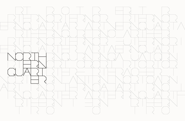
Research programme and brochure designs for inspiration within my own work for the promotion of my hypothetical Wes Anderson film festival- researching designs with unique compositions, layouts, shape
and print finishes.


Brochure/Programme design by Wemakedesign- an identity for the Brand Union- a development for a Dublin-based department store, 'Arnotts'. The brouchure contains information about the store, the area, maps and other such content.
The cover is completed with a debossed and foiled print finish (GF Smith Pergrina ruby red paper stock). Great light typeface used here- really contemporary and modern. Complete with the crisp, flushed photographic images these are beautifully and minimally designed. Great inspiration for my own programme designs- simple and effective.


Japan in Italy brochure design, created by Stefano Greco- a project designed through an intership. The iconic fan-shape denotes a Japanese influence in a creative and considered swatch-book-like style. Interesting visual communication- certainly something to consider in my own design work (developments of which can be found on my Design Practice blog).


Printed programme for Hexagon by Bambam design- creative use of minimal spot colours in combination with four colour process photographic prints, with interestingly deconstructed composition and layouts. Perhaps a little too busy for my own designs, but a great inspiration for conceptual design layout and thinking.


Wonderful branding and promotional work by designer Martin Holm for the rebranding and identity of the Oslo Science Fiction Festival 2010- combining various elements of print-based media including programmes, banners, t-shirts and merchandising, etc.
Here, Martin shows how effective simplicity can be, with bold reversed out vector images and a distinctive and charismatic visually communicative typeface. Bold, simple and instantly effective- great inspiration. This is a new favourite.


A programme for ARCHA theatre by designer Radka Pitrmucova. A wonderfully bold style, distinctive of European Graphic Design, (particularly Eastern Europe- Russia, Czech Republic, etc) with a strong, high-impact geometric influence- greyscales combined with electric blues and green spot colours for a contemporary and (darn I say) trendy design outcome.
Awesome collection! Great inspiration!Thanks for sharing them..PSD to WordPress
ReplyDelete