
Using examples of design for
branding & identity, packaging & promotion, publishing &
editorital, and information & wayfinding, explore the following
colour systems:
* CMYK (Process)
* Spot Colour (2 or more)
* Monochrome & Tints (Solid colour and half-tone)
CMYK (PROCESS)
CMYK definition
(http://dictionary.reference.com/)
graphics
cyan, magenta, yellow, key.
A colour model that describes each colour in terms of the quantity of each secondary colour (cyan, magenta, yellow), and "key" (black) it contains. The CMYK system is used for printing. For mixing of pigments, it is better to use the secondary colours, since they mix subtractively instead of additively. The secondary colours of light are cyan, magenta and yellow, which correspond to the primary colours of pigment (blue, red and yellow). In addition, although black could be obtained by mixing these three in equal proportions, in four-colour printing it always has its own ink. This gives the CMYK model. The K stands for "Key' or 'blacK,' so as not to cause confusion with the B in RGB.
Alternative colour models are RGB and HSB. (1994-12-22)
BRANDING AND ITENDITY


http://www.nico189.com/projects/20/Pantonecans
Hypothetical branding project 'Pantonecans' by Italian graffiti artist 'Nico'. A simple, creative concept with undoubtedly great desirability with graffiti-based designers the world over. A creative application of the four- colour system, fitting to the existing PANTONE minimalist design.
BRANDING AND IDENTITY


http://www.behance.net/gallery/Slant-Magazine/84645
Designs for 'Slant' Magazine by Atlana- based designer Georgios Saliaris, as featured in the Summer 2008 edition of CMYK Magazine (http://www.cmykmag.com/).
With a crisp, clean aesthetic, I decided to showcase this example of the four- colour printing process because of the versatility and considered design within the magazine, and also to demonstrate the most commonly used printing method in the magazine industry. Due to the common use of photographic images within magazines, CMYK is used as a cost-effective and efficient printing method.
PACKAGING AND PROMOTION


PACKAGING AND PROMOTION


 http://www.behance.net/gallery/Bollocks/466706
A wide array of promotional and packaging printed media here from designer Tony Ferriria in his promotions for the 2008 Glasgow-based Ethical Debate for Graphic Designers. Really like the design and consideration put into this brief- with all bases covered.
The use of the CMYK process colours palette instantly creates a visual communication for the interests and language of (print-based) designers, used creatively, and subtly throughout the media- from block colour to the four-colour photographic print process, this showcases the versatility of CMYK printing.
PUBLISHING AND EDITORIAL


PUBLISHING AND EDITORIAL


INFORMATION AND WAYFINDING


INFORMATION AND WAYFINDING

A colour model that describes each colour in terms of the quantity of each secondary colour (cyan, magenta, yellow), and "key" (black) it contains. The CMYK system is used for printing. For mixing of pigments, it is better to use the secondary colours, since they mix subtractively instead of additively. The secondary colours of light are cyan, magenta and yellow, which correspond to the primary colours of pigment (blue, red and yellow). In addition, although black could be obtained by mixing these three in equal proportions, in four-colour printing it always has its own ink. This gives the CMYK model. The K stands for "Key' or 'blacK,' so as not to cause confusion with the B in RGB.
Alternative colour models are RGB and HSB. (1994-12-22)
BRANDING AND ITENDITY


Hypothetical branding project 'Pantonecans' by Italian graffiti artist 'Nico'. A simple, creative concept with undoubtedly great desirability with graffiti-based designers the world over. A creative application of the four- colour system, fitting to the existing PANTONE minimalist design.
BRANDING AND IDENTITY


Designs for 'Slant' Magazine by Atlana- based designer Georgios Saliaris, as featured in the Summer 2008 edition of CMYK Magazine (http://www.cmykmag.com/).
With a crisp, clean aesthetic, I decided to showcase this example of the four- colour printing process because of the versatility and considered design within the magazine, and also to demonstrate the most commonly used printing method in the magazine industry. Due to the common use of photographic images within magazines, CMYK is used as a cost-effective and efficient printing method.
PACKAGING AND PROMOTION


Packaging and promotion design by Ayla Soriano- promoting a range of inks in the brand 'Octopus Garden' (as inspired by The Beatles' hit record). Great concept with the octopus, and good use of process colours here with the screen print range of packaging- Cyan, Magenta, Yellow and Black all clearly distinguished for the four- colour screen print process.
PACKAGING AND PROMOTION


A wide array of promotional and packaging printed media here from designer Tony Ferriria in his promotions for the 2008 Glasgow-based Ethical Debate for Graphic Designers. Really like the design and consideration put into this brief- with all bases covered.
The use of the CMYK process colours palette instantly creates a visual communication for the interests and language of (print-based) designers, used creatively, and subtly throughout the media- from block colour to the four-colour photographic print process, this showcases the versatility of CMYK printing.
PUBLISHING AND EDITORIAL


A wonderful printed publication by Norweigan Designer 'Heydays'- the annual report for the company 'Anthon B Nilsen', who operate in property, education and recycling. Very employee focused, the annual depicts the lives of the individuals "behind the scenes"- documenting the belongings and more personal factors of the employees, as oppossed to standard portraits and traditional photographs.
The variety of print finished and sophisticated and diverse- including black foil blocking (for the cover typography and vector images), and three types of paper stock- including the financial reports (image featured directly above) which displays a confident uppercase, condensed black fill typeface on yellow-
coloured paper stock.
The variety of colours used in the minimalist composition photographs dictates the printing method to be CMYK- for the most rational, and cost effective choice to capture the tones, shades and lighting variations within the image(s).
PUBLISHING AND EDITORIAL


Printed publication, 'Real Dutch Design', created by Dutch (you guessed it!) designer Marcel Kampman showcases the best of the Dutch design and arts world. As well as engaging and insightful content, the book is a visual treat- tints and monochrome printed pages, combined with tactile- and, best of all, a blow-moulded, self-heated cover design on a chrome background- giving the book a really visually unique quality, and a desirable, luxurious finish.
INFORMATION AND WAYFINDING


A great wayfinding printed publication for Singapore General Hospital, created by designer Ariffah Johari. The information graphics guide displays various graphs, pictograms and floor plans for the hospital in order to aid movement and familiarity with the building.
The booklet is complete with a vast variety of vector-based designs, diagrams and photographs- to print all effectively and in a cost-effective manner, the four- colour process has been used to achieve quality throughout. I particularly like the minimal patterned design, printed in vibrant and complimentary brights, as well as the interesting use of stocks (tracing paper) used within the booklet for a more tactile, interactive experience.
INFORMATION AND WAYFINDING

Information Graphics printed media by Socio Design- a guide for mobile phone manufacturing company, Nokia. The Designers describe the publication as:
"an in-depth research project examining the
integral role of context in consumers’ current way of life "identifying
needs and insights" to develop and refine context-based services for
future use. The findings needed to be presented in a straightforward and
visually stimulating way, inviting the challenge of how to present the
findings in such a large volume."
The publication is printed in a "coffee-table" style booklet with a spiral bind, combining various printing aesthetics- such as duotone, tints, and CMYK colour printing to encapsulate the diverse range of images and visual outcomes. The book also provides an interactive and engaging experience with fold-out pages and page sections.
Spot Colours
Refers to solid colours which are found in commercially obtainable colour ranges such as Pantone®, these are mostly used in addition to CMYK where CMYK is not available e.g. Printing gold or silver. When using Pantone colours, it is worth bearing in mind for future jobs that should you want to print in CMYK, the chosen Pantone® may not have a suitable CMYK equivalent, which may in turn lead to the expense of using additional plates
BRANDING AND ITENDITY


The 'Core Cider' branding was created by Designers Brett Layton and 'Braincells' for the High Vale orchard in the foothills surrounding the Perth region of Western Australia. The high-quality modern product is reflected in it's minimalist and innovative branding- combining the image of the "cored" pear with the simple, visually communicative type. The design was printed using 5 spot colours and white silk- scree- this way a distinct brand colour has been distinguished- and can be identified by printers the world- over.
BRANDING AND IDENTITY


Laduree Packaging
A few samples of Laduree (Patiserrie and Macron producers, established in Paris, France), and some images taken by my sister, Charlie, from a weekend break (last week). The company has a beautiful range of Reinacennsee- inspired logos and branding designs, which are, more commonly than not, printed in a minimal spot colour metallic print- with serif typeface and embellished borders in a cameo style.
The company prints over various printed media and colours (dependent on seasonal trends, patiserries, etc.) such as boxes, display cases, and even delivery vans. A sophisticated and distinctive logo for the brand.
PACKAGING AND PROMOTION

Wonderful use of colour and sophisticated type for the packaging and print of these alcoholic limoncello drinks. Unfortunately, I am unable to find the original source (due to a broken link)- though here is the link posted to my Tumblr blog, when I first saw them a short time ago. Love the bright, acidic colours which communicate the flavour and taste of the drink, and the set of labels- one with the yellow text, the other reversed out. A good use of spot colour- could have been produced using the CMYK printing method, but the minimal colours used here dictate spot printing to be a far more economical choice.
PACKAGING AND PROMOTION

Spot colour duplexed business cards for advertising and design company 'The Ubiquitous ("The Manufacturing Company"), created by letterpress print designers, 'Blush' (http://www.blushpublishing.com/) . Really luxurious and considered designs- complex with letterpress finish (on both front and back). The aqua colour works brilliantly as a stand out feature- and is complimented by the soft black colour- with a textured aesthetic, far more luxurious and considered effect than the standard matte black would provide.
PUBLISHING AND EDITORIAL


A design brief entitled 'Arena Afrika' by Norweigan Designer, Heydays- and a fantastic use of spot colour throughout the printed publication outcome. The design boasts some sophisticated finishes such as UV spot varnish (featured on the cover), and two sections divided by coloured stock of the same spot colour.
The contents notes the Norwegian Council for Africa and the work for democracy in the country. I love the bold colour used- usually unique, it really brings the publication to life- eye-catching and desirable.
PUBLISHING AND EDITORIAL

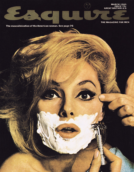
The New York Times Style Magazine Men's Fashion Fall (Autumn/Winter) 2009 magazine cover- with actor Michael Fassbender modelling for the cover shoot, photographed by Jean Baptiste Mondino.
Really love this colour design- with the cinematic B&W portrait with and added hint of sophisticated and style with the magenta- coloured New York Times logo, and title segment- reminicant of the 1965 Esquire Magazine cover... but with a little more testosterone...
INFORMATION AND WAYFINDING


Wayfinding design created by Portuguese designer, João Castro, a hypothetical informative guide and re design of the wayfinding system found in Lisbon airport (Portugal's capital). His designs creatively communicate pictorial diagrams and signage to be easily read by thousands of passengers each day from a multitude of different cultures and languages. The design is visually engaging and informative in printed publication format, using black and yellow to represent hazards, warnings and important signage- commonly found in pictorial or information design.
INFORMATION AND WAYFINDING


Creative designs by Russian design studio Marmelad Studio for a Russian shopping center, using a spot colour "branding" wayfinding and informative system around the center through signage design. The soft grey with the vibrant, burnt orange works really well for a unique, sophisticated design with a serif typeface. I also really like the Kandinsky- esque geometric patterns printed as vinyl wall art (see picture directly above), which adds a hint of character to the otherwise quite uniform design(s) and printed media.
MONOCHROME & TINTS (SOLID COLOUR & HALF TONE)
monochrome [ˈmɒnəˌkrəʊm]
n
1. (Miscellaneous Technologies / Photography) a black-and-white photograph or transparency
2. (Miscellaneous Technologies / Photography) Photog black and white
3. (Fine Arts & Visual Arts / Art Terms)
a. a painting, drawing, etc., done in a range of tones of a single colour
b. the technique or art of this
4. (Miscellaneous Technologies / Photography) (Fine Arts & Visual Arts / Art Terms) (modifier) executed in or resembling monochrome a monochrome print
tint (t nt)
nt)
nt)
n.
1. A shade of a color, especially a pale or delicate variation.
2. A gradation of a color made by adding white to it to lessen its saturation.
3. A slight coloration; a tinge.
4. A barely detectable amount or degree; a trace.
5. A shaded effect in engraving produced by fine, close, parallel lines.
6. Printing A panel of light color on which matter in another color is to be printed, as in an illustration.
7. A dye for the hair.
tr. & intr.v. tint·ed, tint·ing, tints
To give a tint to or take on a tint.
BRANDING AND ITENDITY

Monochromatic branding and identity design by Budapest-based designer, David Barath for 321 associates- a signage and wayfinding company which specifically design for architectural projects. Barath's resign for the company is bold and simplistic- with a modern aesthetic that is perfectly suited to the crisp and technologically sophisticated practice of Architecture- with a consistent branding and logo design that works across a range of print media (see examples in the image(s) above).


Beautifully sophisticated Letterpress tint designs created by Flintshire based design studio, 'Blush' (North Wales, UK) for Royal Welsh College of Music and Drama shows. Here, a transparent white ink is used to enhance the letterpress print finish (of which the company specialise in) of the deboss typography- printed onto a heavy 425gsm cotton paper for a high-quality, and luxurious feel- reflective of the classic sophistication of the college itself.
PACKAGING AND PROMOTION


A 2008 Illustrative design for 'Don't Panic' (Arts, Style, Music and Culture magazine: http://www.dontpaniconline.com/london) created by Greecian design studio, Studio Monochrome. The weight of line and shading used in this hand-rendered illustration provides a great monochrome effect with varying shades and tones- an eye-catching and unique promotional packaging design.
PACKAGING AND PROMOTION


Exhibition printed media and promotional design by Design Studio 'Them' for the Rankin Photography Exhibition, creating the largest photographic exhibition in the UK with an interactive space where members of the public would be photographed as live models.
With a strong branding identity, this tongue in cheek play on words is as bold as the photographer's portfolio, and works wonderfully in the simple yet effective monochromatic print- the condensed, uppercase typography adding a certain brash confidence that works perfectly in these advertisements and printed mailshots.
PUBLISHING AND EDITORIAL


Great publication design which utilises both monochrome photographic imagery and red tint overlays- 'Ctrl+Alt+Shift' is an HIV and Stigma promotion and information guide created by designer Derek Bowers.
The in-depth printed (and online format- found on Issuu) magazine informs the reader about HIV and it's current status across the world- focusing on the United Nations ambitions to support the treatment, care and support of HIV sufferers.
Using the red tint instantly communicates both health care and HIV (charities of which are branded with red colouring)- the high impact colour being both eye-catching and psychologically powerful- an attractive and imposing design project.
PUBLISHING AND EDITORIAL


Gorgeous monochrome and print fanzine- created by designer Nathalie Kapagiannidi. The A2, folded zine documents the work of Photographers whom have been inspired in their images by director Tim Burton, and his filmography.
The blue tint works wonderfully over the monochrome images for a ghostly and almost maccabre feel- as so often reflected in Burton's films.
Despite it's low quality stock and print, the composition, layout and type have been well considered, making the design both memorable and desirable.
INFORMATION AND WAYFINDING


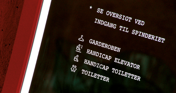

http://www.behance.net/gallery/Spinderihallerne/742580
Monochrome information and wayfinding design by Danish designer, Bo Virkelyst Jensen, entitled 'Spinderihallerne'. A crisp use of pictorial imagery as a visually communicative guide, with a sophisticated and modern reversed-out print for a trendier and slightly more unique aesthetic than the standard black on white.
INFORMATION AND WAYFINDING


http://www.behance.net/gallery/Britistics-a-UK-Infographic/1457231
An extensive and rich body of work in the printed media infographics guide of 'Britistics'- statistics of Britons and Britain's inhabitants, created by designer Matthew Rowett. Using reputable sources, Matthew created this hypothetical newspaper supplement- with wonderfully illustrative pictogram images which keep the eye, and mind, entertained.
The monochrome print keeps the design style consistent, and detracts from being too busy or "clashing" in the colour palette.
No comments:
Post a Comment