Having recently finished reading the Typographic study book 'New Vintage Type', I felt an oppurtunity to blog some of the great examples they demonstrated in their book.
Although I do not have a primary love or focus on typography, it is certainly becoming a far more active interest in mine, and I have paid particular attention to focusing on this field, as I feel it is perhaps a weaker area that requires more attention.
These are the previously mentioned findings, and styles of type I was parituclarly drawn to:
A great blend of past and present with Marian Bantjes' typographic stitch design (having discovered this design, I have been opened up to Batjes' amazing typographic work- I certainly recommend a look!) a blend of traditional cross stitch type with pixels- a fun and innovative idea.
Hammerpress' woodblock font print design for American band, Modest Mouse. Love the simplicity of this- as would be found in screenprinting methods- minimal colours and the bold, shadowed font works really well- very imposing on the design that captivates the audience- really grabbing their attention. Great design.
JUST my type- elegant, sophisticated and formal without being too traditional and "samey". Cool new typeface design by Morrow McKenzie Design for Lucina.
Clean-cut Architect's in-house design 'Neutraface' for House Industries, inspired by 1940's/50's Modernist Architect, Richard Neutra. Totally classy.
Great Illustrative design for houseware company, Joseph Joseph, UK by Bo Lundenburg. Love the compositions of this surface-pattern-like style with typeface used including: Allure Script, Egiziano, Blair, Futura Black, and Candid.
Great use of colour too- a real 1960's vibe (particularly in the first design).
I really like this handwritten embellished scripture style created by Vittorio Costarella at Modern Dog for House of Blues/Dam Chaon's 'You remind me of me'. Good use of minimal colours too- bold, direct and simple.
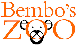
LOVE this work created by Roberto de Vicq de Cumptich for his book 'Bembo's Zoo', based around the concept of an anthropomorphic alphabet- utilising Bembo typeface, considered one of the world's most popular typographic designs.
I really like the creativity in the designs- and the fact that although not quite "perfect" it works all the better for it.
*From my research and particularly favourite findings here shown, it's become clear to me that although Typography is a relatively new ~love of my life~, and, although I do have particular tastes and favourites, I don't have a direct focus or love for any genre. Unusually for me, I like it that way- I now see how much more important it is to focus on the context of design, then picking a favourite style, or being biased. Whilst that is, of course, important- it is far more important to satisfy the brief, and visual communication of your product/message being portrayed.


