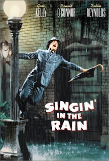
One of my initial sources of research for my design developments for the D&AD/Rain poster brief set by KesselsKramer (see my Design Practice blog for my design process), and if this would have any influence on the visual outcome in terms of images, type or layout. I really liked the use of type on the poster- the bold, uppercase font that is used consistently throughout with a slight drop shadow- a very bold "all American" old Hollywood style that is bold and eye-catching without being too flamboyant- bold, simple and minimal... just my cup of tea, and definitely a style that I will aim to pursue within my own work.
Sunday, 11 March 2012
Image//D&AD & Rain//Singin' in the Rain posters.
One of my initial sources of research for my design developments for the D&AD/Rain poster brief set by KesselsKramer (see my Design Practice blog for my design process), and if this would have any influence on the visual outcome in terms of images, type or layout. I really liked the use of type on the poster- the bold, uppercase font that is used consistently throughout with a slight drop shadow- a very bold "all American" old Hollywood style that is bold and eye-catching without being too flamboyant- bold, simple and minimal... just my cup of tea, and definitely a style that I will aim to pursue within my own work.
Subscribe to:
Post Comments (Atom)


No comments:
Post a Comment