
Researching general packaging design for my role within the Graze brief (largely looking at developing the colour scheme and packaging, whereas Charlie is looking more towards the logo and branding), and existing design ideas and strong, consistent identity design- some great examples and sources of inspiration featured below.

http://lovelypackage.com/category/health-beauty/page/32/
Designed by Tank | Country: United States | Fonts used: Interstate
Beautiful new work from Massachusetts based Tank.
Really fresh and clean, the light type and combination of greys, whites and ice blues work wonderfully together to denote the health and purity of these beauty products- simple, elegant and really refreshing-also works well on a variety of packaging products, as evidenced above on various three-dimensional shapes.
Really fresh and clean, the light type and combination of greys, whites and ice blues work wonderfully together to denote the health and purity of these beauty products- simple, elegant and really refreshing-also works well on a variety of packaging products, as evidenced above on various three-dimensional shapes.
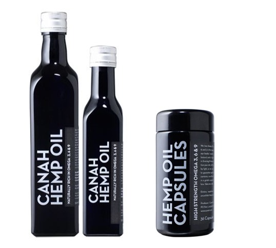
http://lovelypackage.com/category/health-beauty/page/31/
Designed by It’s Everyday™ | Country: Romania | Fonts used: Neutraface
“Canah was our baby: the first commercial producers of hemp in Romania, with big plans. All very eco-friendly, involving the use of local farmers and traditional methods. We did their naming, branding, site, copywriting, promo materials and packaging.
Actually coming up with the final products involved some pretty serious research into spectrum-blocking glass, which we ordered from Switzerland, to protect the fragile hemp oil. We wanted to keep the actual hemp imagery to a bare minimum, avoiding the other connotations that hemp products carry. Sadly the team which realised our designs managed to mess them up, but Canah remains one of our favourite projects.”
The typeface used on this packaging design is brilliant. Unique, bold, and sophisticated in it's reverse out, monochrome colour palette. The simplicity of this design is what makes it work so effectively- definitely a consideration in terms of just how minimally we work ourselves within our design outcomes in the Graze brief.
The typeface used on this packaging design is brilliant. Unique, bold, and sophisticated in it's reverse out, monochrome colour palette. The simplicity of this design is what makes it work so effectively- definitely a consideration in terms of just how minimally we work ourselves within our design outcomes in the Graze brief.

“Given that the established brands in the beauty industry invest billions (with a ‘b’) on product and brand advertising, we were tasked with launching a new concept in urban, modern and time-sensitive beauty treatments. Gee Beauty is the result of experience combined with irreverance and a best-of-class lineup of products and services.”
Designed by GJP.
I first saw this series for the make up tools packaging design a couple of months ago when initially researching packaging for a design production for print brief, and thought it was just so clean, crisp and stylish- perfectly suited to the fashion-orientated products in which they are promoting and advertising. Again, a great example of minimalism through type and monochrome working incredibly well together- something to considering using more of in our own designs, and how the character of type can make a big impact on our design outcome(s).
I first saw this series for the make up tools packaging design a couple of months ago when initially researching packaging for a design production for print brief, and thought it was just so clean, crisp and stylish- perfectly suited to the fashion-orientated products in which they are promoting and advertising. Again, a great example of minimalism through type and monochrome working incredibly well together- something to considering using more of in our own designs, and how the character of type can make a big impact on our design outcome(s).

Designed by Little Fury | Country: United States
Help Remedies uses witty writing and 100% recyclable moulded paper pulp to make their health products friendly and welcoming. Their simple design makes these products stand out from the sea of over designed packages in your typical drug store.
“While some health problems are large, complicated and frightening, most aren’t the end of the world. A kind word and a little help can get you on your way again.
Help Remedies was created to make solving simple health issues simple. We find the best solution there is, and take away everything else. By stripping away some of the complexity and fear mongering of the health industry, we hope to make the category friendlier and more accessible, and in doing so empower people to make their own health decisions.
We think a little help, honesty and kindness will go a long way.”
Love the bling deboss style of print production with these pad printed first aid boxes- really clean, minimal and very chic (a good design alternative to the usual first aid green box)- clearly distinguishes the product without being too in your face or flamboyant. Product/packaging design at it's best.
Love the bling deboss style of print production with these pad printed first aid boxes- really clean, minimal and very chic (a good design alternative to the usual first aid green box)- clearly distinguishes the product without being too in your face or flamboyant. Product/packaging design at it's best.

http://lovelypackage.com/category/health-beauty/page/30/
Designed by Anwar Pack. | Country: United States | Font: Goudy Heavyface
“An emotional branding project for packaging design. I had to develop primary, and secondary packaging, as well as a gift set to house it all, for a fragrance modeled after someone close to me. I chose my father for the project, so I developed a traditional grooming kit. I designed and made all of the packaging, upholstering it with nue-buck leather and suede. I wanted to design something that was traditional and nostalgic, but at the same time contemporary enough to apeal to a more youthful audience.”
A fun and somewhat nostalgic packaging design for this shaving set- great playfulness mixed with the "gentleman" like sophistication of the luxury gold-plated and foil-blocked designs in combination with the luxurious chocolate-brown case(s) and lining. Sophistication with a sense of humour- just the sort of design outcome that we are hoping to achieve with our Graze designs- formal, but in no way serious(!).
A fun and somewhat nostalgic packaging design for this shaving set- great playfulness mixed with the "gentleman" like sophistication of the luxury gold-plated and foil-blocked designs in combination with the luxurious chocolate-brown case(s) and lining. Sophistication with a sense of humour- just the sort of design outcome that we are hoping to achieve with our Graze designs- formal, but in no way serious(!).

Designed by JuliAnn Miller | Country: United States | Fonts used: Myriad Pro
“We were to design work for a social or political cause; I chose tattoos for my topic. This Tattoo Tester is a kit that comes with certain papers so that the user can create custom temporary tattoos (transfer paper and carbon paper). The kit also includes a brochure with information on tattoo statistics and a brief history of tattooing. All parts of this kit are designed, written, and constructed by me. The box is made from light cardboard and all printed material is printed on recycled kraft paper.
Again- as previously researched on my environmental packaging/branding design blog post, I really love the use of kraft paper in these product branding design- the warmth of the brown giving real character and environmental/natural aesthetic appeal to the packaging design, which I feel would suit the visual outcome and environmental ethos of the Graze brand very well- definitely need to start researching into it more!
Again- as previously researched on my environmental packaging/branding design blog post, I really love the use of kraft paper in these product branding design- the warmth of the brown giving real character and environmental/natural aesthetic appeal to the packaging design, which I feel would suit the visual outcome and environmental ethos of the Graze brand very well- definitely need to start researching into it more!

http://www.behance.net/gallery/Adam-Eve-Law-Firm-Branding/2616335
"Adam & Eve represents a group of creative professionals who share ideas, experience, knowledge, the understanding and commitment to achieve legal results for their clients. Adam & Eve uses traditional biblical philosophies as a model in order to communicate their values as an Intellectual Property Law Firm.
This brief was to create the branding for an 'Intellectual Property Law Firm' that explores and challenges marketing and advertising strategies. I wanted to create a law firm that pushed the creative boundaries of design and marketing so decided to use a slightly controversial approach using religious influences to drive the design.
This brief was to create the branding for an 'Intellectual Property Law Firm' that explores and challenges marketing and advertising strategies. I wanted to create a law firm that pushed the creative boundaries of design and marketing so decided to use a slightly controversial approach using religious influences to drive the design.
The name 'Adam and Eve' sets a very obvious tone for this company, in which I then created 10 "commandments" that the company prided themselves on. These commandments / values were what influenced the design solutions eg. one value was being a friend to nature, which inspired the eco materials and stocks. The design direction lead to mixing old traditional styles with modern techniques such as the scroll invitation in a modern day mailing tube."
A truly strong, considered and stylish brand identity. Although I'm far more a fan of colour, usually, than monochrome design, I think these design outcomes are truly well considered and stunning- a range which sits so well together, with minimal stock usage and consistency that just works a treat. Perhaps a little more formal than the design outcomes/target audience that Charlie and I are working towards for the Graze/YCN brief, but a great source of inspiration in terms of the design branding nonetheless.


This is an experiment for my packaging class at l'Université du Québec à Montréal. Though Antidote is a real "made in Montreal" software (www.antitode.info). Take a look at this simple packaging which could replace those big software boxes with plastic cd cases inside."
One of my initial sources of inspiration in terms of the combination of (jade) green and the brown cardboard stock (and reversed out white type), I think this branding design is contemporary, stylish and eye-catching- with a great balance of the formality of the office environment in which we will be promoting our Graze product with the character and unique brand identity that the flooded green brings to the design. Brilliant stuff.
One of my initial sources of inspiration in terms of the combination of (jade) green and the brown cardboard stock (and reversed out white type), I think this branding design is contemporary, stylish and eye-catching- with a great balance of the formality of the office environment in which we will be promoting our Graze product with the character and unique brand identity that the flooded green brings to the design. Brilliant stuff.


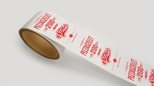
"Szelet (it means a 'slice' in English) is a really small pizzeria which specialises in a slice of pizza. I started with inventing the name 'Szelet'. After that I designed it's identity, the interior design, the packaging and the web design. I wanted to choose a strong concept which can be developed into a franchise later. Therefore I have chosen a very intense colour- red- and a familiar shape that evokes the 'world' of pizzeria and
fast food restaurants."
One of my favourite brand designs, without question, found to date- love the bold, minimal colour palette and the reversed out type on red featured throughout a great deal of the designs. Really eye-catching and full of character, whilst still remaining classy and sophisticated- certainly the sort of style that we hope to achieve within our own Graze branding. The consistency of the branding, in particular, is a key feature- making the brand recognised, known and easily/naturally associated with the product will increase awareness, and therefore, custom for the brand. Good identity and branding design is promotion within itself- something that Graze are really hoping to push and develop- and that we ourselves set out to achieve.
One of my favourite brand designs, without question, found to date- love the bold, minimal colour palette and the reversed out type on red featured throughout a great deal of the designs. Really eye-catching and full of character, whilst still remaining classy and sophisticated- certainly the sort of style that we hope to achieve within our own Graze branding. The consistency of the branding, in particular, is a key feature- making the brand recognised, known and easily/naturally associated with the product will increase awareness, and therefore, custom for the brand. Good identity and branding design is promotion within itself- something that Graze are really hoping to push and develop- and that we ourselves set out to achieve.


No comments:
Post a Comment