
As part of myself and Charlie's research and development into the YCN/Graze brief, we really wanted to look at environmental methods of production, and the visual communication of environmental design within branding for inspiration for our own design outcomes.
Through an online search, I found some great examples of environmental design that I would really like to look more closely at (examples shown below) to develop the Graze brief in our own, unique way.

http://www.behance.net/gallery/Mareiner-Holz-corporate-identity-design/1716735
"Mareiner Holz has developed a whole range of techniques for finishinguntreated wooden boards in an environmentally friendly way. In doing so theydiscovered that each wood has its own unique character and therefore requiresindividual techniques in order for its true character to really shine. So muchmore than just flooring. When “Mareiner Holzindustrie” became simply “Mareiner Holz” it marked not only the adoption of a clear positioning strategy but alsothe establishment of “Wood Treatment” as a new market category. In addition, anemotional world was created by this courageous brand personality, which isespecially evident in the aesthetics of the company’s products: 100% naturalbeauty. As the company’s brand mark, Bert the woodpecker is the whimsicalrepresentative of the agile outdoorsmen.
New branding and positioning for Mareiner Holz, leading wood processor in Central Europe, by moodley brand identity."
A really crisp, smart branding and identity design, inspired by the fine craftsmanship of the carpentry brand- great proof that environmental doesn't have to be preaching or slightly infantile in directing it's message (which it can unfortunately often be)- really sophisticated, high-end design.


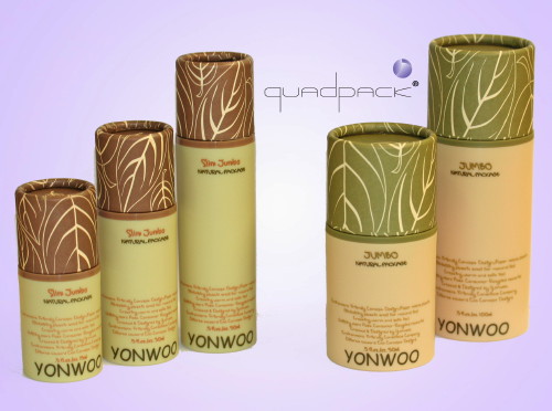
http://www.premiumbeautynews.com/IMG/jpg/ecolograngeyw500.jpg
Great printed pattern used in this unique packaging design- almost reminds me of cabbage leaves, however? A little predictable with the colours chosen, although they've been chosen for a reason- clearly conveying the "environmental" and "natural" nature of the product.
Great printed pattern used in this unique packaging design- almost reminds me of cabbage leaves, however? A little predictable with the colours chosen, although they've been chosen for a reason- clearly conveying the "environmental" and "natural" nature of the product.

http://packaginguniversity.com/blog/2009/06/29/great-eggspectations-with-your-product-packaging/
"If it’s organic it’s easy to differentiate because consumers will be looking for less and more natural packaging. Words like organic, green, natural all appeal to this market segment. They want to identify the type packaging used with the product inside so brown or kraft paper and the gray of molded pulp are a good complement to this type packaging. It looks natural and it is!"
Love the use of the kraft paper in this packaging design (which I have begun to start researching for our own design production of the Graze boxes and mailshot media) which still ensure that the products look environmental and nature, but combined with the white paper cups certainly look more unique than your average egg box design.

http://www.packaging-int.com/upload/image_files/articles/images/companies/284/faerch8b.jpg
Wonderfully delicate laser cut design which adds the to natural, floral aesthetic of the packaging and design outcome. Looks really fresh and different- this would certainly stand out as a high-end premium product, just as the Graze box is- a method of delivery and design certainly worth considering in our own design production and development(s).


Designed by Designworks | Country: New Zealand
“As a natural product range that works, Huni has a refreshingly bold and Kiwi personality. The pattern, logo and typeface were crafted to reflect the flow and movement of honey. The distinctive bold form of the packaging moves away from traditional bottle forms – standing out on the shelf and in the hand.”

http://www.thedrum.co.uk/uploads/news/old/14706/master.imgsize2.php.jpg
Really simple, eye-catching and decorative, yet minimally and tastefully so. Really like the minimalist approach to the packaging in general- the transparent outer bag letting you know the product, and visually engage with the product, as well as having all the necessary details, nutritional information, etc.

http://foundline.com/clients/true-body-products
"True Body Soap is an all-natural, affordable bar soap sold in grocery and natural food stores nationwide.The product philosophy is "we only put in what you need to get clean"—and the visual design of the brand, packaging and website embody that vision. Found Line has developed the identity, sales and consumer materials that help True Body Soap communicate its mission and value."
A simple yet consistently branded environmental looking design. I am personally a really big fan of one/two colour plus stock printing- believing that the more minimal a colour scheme (in general), the more sophisticated and considered the branding appears to be.
Also love the consistency right through to the bar of soap itself- where the logo of the brand has been stamped out of the material- ensuring that the brand is always memorised, recognised and linked- especially when the product itself is being used.
No comments:
Post a Comment