Looking at a few existing examples of vector-based character design for inspiration and development throughout the Design Production for Digital module, and creating my own penguin vector-based designs.
For a long time I have wanted to put a crisper, more minimal vector-based style, and this project and subject matter offered the perfect opportunity to execute this with a fun, distinctively bold illustrative geometric style which is aimed to appeal to my target audience of 5-11 year olds (more design development of which can be found on my Design Practice blog).
The examples below show styles I have been influenced by, either at the time of design, or later on throughout the design process.
A great example of how vector-based design can be used completely minimally and discreetly but still prove and effective visual communication tool with the correct consideration of context, and, in this case, the colour palette used in the design (very similar to that of my own design outcomes). The reversed out logos look great- really unique and eye-catching.
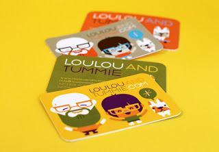
Again, this design by Loulou and Tummie is really pushed by the innovative use of colour in their designs to make a "family swatch selection" over this series of designs (images featured above) which help to ensure consistency and a sense of familiarity among each individual design, along with fun, rounded shapes that don't depend too much upon realism- definitely something to remember in my own designs- I don't have to be 100% anatomically accurate, as long as visual communication is still effectively taking place.
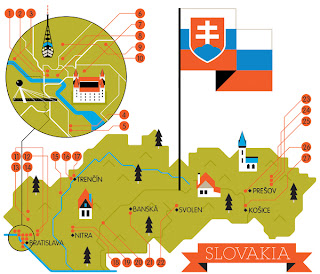
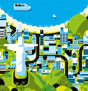
Again, more evidence that colours really do make or break a vector design in these detailed map illustrations, which detailed and considered colour palettes create a real atmosphere and character within each design- each image working as part of a series, and well as it's own separate entity.
A wonderful combination of light and shadow in this design, combined with a fabulous consideration for texture which really helps bring the piece to life in an incredibly realistic rendered design- showing just how detailed vector-based character design can be, as opposed to the great deal of minimalist work I have been looking at so far, and a reminder to always explore various outcomes to see which is best suited to the project and the client's needs.


No comments:
Post a Comment