After visiting the Picture House yesterday to take photographs for my hypothetical Wes Anderson Film Festival project, I picked up a few examples of printed media they had dotted around in holders and placed around surfaces. Of course, of a cinematic nature, they were all useful to help distinguish what's out there- how existing media is used, and how my own designs will fit in, or stand out from exisiting print and publications. I have also found the materials very useful in being able to generate accurate scales and suitable measures for my design work- for all developments and design ideas, see my Design Practice blog for more information.
"Leeds Loves Film"- a simple three-face fold leaflet/booklet- four colour process print (for full colour photographs) along with reversed-out white type on black. Not as contemporary a style as I would personally like to create- but good use of flood colours. The black dulls the powder blue a little (as opposed to how white lifts it, and makes it brighter)- though a good example of a simple fold.
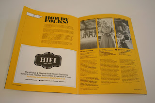
My favourite print example I picked up- the Hyde Park Picture House programme booklet- complete with printed advertisement, film summaries, and screening times. A twenty-one page booklet which wonderfully combines a contemporary yellow spot colour with monochrome throughout for a stylish and contemporary finish. It'd be great to create a design like this- and being able to combine vector-based design with photographic images (stills/screenshots from Wes' films).
And finally, the booklet for '25th Leeds International Film Fetival'- printed on a lightweight stock in CMYK (to produce full colour photographs)- a few too many colours for my liking- the pictures would be far more effective in monochrome or duotone- looks a little too busy, but serves a purpose, of course. Also makes it far easier to produce (particularly considering it is the densest publication with 103 pages).


No comments:
Post a Comment