Looking at, and researching specific film posters in order to (hopefully) inspire designs for my Design Production for Print project (see my Design Practice blog for more details) in creating promotional designs for the hypothetical Wes Anderson Film Festival.
Love the aqua colour and the bold vector style- this is how illustration SHOULD be done- I'm just worried that I won't have quite enough time to see this sort of style through.
Beautifully elegant and sophisticated- much like the aura of the Cannes Film Festival Itself. The metallic gold spot colour works wonderfully with the monochrome here, really pops out and adds a sense of regality.
A little bit crazy. Interesitng minimalistic take on the design and layout- mine will certainly have to have a few more details than this in order to promote the Festival, and to portray required information.
Love the one spot colour- this works so well here- interesting layout and format too. White always, in my opinion, works so much better with colour than black- keeps it looking fresh, vibrant and crisp.
A bit too rough and ready for me- but I like the typeface engulfing the page- looks really high-impact and would certainly be eye-catching to a passer-by.
Love how mad this really is. Sure, it's appropriate for the Futuristic Film Festival, but perhaps not with The Wes Anderson Film Festival (films of which have more than a little tendency to flirt with 1970's stylings)- fun use of hand-rendered illustration, not very commonly seen in contemporary graphic design, so pretty refreshing.
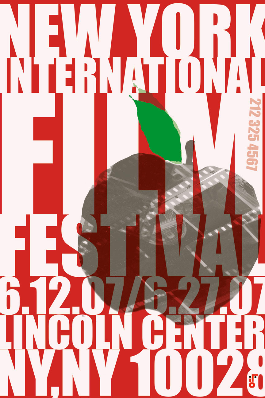
Quite Saul Bass like in it's paper-cut like style. Fun colours and an engaging way to attract attention with the type part of the illustrative design.
Again- love the colour palette. So simple in design, but the vibrancy really makes it stand out to be something quite extraordinary. I don't think it would be doable considering the time (but I'll definitely have a go!), but a style like this would make a brilliant poster/programme design cover.
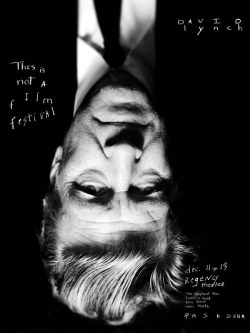
Perhaps my favourite poster from the blog (might be to do with a Lynchian love?)- fun and simple composition- the type also creating a sense of playfulness and the (CLICHE ALERT!) "thinking outside the box" that Lynch is so well known for in his films- yet the black and white helps to ensure the design is kept minimal and sophisticated.


No comments:
Post a Comment