
Beginning to explore several sources of printed media and zines to develop inspiration for my own work in the design production for print module- with particular focus on my film screening programme collection which I hope to create. The images shown below are just are a small selection from my own personal collection that have inspired me with their design and/or print finishes.


'Everybody's book of kittens' is a charmingly sweet illustration series by Illustrator and Designer Gemma Correll. The black and white hand-rendered illustrations with varying weight of lines and textures work really well with the smooth semi-gloss stock it's printed on to- simple sweet stories about the love of our furred friends follows throughout. Cute and quirky.


A hot dog fold illustrative booklet I picked up at last year's Leeds University book fair, created by my friend and fellow Graphic Designer, Beth Yates. Simple geometric shapes and lines are used to maintain interest- and the black ink plus yellow stock work wonderfully together for a high-impact visual design.


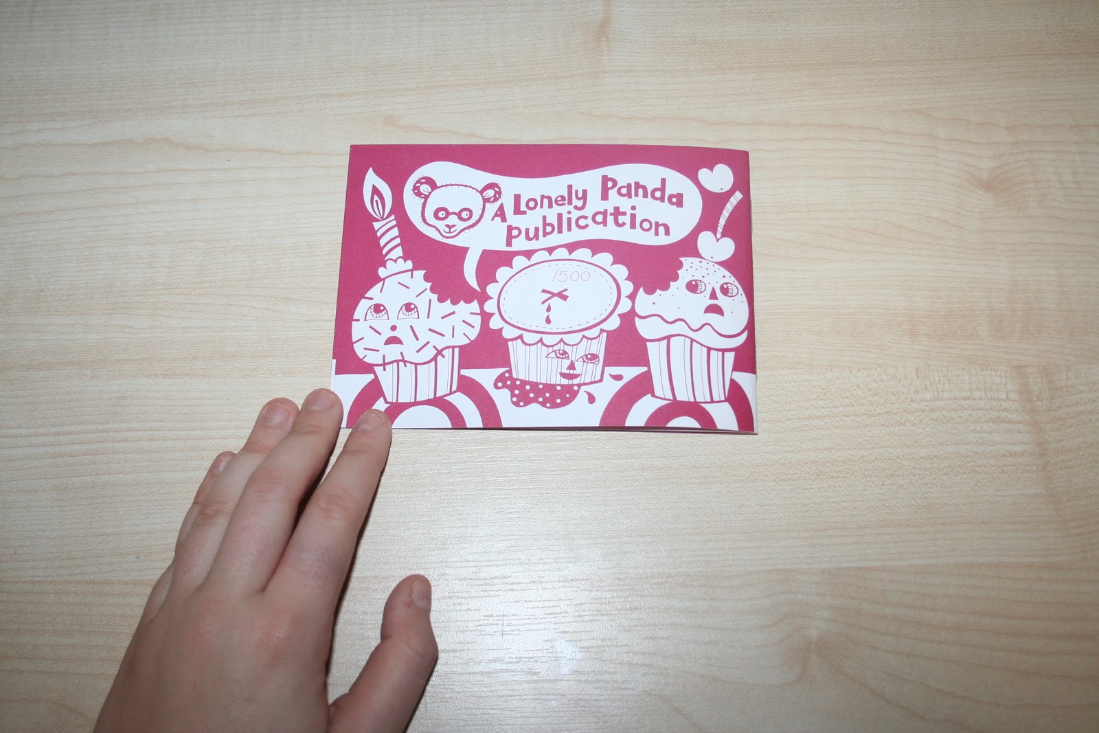
Another booklet picked up at the Leeds University book fair last year- really like the format of this slim, landscape booklet- breaks for the usual 'A Series' structure in a refreshing way. Originally bought with a pack of miniature crayons, with interactive print acts as a birthday colouring- fun, simple idea- and keeps the printed media one colour plus stock- I love simple colour palettes.


Yet another Leeds University purchase- 'Chuckle Sandwich' is a humorous collection of anecdotes and stories of inanimate objects- love the wit throughout- never fails to raise a smile. Also, good contrast of highly- coloured front and back cover with the black and white inside of the booklet- leaves a little more to the imagination.


Booklet/Flyer from Club 'Nation of Shopkeepers' in Leeds. The four colour CMYK printing process is used to ensure that all colours can be reproduced- from monochrome band images to the vector design on the cover. Interesting blend of hand-rendered illustrations, digital type and photography- might be a little bit too much going on for my personal taste, but a good colour palette used.


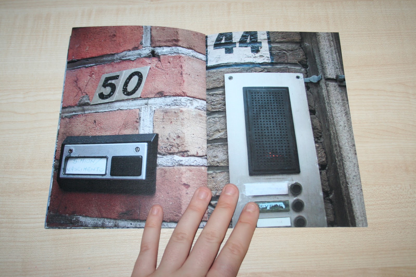


'Bruges is famous for it's buzzers' was a zine I picked up from Leeds' Reetsweet Corn Exchange market- a collection of Photographic images from the charming Belgian town of Brugge (one of my favourite places in the world... so far). Interesting observations made, and a great way of documenting for a kooky and
unique print outcome.


Brilliant design here from Bradford's National Media Museum- highlighting one of their exhibition events throughout the year. Wonderful combination of spot colour plus monochrome and colour plates throughout the publication- I'd love to be able to create something like this. Bold griding, simple style- a great source of inspiration for my own film-based work, my hypothetical Wes Anderson film festival (more information of which can be found on my Design Practice blog).


Another Bradford Media Museum publication- this time a little more bold and colourful, perhaps reflecting on it's family-filled content? Adding a little more playfulness to it's character?


Again- another film-based programme design, this time for the Yorkshire Film Societies (picked up from a day visit to The Thackaray Museum in Leeds). Here, a fluorescent orange spot colour is used in combination with monochrome images. Perhaps a little too bright and "in your face" in combination with the low contrast black and white images for me- but certainly eye-catching amongst other printed media.


Great new branding and design identity for Chester zoo- love the fun illustrations and hand-rendered type- really innovative and engaging- far more exciting for the younger audiences than designs of the past (from great experience... I am Chester Zoo's biggest fan...ever).


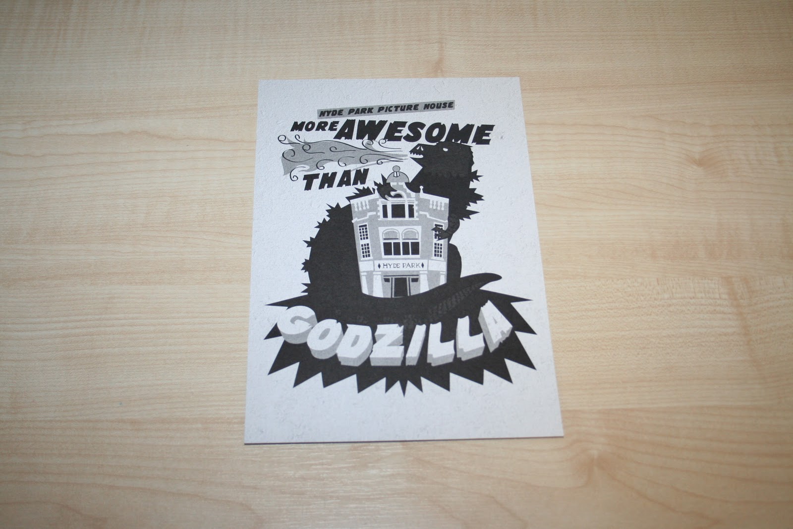
The programme for the film screening of 'The Skin I Live In' I picked up on an evening out to The Hyde Park Picture House in Leeds (where I intend to set and promote for my Wes Anderson Film Festival). The programme is okay to a level... though quite bland. The stills and photographs from the film work well in the programme, but it's very samey throughout- the composition and layout could certainly be a little more lively.

Love this bold, monochrome illustrative flyer- oh, and it's so true, of course.
Great map on the back- really simple and easy to follow... I need to draw some of these up for my own wayfinding and signage designs!


Picked up this '5 a day' programme fold guide whilst at Uni- an interesting fold technique to compress down to a really small pocket-sized design- this scale would work well for my own pull-out maps- need to get experimenting asap!


Another great piece of design picked up from the Leeds University book fair last year- got to love Anchorman... and whoever made this. A simple hotdog fold could work well for some of my mailshot designs- enables you to get a lot of content across in a condensed amount of space- pocket sized information- good for being on-the-go.


The Art and Design Show at Manchester Met Uni- don't know much about their work, but I have to say- I do love their programme. The cool yellow spot colour works wonderfully with the black and grey- vibrant, energetic design. Contemporary layout and type too.


This year's beautifully die cut prospectus design, along with the Graphic Design handbook from a couple of years back. Of course, being made by Graphic Design Grads they are wonderfully composed with eye-catching and considered styling- wonderfully elegant, brilliant examples of publication design. Great spot colour throughout in the Graphics year book- interesting composition of photographs too.


No comments:
Post a Comment