


"Art Direction and editing of publication,
in collaboration with Fabio Sebastianelli.
-
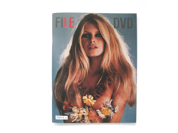
FILE Magazine is a bi-annual publication featuring
a broad selection of visual communication in the fields
of graphic design, art, photography, fashion and
moving image. Beautifully presented in a 30 x 39 cm
hard cover with a full colour 52 gsm newsprint
stitched inside.
Each issue is accompanied by a DVD featuring
short films, music videos and documentaries.
A magazine to Watch & Read.
-
www.file-magazine.com"
in collaboration with Fabio Sebastianelli.
-
FILE Magazine is a bi-annual publication featuring
a broad selection of visual communication in the fields
of graphic design, art, photography, fashion and
moving image. Beautifully presented in a 30 x 39 cm
hard cover with a full colour 52 gsm newsprint
stitched inside.
Each issue is accompanied by a DVD featuring
short films, music videos and documentaries.
A magazine to Watch & Read.
-
www.file-magazine.com"
A great magazine by Designer Thorbjorn Ankerstjerne which combines creative layouts (reminsiant of Bauhaus-esque Eastern European design- think Rodchenko)- with bold and imposing typefaces in creative, deconstructed layouts- combined with considered, bold potraits and print finishes.
Perhaps what I like best about the magazine is it's contrast- the newsprint, light gsm weight stock it is printed onto in combination with the carefully considered, crafted stitch used as a bind- creative finishing.


'Nice' magazine by Russian designer Udobnyj Danya examines film in it's content- and utilises a well-structured and varying grid design to maintain interest and adds a new, playful character with each page. I particularly like the wide-angle photograph used in combination with the typeface- creating a really cinematic, filmic aesthetic.


"The Faber Film range of books cover a variety of genres and include screenplays, techniques guides and film history books. Faber and Faber's long history of typographic excellence ensures the books reflect the high profile of the Faber's film list, which attracts both film enthusiasts and professionals alike. As there is nothing more trustworthy and high profile in film than a cult classic, the covers of this range aim to reflect these golden times, coupled with some very contemporary topics."
Great range and branding design by Perth (Australia)- based designer Holly Almasi. The combination of the colour palette and typefaces used make really beautiful, desireable publications with quite an old-Hollywood, retro feel about them- very cinematic and full of character and flair.

A sweet, simple vector design by Canada-based Designer Janine Vangool for her printed publication, 'Uppercase' Magazine. Love the colour palette used- really attractive and contemporary- but perhaps suited for a younger audience and film covers? Needs to be slightly more edgy to attract young adults, I personally think.


Wonderful publication based around the life of Political Party member, Harvey Milk, whose power in state (US) was rocked upon the controversial declaration of his homosexuality. This publication not only explores the life of Milk, but also the film consequently made in his honour, 'Milk', directed by Gus Van Sant. Love the bold spot colour used in contrast to the cinematic monochrome screen shots and photographic images- a really edgy, high-impact design.


Bold packaging design for a college of creative studies, created by Designer Ryan Cady. Creative print finish with fluorescent colours and reversed out type- eye catching, bold and impossible to miss.
No comments:
Post a Comment