For my live University of Leeds Ballet brief, at the core of the project, it's fundamentally a branding and promotional brief. Therefore, I've decided to look at some existing ballet branding projects online for sources of contemporary design inspiration.
As discussed with Carys, I'm looking at creating a design which is contemporary, and reasonably gender neutral (as they try to introduce more males to the ballet society)- I'm hoping to explore typographic design as the basis of the branding with photographic visuals throughout my promotional media.
Throughout the examples below I particularly like the bold, geometric typographic design used in the brand identity for the Melbourne Dance Company, which adds real contemporary character and movement, reflecting positions of the ballerinas, and I'm a big fan of the tactile poster designs for the Dutch National Ballet (shown at the bottom of the page) with a really interesting weaved texture, again, showcasing the intricate movements of the dance.
Some really interesting ideas to potentially explore, all my design developments will be featured on my Design Practice blog.
behance.net/gallery/Melbourne-Dance-Company/2437569
Josip Kelava, Melbourne Dance Company
Olga Gaze, Bolero
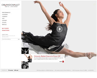
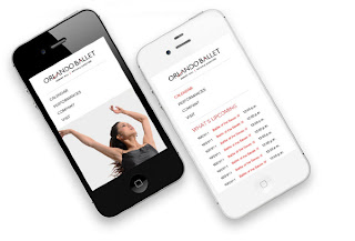
behance.net/gallery/Orlando-Ballet/5281811
Jonelle Chandler, Orlando Ballet
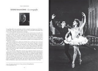
behance.net/gallery/22-International-Ballet-Festival-of-Havana/3777674
Naná Ramírez, International Ballet of Havana
Martin, Dutch National Ballet Posters


No comments:
Post a Comment