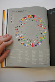
Most of the images shown are pictorial diagrams and info graphics- what I am particularly drawn to. However, some examples, (such as the diagram shown below) are more abstract or mathematical- and have given me inspiration outside of what I would normally favour- still all brilliant concepts and designs.
Half colour wheels- an interesting compositions and info graphic, with information sourced from Pantone about the "In" colours of women's fashion.
The distribution of religion and the belief ratios around the world- from one extremist view to another. I like how the spectral colours and used, in combination with circumfrences which relate to one another in terms of scales reflecting the belief percentages.
A "Word Cloud", this time, again, utilising various scales to determine the popularity from a poll of the "must read" books and literature. Easily readable, yet a slightly more abstract composition make for an interesting graphic visual.
Simple and well structured series of diagrams which document complimentary flavours and foods within recipes. Creating simple, yet repetitive diagrams like these would work really well in my own project for comparing and cross-referencing similar auteur details within Wes Anderson's films (see my Design Practice blog for future design developments).
Really like these designs- definitely the sort of simple yet strongly design pictorial images- communicate simply, yet effectively the percentage of ingredients used within each specific drink, salad dressing or coffee. Distinctive outlines and shapes of the cups and glasses help to visually communicate the product.
Something a little more original- yet still contemporary. A graph showcasing the popularity of newborn girl's names within the US. The pink colour is, of course, visually communicative and iconically related to the female gender, whilst the simple bar chart and key system makes for simple yet informed reading.


No comments:
Post a Comment