lululocketphotography.tumblr.com Conituning my research for the brand development of Lulu & The Lens Photography as one of my ten negotiated briefs for Design Practice III, I have decided to (and will, of course, ask Lulu's consent) present the identity as a 'Lifestyle and Wedding' Photography brand, which encompasses the vast majority of Lulu's existing portfolio work. Below, I've categorised a small selection of her latest works into both of the aforementioned photography styles, and it could be quite interesting to use this "double" as a concept for the furthering of the design outcomes- perhaps as a reversed business card, or double- sided portfolio. The potential variations to explore are really exciting, and I look forward to the design development stage, all evidence of which will be posted on my Design Practice blog. // PHOTOGRAPHIC PORTFOLIO WEDDING
Looking at a few existing examples of vector-based character design for inspiration and development throughout the Design Production for Digital module, and creating my own penguin vector-based designs.
For a long time I have wanted to put a crisper, more minimal vector-based style, and this project and subject matter offered the perfect opportunity to execute this with a fun, distinctively bold illustrative geometric style which is aimed to appeal to my target audience of 5-11 year olds (more design development of which can be found on my Design Practice blog).
The examples below show styles I have been influenced by, either at the time of design, or later on throughout the design process.
A great example of how vector-based design can be used completely minimally and discreetly but still prove and effective visual communication tool with the correct consideration of context, and, in this case, the colour palette used in the design (very similar to that of my own design outcomes). The reversed out logos look great- really unique and eye-catching.
Again, this design by Loulou and Tummie is really pushed by the innovative use of colour in their designs to make a "family swatch selection" over this series of designs (images featured above) which help to ensure consistency and a sense of familiarity among each individual design, along with fun, rounded shapes that don't depend too much upon realism- definitely something to remember in my own designs- I don't have to be 100% anatomically accurate, as long as visual communication is still effectively taking place.
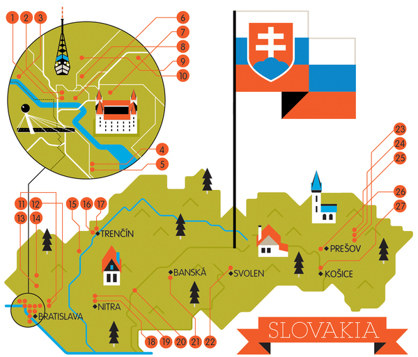
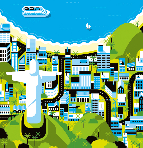
Again, more evidence that colours really do make or break a vector design in these detailed map illustrations, which detailed and considered colour palettes create a real atmosphere and character within each design- each image working as part of a series, and well as it's own separate entity.
A wonderful combination of light and shadow in this design, combined with a fabulous consideration for texture which really helps bring the piece to life in an incredibly realistic rendered design- showing just how detailed vector-based character design can be, as opposed to the great deal of minimalist work I have been looking at so far, and a reminder to always explore various outcomes to see which is best suited to the project and the client's needs.
Saw this video for the first time a couple of weeks ago, and it has provided me with a late, but great, source of inspiration for my title sequence (the development of which, and final, can be found on my Design Practice blog). Looking at the current stage of my title sequence, I realised one fundamental thing- the lack of titles! Sure, my designs are mainly illustrative to appeal to my target audience, but there is absolutely bare minimal text- and I think it would really benefit from it- perhaps highlighting my 'Top 10' without having to illustrate all of the ten through motion sequences? I really liked the style in the video above, with the text draw to the image in a diagrammatic way with the straight line- really simple, but clean, crisp and informative- I will definitely try adding this to my design.
On another note, must do more photography and video soon- work like this makes me miss it too much!
Whilst watching an episode of Russell Howard's Good News (whilst working, promise...) the other day, I noticed the unique and quirky 25 second title sequence- which really caught my attention. I love the really hand-made, yet slick feel to the design which combines a wide variety of assets, video and photographic imagery to create a really thrifty- looking, original design- definitely something that I would have liked to explore more within my own designs- using a variety of different assets and styles of working for my own design outcomes (which can be found on my Design Practice blog), which may have proved a successful choice for my own title sequence and ident series- definitely something to write about and refer to in my own evaluation.
Another little bit of ident inspiration- this time, with penguins! Featured on the BBC One channel with their distinctive logo and identity- and (as shown at the end of the video sequence above) the distinctive circle shape which appears in all of their idents to represent the 'O' in 'One'. A clear, consistent branding that works really well for the company and is widely recognised- I aim, in my idents to also keep this consistency in terms of character design, colour palette, audio, etc- for more design developments see my Design Practice blog.
Again, another look at a few examples of the CBBC 'bug' idents (series) now I have come to the stage of actively producing my ident designs and looking at distinctive devices that are used within broadcast idents.
For my proposed broadcasting channel, CBBC, I do have the slight disadvantage that no idents are made for separate television shows, as the BBC is commercial free (where part of the licence fee goes... a small part, I'm sure), so the idents are based purely on the entire channel alone- and not very specific as a result.
However, again, like in my research for Cartoon Network- sound effects and foley seem to play a really big part in these ident designs- something I perhaps should have considered earlier, despite being quite happy with the soundtrack I've chosen- definitely something to experiment with, or, at very least, write about in my module evaluation and feedback as something to have considered, and/or to try again with in the future.
Blogging a few more examples of motion graphics title sequences (as I did earlier in the 'Design Production for Digital' module with the 'Silent Movie' brief) to inspire my potential storyboard development and visual communication of my ideas for the proposed 'Top 10 things you need to know about...penguins' programme for children aged 5-11 on the CBBC channel. Below are a few examples of motion graphic title sequences from film.
Here, illustrator and designer David Shrigley uses his quirky and humorous style of drawing to convey a unique take on the title sequence for film 'Hallam Foe'. Complete with the 1980's soundtrack of Edwyn Collin's band, 'Orange Juice', the combination of the soundtrack and style create an "indie hip" look for the title sequence- clear from the start that the film will be a little tongue-in-cheek, and something out of the ordinary- full of whimsy and surprises along the way.
A clearly communicated and cleverly crafted title sequence for the film 'Thank You For Smoking', which utilises existing design in the form of cigarette box packaging to tie in with the central themes of the film- a wonderful blend of both contemporary and more traditional typefaces used in a creative mix, with a strong colour palette throughout. A simple idea, but one that works incredibly well.
The title sequence for the film noir- esque film is perhaps the most vivid communicator of a narrative throughout the design- with a clear style and message which tells the audience what to anticipate from the main feature itself. Again, a really strong colour palette is used, which helps to ensure an overall aesthetic consistency between the fast-paced, multiple key frame, busy action of the motion design throughout the sequence.
Being given a copy of the fantastic book, 'Negative Space' by iconic (and one of my personal favourites!) Graphic Designer, Noma Bar, I really admired the bold, vector-rendered illustrative style produced by Bar- dependent on strong visual concepts and use of minimal block colours in a simple, yet very effective design outcome.
I feel that this is the sort of visual outcome I would like to work with for my own motion graphics 'Top 10' design project (see my Design Practice blog for further details/examples of my work), for my subject matter, penguins. The bold, monochromatic with spot colour vector-based style will work very well for my chosen target audience, 5-11 year old children, as well as being a clear visual representation of the distinct and bold animals themselves.
Below, I have photographed a few of my favourite illustrations from the book, that may inspire me to think more conceptually and creatively than I may have done in the past.
Taking a further look at kinetic type within this module- this time for my 'Top 10 Things' project, to look at the combination of kinetic type with music/soundtrack backing, and the necessity for precision in time management to the soundtrack. For the best example of this, below, I have blogged kinetic type "music videos", which have been created post-release of the song hits, carefully timed to the lyrical or instrumental beat of the songs.
A lot of stamina must have been required to make this video! For me, the typefaces don't always feel quite right or appropriate for the lyrics, but a great use of effects and experimental layouts used- and very well timed to the lyrics within the steady pace of the song.
Really great movement and effects used in this video- I love the beat pump motion which is used- can't wait to get experimenting with effects like these in my own designs- works really well with the music to create a high-impact, bass-like visual design.
Great use of multiple colours (in a varying colour palette) and contemporary cool typography used which helps bridge the movement between key frames in this motion graphics piece. Subtle movement and animation is used to great effect in communicating the lyrics in the song with considered style.
Again, a lot of dedication in making this motion graphics piece! Papyrus typeface, I think, isn't very well utilised here as the title key frame, though throughout the rest of the animation the combination of typefaces and simple, vector illustrations work well, with the colours and motion used being the main focus of variation and change- the repetition through chorus working well as a repeated sequence, most notably.
Perhaps a little too much going on in terms of sequence and key frames for me here... but, again, fits well to the pace of the music, and, of course, an appropriate colour scheme. The typeface works well for it's neutrality and versatility within the design.
Researching general animated television show idents for inspiration for the developments of my 'Top 10...' motion graphics design project, with my specific subject matter of 'penguins' in mind. For more information and links to work, visit my Design Practice blog.
Also helping to establish effective movement and effects applied to type for inspiration for the 'Silent Movie' project (again, more information of which can be found on my Design Practice blog).
Analysis and comments about each of the sourced/linked idents are posted below.
The classic BBC ident- very simple and achievable with my current skill level on the Adobe After Effects software. Here, minimal colours and movement were used in times of function before form- before the true "style" of the BBC was adopted, and visual communication and delivering information was essential. Basic, but it does the job.
Again, another BBC ident, this time for their DVD range- again, a little non-descript in terms of style, but still using the iconic simple monochrome typographic logo and the three distinct colours used in the BBC "early days"- red, blue, and green.
Simple (and, achievable through my current knowledge of the After Effects programme) motion graphic titles for American broadcasting channel 'abc'- at this stage, not really giving much away in terms of visual communication of the channel, but simply acting as an informative ident- more creativity in terms of character would have helped to distinguish the branding of the channel more effectively.
The '20th century fox' ident/title sequence is perhaps one of the most iconic introductions to television, film and cinema from the past century- with it's grand orchestral soundtrack and the prestige communicated through bold, spotlighted typeface on (what appears to be) a plinth- it shows the "majesty" of the brand and creates a sophisticated motion graphic design which builds upon suspense and excitement of the audience.
A classic example of a CBBC pre- programme ident, usually shown in the intervals between age range/programmes on the channel, this ident introduces a variety of characters featured on the CBBC channel- such as Shaun the Sheep (from Nick Park/Aardman's original creation) whilst incorporating the strong visual identity of the channel with it's 'C' typeface characters and the green, white and black colour palette.
A simple and fun ident motion graphic design, which utilises foley art to enhance the simple five second animation in the stretching effect- great source of inspiration for my own 'Silent Movie' stretch designs (examples of which can be found on my Design Practice blog).
A lot of visual content in this short ident motion graphics piece- not the usual style that I would associate with Cartoon Network, not quite as playful/silly, with the same sort of character- but an interesting variation and visual outcome nevertheless.
This is more like it! Totally silly and mischievous- and directly aimed at it's younger target audience with it's humorous character. Good colour palette also, clear, vector style- distinct and bold.
A the true classics in ident/title sequence history- the original Walt Disney pictures ident is a firm memory of mine, and I'm sure many children of my generation- the castle vector pictogram an identity of the Disney brand- showing the "magic of Disney" in a fantastical, fairy tale-like way.
And finally- a contemporary classic. The Pixar ident was created by company founder, John Lassiter after experimenting with animating an anglepoise lamp on his desk to create the iconic Pixar film's introductory ident. In this playfully simple piece of motion graphics, the company branding is shown as fun, innovative and with "bright ideas"- as the lamp denotes.
Looking at more examples of kinetic type- this time in perhaps more of a mainstream, or narrative format- as well as being from YouTube, which, comparatively to Vimeo, it is far more rich in quantity for my research, but perhaps not quality- but will, of course, provide a lot more room for potential inspiration for the motion graphics movement in my own Silent Movie project- looking at colour, type, and layout, in particular.
Great use of layout- keeping a varied and interesting composition- amazing what you can do with such a minimal colour palette and simple, modern sans serif typeface. Executed with great finish, the motion is so slick and precise, it can almost be forgotten about- all the movement seems very natural and fluid.
Wonderfully eerie and subtle, the uppercase sans serif typeface is really crisp and clean- and combined with the styalised effects make this animated piece really edgy and considered- again, also, showing how effective a minimal colour palette can be.
Whilst I can see how the typeface is appropriate to the film, having watched it in the past, I don't think it's visually that effective- it looks a little messy with the textured background, and a little out of context with the particular sound/narrative- if you weren't to have seen the film, it could be a little confusing or misleading. However, I think the colours work well- particularly with the blood splatter effect played in the background.
Quite brilliant! This scene from Oscar winning 'The King's Speech' perfectly encapsulates the scene where the King is engaged in an angry speech therapy session- good use of colour- a lot going on, but they are well-considered and consistent. Also, using the typeface Gotham ensures that the animated piece looks clean, crisp and contemporary.
Fun play on the scene in Resevoir Dogs where the agents are assigned their names (Mr Black, Mr Brown, Mr Pink, etc)- in which the type and colour used within the motion piece works alongside the narrative- interesting use of textures and effects too (such as the vignette) - gives the animation a very filmic, old Hollywood style.
At first, I thought that the layout and positioning of the type was a little cluttered and a bit too messy for my liking- though at the end of the motion piece, I could see how carefully planned and considered it really was! The lowercase/titlecase serif typeface works well with communicating the subject matter, and the subtle yet prominent use of colour for a single word works well- a memorable and unique design.
Good use of minimal colour and simple yet effective layout and composition from this narrative in Quentin Tarantino's 'Pulp Fiction'- easy to watch and direct- perhaps could be a little more inventive, however?
I much prefer this motion graphics piece from the film 'Kill Bill' from the example written about earlier in this post- the colours feel more appropriate (the stark contrast of the bright yellow and black which is iconic- and can be seen throughout the film) as well as a more appropriate use of type- however, in this example, I still would have chosen not to use the serif typefaces- doesn't feel appropriate for the violent, brutal, yet ever-so-stylish film and it's narrative content.
Good use of type effects in this section from Pixar's 'Up'- I like the way that the type overlays when the two central characters are talking over one another. Although the yellow, black and white work fine together- I would have liked to see a blue version. Again, being familiar with the film, I feel that this would have been a more effective means of visual communication.
Very fun and playful- but for me, I would have probably chosen not to add the images- they feel a little unnecessary, and clutter an otherwise slick and inventive motion piece- though they, by no means, affect it's visual impact entirely. Good use of minimal colours throughout the narrative- but still bold and eye-catching.
In one of the two research tasks for the Silent Movie project (see my Design Practice blog for more details) we were assigned for over the weekend, we were asked to look at an existing piece of motion graphics design- specifically kinetic type. For the first part of the task, being asked to take a series screen grabs of the design (twenty-five). From my research and videos sourced earlier today, I chose this hypothetical title sequence for the classic Hitchcock film 'North by Northwest' for it's interesting variations of composition, type layout, and minimal, sophisticated colour palette.
I took twenty-five screen grabs over the 1 minute 15 video (75 seconds)- resulting in a screen grab every 3 seconds (temporarily left the time bar on the bottom- I'll crop the images down before I print them off for presentation on Tuesday- just for my reference for the meanwhile). Really interesting to see the progression in the kinetic type design this way- distinguishing the key frames throughout the design as well as developing a closer understanding of time specifications, movement, and composition.
Then I went on to generate a series of screen grabs highlighting what I felt were the key frames within the motion graphics design. Surprisingly not as many as I thought- being a title sequence, the design covers a lot of content, though each key frame specified here (on average 75 seconds/# of frames) is at every 3.75 seconds- though, of course, could easily be broken down into more detailed and depth.
Again, I will crop down the images ready for print and annotation for Tuesday's scheduled workshop session.
The sheet ready to print and annotate on Monday (printing onto A3 scale to achieve the highest resolution, scale and quality of image at short notice)- bit peeved with the widowed frame at the end- but I wanted to achieve the largest frames possible within the dimension limits- GD sacrifices must be made. Again, I will annotate this with directions and time frames once printed (and post an image below...).
NOTE: After talking with friends (GD buddies) today I realised that we don't have to annotate the screen grabs as we will in fact be cutting them out... probably should have been listening more carefully...