Showing posts with label Design production for digital. Show all posts

Tuesday, 7 February 2012

Design Production for Digital//Top 10//DVD Packaging Inspiration.


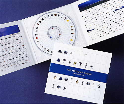
A couple of weeks ago, whilst starting to generate ideas for my DVD packaging, I began looking through various online sources and printed media through inspiration. I found these two books 'The Packaging and Design Templates Sourcebook' and 'The Packaging and Design Templates Sourcebook 2' in the college library, and they had a great variety of net designs with downloadable PDFs to work from to apply your own designs to. Featured in the images below are some sources of inspiration which I felt I could have potentially gone on to develop and apply to my own penguin-themed subject matter in various ways, but didn't quite make the cut.
The developments for my final packaging, and general idea generation can be found on my Design Practice blog.


- Mountain peak? Suit the background of the original Ident #2 'Slide'? Colour palette works well with existing designs- something quite original and unique- could fold out from square based pyramid (where the CD/DVD will be placed).


- Penguin swimming? Would work well in striking monochrome colour palette- bold, crisp print finish with unique opening design- potentially a little too delicate.


- General DVD packaging- but a good, rounded shape which suits the basic geometric shapes generated in my own designs- suiting the character of my penguin subject matter and my proposed target audience of 5-11 year old children.

Design Production for Digital//Top 10//Vector character design inspiration.


Looking at a few existing examples of vector-based character design for inspiration and development throughout the Design Production for Digital module, and creating my own penguin vector-based designs. 
For  a long time I have wanted to put a crisper, more minimal vector-based style, and this project and subject matter offered the perfect opportunity to execute this with a fun, distinctively bold illustrative geometric style which is aimed to appeal to my target audience of 5-11 year olds (more design development of which can be found on my Design Practice blog).
The examples below show styles I have been influenced by, either at the time of design, or later on throughout the design process.


A great example of how vector-based design can be used completely minimally and discreetly but still prove and effective visual communication tool with the correct consideration of context, and, in this case, the colour palette used in the design (very similar to that of my own design outcomes). The reversed out logos look great- really unique and eye-catching.


Again, this design by Loulou and Tummie is really pushed by the innovative use of colour in their designs to make a "family swatch selection" over this series of designs (images featured above) which help to ensure consistency and a sense of familiarity among each individual design, along with fun, rounded shapes that don't depend too much upon realism- definitely something to remember in my own designs- I don't have to be 100% anatomically accurate, as long as visual communication is still effectively taking place.


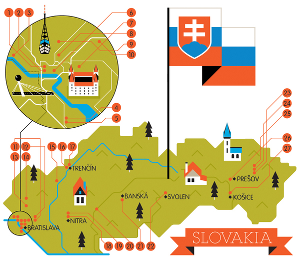
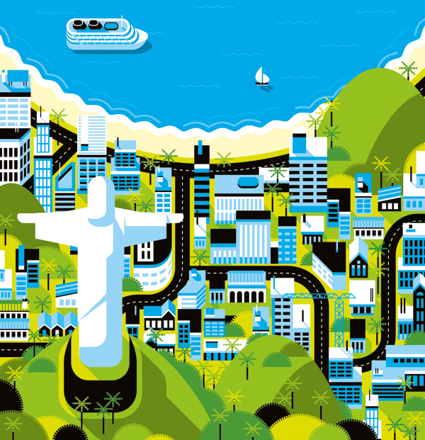
Again, more evidence that colours really do make or break a vector design in these detailed map illustrations, which detailed and considered colour palettes create a real atmosphere and character within each design- each image working as part of a series, and well as it's own separate entity. 


A wonderful combination of light and shadow in this design, combined with a fabulous consideration for texture which really helps bring the piece to life in an incredibly realistic rendered design- showing just how detailed vector-based character design can be, as opposed to the great deal of minimalist work I have been looking at so far, and a reminder to always explore various outcomes to see which is best suited to the project and the client's needs.

Monday, 6 February 2012

Design Production for Digital//Top 10//Video Type.


Saw this video for the first time a couple of weeks ago, and it has provided me with a late, but great, source of inspiration for my title sequence (the development of which, and final, can be found on my Design Practice blog). Looking at the current stage of my title sequence, I realised one fundamental thing- the lack of titles! Sure, my designs are mainly illustrative to appeal to my target audience, but there is absolutely bare minimal text- and I think it would really benefit from it- perhaps highlighting my 'Top 10' without having to illustrate all of the ten through motion sequences? I really liked the style in the video above, with the text draw to the image in a diagrammatic way with the straight line- really simple, but clean, crisp and informative- I will definitely try adding this to my design. 
On another note, must do more photography and video soon- work like this makes me miss it too much!

Design Production for Digital//Top 10//Innovative Packaging.


Research general packaging sources to act as inspiration for my own DVD case design. Whilst it is, by no means, the fundamental basis for this 'Design Production for Digital' project, I felt it was important to still give a good amount of focus and development to the design to make the outcome work as a whole "package" (please excuse the pun)- really looking to push the innovation of the design. I could just make a simple DVD sleeve, though I felt that my penguin subject matter, and my youthful target audience (children aged 5-11) warented something a great deal more fun, playful and "special"- something that, in the retail sector, would stand out against other products as something unique and memorable. The designs (with linked sources) posted below are a few examples of the inspiration I had in creating my own design (which can be found on my Design Practice blog).


http://www.123-labels.co.uk/faq/wp-content/uploads/2010/11/7-Great-Product-Packaging-Design-Inspirations-using-Round-Labels-011.jpg


Love the simplicity of these designs and the really bright, eye-catching colours in contrast to the white base of the design- and, of course, the round shape of the box structure itself, which has proved to be a major inspiration for the geometric shape and development of my own packaging design- which can be found on my Design Practice blog.


http://www.inewidea.com/wp-content/uploads/2010/02/201002151001.jpg


Too cute! love the fun kawaii- style children's character design for this fennel (vegetable)- like character for this Asian food packaging- sweet, friendly and a great novelty item which would suit my own design's age of target audience, 5-11 year olds, perfectly.


http://blog.pentawards.org/?p=1956


Again- great simplicity in these lightbulb box designs, but it works really well- a crisp sort of minimalism that I aspire for in my portfolio and designs in general, but perhaps didn't quite achieve in my final motion graphic designs- making them a little more decorative than I would of initially liked... however, I feel that my own ident, title sequence and packaging designs are an affective visual communication of my chosen subject matter to my chosen target audience.


http://homepage.mac.com/thebecker/iblog/B533212817/C626155530/E20061118095112/index.html


Amazing (and very simple) idea- this sort of novelty and innovation is something I really want to push within my own design practice- this DVD special edition boxset from the series 'Six Feet Under' using turf on the top of the box to visually communicate the subject matter of the funeral director dark comedy. Again, really simple, but really effective nonetheless.


http://www.packaging-films.com/gifs/innovative-packaging3.jpg

Brilliantly simple and minimal- not so hot on the green, but I'll let it slide where the designers made up for it on sheer innovation and wit. My kind of design. 


http://www.cornerofthecircle.com/wp-content/uploads/2012/01/innovative-packaging4.jpg


Brilliant use of iconic shape and net design- this would really suit my own character design- perhaps utilising the outline shape of a penguin itself, or perhaps just the head- really fun and simply made- a great form of visual communication and humor. 


http://www.cornerofthecircle.com/wp-content/uploads/2012/01/innovative-packaging4.jpg

LOVE this design- seen it a few times before in the past and always found it really smart and fun- a really subtle yet effective use of type and colour- as well as being a great talking point and novelty item- this sort of design would work really well within my own packaging, but perhaps making it a little more character based to suit the fun, novelty needs of my target audience.


http://www.flickr.com/photos/miadcommunicationdesign/3170827550/sizes/o/


One of my initial ideas for packaging was to create a mountain- peak design, a square-based pyramid which would fold out to reveal a compartment for my DVD to be held. A fun idea, but not very visually connected to penguins themselves- more the habitat in which they live- not as visually representative as I would like- though I really like this hinge design mechanism- a great source of inspiration, although not actually pursued in terms of design direction.

Design Production for Digital//Top 10//Russell Howard's Good News Title Sequence.


Whilst watching an episode of Russell Howard's Good News (whilst working, promise...) the other day, I noticed the unique and quirky 25 second title sequence- which really caught my attention. I love the really hand-made, yet slick feel to the design which combines a wide variety of assets, video and photographic imagery to create a really thrifty- looking, original design- definitely something that I would have liked to explore more within my own designs- using a variety of different assets and styles of working for my own design outcomes (which can be found on my Design Practice blog), which may have proved a successful choice for my own title sequence and ident series- definitely something to write about and refer to in my own evaluation. 

Saturday, 4 February 2012

Design Production for Print//Top 10//DVD Packaging Net.


http://www.instructables.com/id/How-to-make-a-pretty-round-box/


After traipsing through various packaging design and template books, I was really surprised to find (or not, as the case was...) that there were no nets for round boxes (with lids), which was quite disappointing. There were a few other shapes I had considered (a square based pyramid, for example, as a "mountain lanscape" (to fold out) though I didn't think this was very visually communicative.
Though I was lucky to find this basic step-by-step guide online (see link above for direct source)- although I could have worked it out for myself with a little mock-up session, it was good to have a quick go-to guide to help with dimensions, etc, for a quick and easy solution so that I can use the time I may have otherwise spent experimenting on working on my motion graphics outcomes instead. For the design development and final outcome for my packaging, see my Design Practice blog.


Friday, 3 February 2012

Design Production for Digital//Top 10//BBC One penguin ident.


Another little bit of ident inspiration- this time, with penguins! Featured on the BBC One channel with their distinctive logo and identity- and (as shown at the end of the video sequence above) the distinctive circle shape which appears in all of their idents to represent the 'O' in 'One'. A clear, consistent branding that works really well for the company and is widely recognised- I aim, in my idents to also keep this consistency in terms of character design, colour palette, audio, etc- for more design developments see my Design Practice blog.

Wednesday, 1 February 2012

Design Production for Digital//Top 10//DVD cases.


Just researching a few sources for further inspiration and design development for my DVD packaging case- one of the requirements to go alongside our digital work on Wednesday's module hand in- taking particular inspiration from existing designs targeted at my proposed age target audience, of 5-11 year olds.


From my initial designs (which can be found on my Design Practice blog)- I wanted to emphasise the rounded, geometric vector shapes in my motion graphics designs by using the spherical shape of a standardised CD/DVD round case as a surface for a vinyl sticker/print of my penguin character's face- though perhaps a little too simple and not interactive and fun enough- would need to be part of a larger design to add any real interest.


Perhaps a little too young (more ages 3-7?) though I like the idea of the handle- that a child can carry it to and from places, with a sense of authority- making it that little more special and tactile- will try and incorporate this into some designs.


There's some really jazzy stuff out there! Perhaps a little impractical for shelf-stacking in your standard video and DVD rental store or retailer, but a great novelty item- I really like this idea- perhaps it could work with a spherical shape for my penguin head, with the DVD case inside? Interactive, fun, playful, and not too difficult to construct either... bingo.


LOVE this presentation- simple, but the fold detail and the foil blocking on the box sleeve/jacket add a real sense of prestige to an otherwise quite basic design- makes it look as if it's a special addition, without being too excessive/over the top.


Again, two more examples of great "fold-out" designs- interactivity and informative text, yet considered in it's layout, form, colour palette and general design- the Muse set (two images above) has great consistency- if I were to make several DVD designs (a series/range) this would be a definite source of inspiration- clean, 
crisp and minimal.

Tuesday, 31 January 2012

Design Production for Digital//Top 10//More CBBC Idents.


Again, another look at a few examples of the CBBC 'bug' idents (series) now I have come to the stage of actively producing my ident designs and looking at distinctive devices that are used within broadcast idents.
For my proposed broadcasting channel, CBBC, I do have the slight disadvantage that no idents are made for separate television shows, as the BBC is commercial free (where part of the licence fee goes... a small part, I'm sure), so the idents are based purely on the entire channel alone- and not very specific as a result.
However, again, like in my research for Cartoon Network- sound effects and foley seem to play a really big part in these ident designs- something I perhaps should have considered earlier, despite being quite happy with the soundtrack I've chosen- definitely something to experiment with, or, at very least, write about in my module evaluation and feedback as something to have considered, and/or to try again with in the future.


Design Production for Digital//Top 10//Cartoon Network Idents.


Looking at more research examples of existing idents targeted at a child audience for inspiration in creating my own ident designs for my Design Production for Digital brief, 'Top 10... things you didn't know about penguins'. 
Cartoon Network are famed for their fun, playful idents and are a great source for looking at how a story is told through an ident- even at a very short time frame- something I particularly want to play up upon in my own designs- having a clear distinction from one another, yet visually and aesthetically reasonably consistent (in terms of colour scheme, character design, etc).
One thing I particularly noticed in these designs in the use of sound effects- really played upon to personify the 'C' and 'N' cube characters in the series of idents- something I would definitely have liked to experiment more with- perhaps even still time- might work in my title sequence?
See my Design Practice blog for more design developments and progress throughout the Design Production for Digital module.


Sunday, 29 January 2012

Design Production for Digital//Top 10//After Effects Shake Effect.


For the start and end solid layer key frames in each of my four ident compositions (storyboards and developments of which can be found on my Design Practice blog) I wanted to learn how to create a shaking effect to make my text "bob" up and down- and I found this video on Youtube which proved really useful- and taught me about how to apply the wiggler effect and combing layers with null objects to also mask the effect over them. In my tests, I found that even on a minimal movement, smooth setting the effect was a little too rapid and sharp for what I had in mind- but a great tool nonetheless- and an effect to consider at a later stage for my title sequence.

Saturday, 28 January 2012

Design Production for Digital//Top 10//More 4 Ident & Rebrand.


Whilst looking for more examples of channel branding and idents, I came across the new ident and rebrand of the More4 channel and was really impressed by their new design, working alongside the 4Creative team.

"The More4 re-brand is centred around a bold flexible logo, created from multiple triangles that flip, fold, attract and repel each other into position. The re-brand extends to a whole new on-screen look, that includes five truly stunning new idents...
The series of idents 4Creative have produced feature real world installations, inspired by the new logo and the triangular shapes used to construct it.
Working in collaboration with pioneers in art installation design, Jason Bruges Studio, and students from Middlesex University, 400 moving flipper units were designed and built, based on the elements of the More4 logo.
The 400 mechanical units were transported from the studio to real environments, filmed at various locations including a windswept Dungeness beach, and a very damp Victoria Park, to create a family of unique live action idents that see the brand breaking out into the real world."

I really love the contemporary, geometric style of the idents- really crisp and modern- and a gorgeously bright selection of colours used in the flipper designs- which balance well with the bold gemoetric shapes for a formal, yet lively and memorable visual identity.

I'd really have loved to have worked with a logo/brand/channel like this in my own designs (as opposed to the rather ghastly CBBC logo...), though, of course, it wouldn't have been appropriate for my subject matter or audience- though definitely something to consider in the future for the potential of personal development work for my portfolio.


Thursday, 19 January 2012

Design Production for Digital//Top 10...//Yeti Sports.


Recommended by a fellow BAGD student for my research for my 'Top 10' brief (Top 10 things...you didn't know about penguins), I decided to take a look at 'Yetisports'- an online gaming programme. Information and facts about the game(s) and it's conception written below the source link:


Yetisports (also known as Pingu Throw) is a web-based Flash game that originally appeared on the Internet in January 2004. The goal of the original game is to have a yeti smack a penguin with a club and try to get it fly as far as possible. The original Yetisports game features no name other than the words "1978 Reinhold + Yeti", a reference to Reinhold Messner's claim to have found Yetis.
The game is humorous and addictive at the same time and therefore very popular on the Internet. Very soon after release, there was a quick succession of many variants created by multiple people on the internet. None of these are officially sponsored by Chris Hilgert, even though many copy the original almost exactly save certain small changes. One of the more violent variants was made by someone known as 'Pawel', featuring decapitation, spikes, a big spiky club and mines. Since the original was released at the Yetisports homepage, the website has released nine further adventures of the Yeti as well as a re-release of the original that allows movement of the penguin in flight.

Game 1 (Deluxe version of original)

Location: Antarctic
Launched: 19.01.2004
Tag Line: "It all started with a club"

In this game, the players hit the penguin with good timing and he goes flying. Using the arrow keys, the player controls the angle of the penguin as he flies, and catches air currents (the closer to an ideal angle, the better the currents) to stay in the air. The videos of records all show the flight starting on a low trajectory, with little manipulation of arrow keys to get better angle, meaning an ideal angle is kept throughout the flight.

Game 2 (Orca slap)

Location: Antarctic
Launched: 12.02.2004
Tag Line: "Hit the bulls eye"

In this game, the goal is to hit
penguins into a dartboard with a snowball. An orca hits the penguins into the air, which the yeti then hits with a snowball. The point on the dartboard the penguin hits is determined by the angle it faces in the air (the penguin rotates) and the height it is in its fall. The theoretical maximum score is 1000 (each of 10 shots scores a bull's eye for 100 points). In the more violent variant, the yeti throws icicles instead of snowballs, impaling the penguins if they hit one.

Game 3 (Seal bounce)

Location: Antarctic
Launched: 18.03.2004
Tag Line: "Up the iceberg"

In this game, you play with 2 clicks of the mouse. The first click starts the yeti windmilling his arms (which hold a penguin), the second makes him release the penguin, between two
glaciers with seals sticking out at regular intervals. The seals hit the penguin higher, which is useful as the penguin will not go higher than 300 if thrown straight up, whereas with bounces it is possible to go substantially past 400.
There is a more violent variant, featuring a sea of blood, dead penguins and the throwable penguin is thrown with the bottom half of his torso ripped off, bleeding. The game physics have also been adjusted to allow for much higher scoring, even with no bounces.

Game 4 (Albatross overload)

Location: Australia
Launched: 29.04.2004
Tag Line: "Gone with the wind"

This game is set in
Australia. The penguin stands on one side of a see-saw while the yeti stomps on the other end. If the stomp is executed with good timing, the penguin lands on an albatross flying overhead. The player then has control over when the albatross flaps its wings. The closer to the ground the bird flaps, the more efficient it is. When the albatross' energy bar (which slowly recharges when the bird is not flapping) reaches 0, the bird will soon crash.

Game 5 (Flamingo drive)

Location: Africa
Launched: 17.06.2004
Tag Line: "May the vulture get him?"

This game, set in
Africa, involves using a flamingo as a golf club to hit a penguin. The angle is set by clicking while an arrow points at various angles, and power is set by clicking while a bar moves up and down. You have five shots per game. There are many game elements that will affect the final score, such as giraffes, which will catch the penguin in their mouths and throw it further if the penguin flies near their heads; Elephants and acacias that block low shots; Vultures that catch the penguin, bring it lower and drop it, if it flies too high; and pythons that bounce the penguin higher if it hits them. There is always the same pattern of animals and trees: A giraffe at 0, an acacia at 1000, and a giraffe at 2000, for example. The pattern can be used to help determine the best angle of the first shot. It is definitely a lower angle, but the exact best angle is hard to achieve. A tiny difference can mean a score on the first shot of 350 or 1000.

Game 6 (Big wave)

Location: Hawaii
Launched: 02.09.2004
Tag Line: "The perfect wave"

This game, controlled by the arrow keys, is the first of a series of games focusing more on the yeti, instead of the penguin and his attempts at flight. The yeti surfs up and down a big wave, trying to pull off tricks and hit penguins out of the air. The wave gradually shrinks until the end of the game. If you press the Y ("
motivation") key, when playing the game, an unseen penguin loudly yodels, which then echoes in the background.

Game 7 (Snowboard free ride)

Location: Austria
Launched: 14.10.2004
Tag Line: "Back to the Snow"

In this game, the yeti snowboards down a long slope, racing 10 penguins. The slope has many jumps and
ibexes that send the yeti into the air, where he can do tricks for points. The point is not to win the race, but to get the most points, though you get bonus points for doing well in the race. Hitting a penguin slows it down for a few seconds, but then the penguin gets angry and moves faster. The top score is 12141.

Game 8 (Jungle Swing)

Location: South_America
Launched: 4.4.2005
Tag Line: "Cry of the rain forest"

This game involves swinging up a series of branches in a tree, jumping with a mouseclick. It requires precise timing, as the angle of the jump changes based on when the click is. When the yeti jumps off a green branch, the branch turns gold. When the yeti jumps off a gold branch, the branch turns red. When the yeti jumps off a red branch, the branch falls off and 3 green branches grow on the 3 next branchless spaces. There are only 25 branches at the start, all of which are green, so to get to the top yeti must swing off of 9 different branches 3 times each to get to the top, as well as the 50 branches that must be climbed to get to the top at all.

Game 9 (Final spit)

Location: Himalaya
Launched: 07.07.2005
Tag Line: "Game Over"

In this game, the yeti has kidnapped a
llama and makes it spit at penguins. The other animals don't like being spat at and spitting them costs points. Missing 10 penguins or running out of time (Hitting the ox gives a time bonus) ends the game. The secondary title of the violent variant is altered to "The End" and is the final violent Yetisports game. In it, the llama gives the yeti a machine gun. Unlike the penguins, the other animals (with the exception of eagles and tortoises) don't get decapitated, but they do bleed. This also has in-game music, something that its official counterpart doesn't. Also, penguins die if they get caught in the wheel the ox is pulling, whilst moving.

Game 10 (Icicle climb)

In this game, the yeti has 12 icicles to throw into the side of a cliff. There is a penguin next to this cliff, and he jumps up the icicles. The only limitation is the fact that the penguin only jumps 1.2 meters up.

Special Stage (Stage Dive)

Location: Concert Halls
Launched: 15.09.2004
Tag Line: "Let it Rock"

Influenced by the new media on his travels the Yeti gets into
rock, and to prove his "popstar" credentials, dives headfirst into the mosh-pit where the penguins are headbanging. They struggle to the task of getting the Yeti around the room. The Yetis movements are controlled with the left mouse button: you have ten clicks to get the Yeti as far as possible.

Glitches

In the deluxe version of the first game, the penguin throws up on impact when the player hits him high in the air and holds down the left or right arrow key. The animation lasts longer than the time it takes for the sign saying the score, "replay", "highscores" and "OK" to pop up. If you click the OK button before the vomiting animation is complete, the penguin will vomit on impact next time no matter what. Then if you play the replay, the penguin will not vomit on impact with the ground and keep flying unguided.
In Game 4, Albatross Overload, your score is the average of three flights. If you have a bad flight you can press 'q' to quit and start over, but your score will not be submitted to the High Score chart on the Yetisports web site.
In Yeti Sports 5: Flamingo Drive, if you hit the penguin hard enough and it hits a snake just before getting to a giraffe, then sometimes on certain giraffes (not to be mentioned here) it will go straight through the neck and continue, sometimes at an increased speed.

Parodies

The original Pingu Throw inspired the popular flash game Penguin Extreme, where a yeti uses a spiked mace as the baseball bat, decapitating the penguin and leaving a bleeding head flying into the distance, to land for distance. On the ground are added landmines that can cause further distance to accrue. The game is a hack of the original Yetisports.

***

Wonderful, simple depiction of penguin characters with Antarctic scenery and backdrops is a great source of inspiration in my own designs- trying to ensure they are kept visually communicative in the message and motion being put across in the designs, but the bold, geometric shapes of the illustrative vector design still being suited for my younger target audience of 5-11 year olds.


Tuesday, 10 January 2012

Design Production for Digital//Top 10//DVD Interfaces.


Blogging existing sources of motion graphics in DVD Interfaces for inspiration of my own design developments in the 'Top 10' Design Production for Digital brief (more information of which can be found on my Design Practice blog). Some great examples shown here, particularly for animation films (in which visual communication is a MUST- not dependent on the characteristics, emotions and acting skills of actors)- all of which are very representative of themes, character or the overall style of the film- great examples of how to exploit existing content for shorter design sequences- a possible consideration for my title sequence and idents to be produced at a later stage?


Thursday, 5 January 2012

Design Production for Digital//Top 10...//Title Sequences.


Blogging a few more examples of motion graphics title sequences (as I did earlier in the 'Design Production for Digital' module with the 'Silent Movie' brief) to inspire my potential storyboard development and visual communication of my ideas for the proposed 'Top 10 things you need to know about...penguins' programme for children aged 5-11 on the CBBC channel. Below are a few examples of motion graphic title sequences from film.


Here, illustrator and designer David Shrigley uses his quirky and humorous style of drawing to convey a unique take on the title sequence for film 'Hallam Foe'. Complete with the 1980's soundtrack of Edwyn Collin's band, 'Orange Juice', the combination of the soundtrack and style create an "indie hip" look for the title sequence- clear from the start that the film will be a little tongue-in-cheek, and something out of the ordinary- full of whimsy and surprises along the way.


A clearly communicated and cleverly crafted title sequence for the film 'Thank You For Smoking', which utilises existing design in the form of cigarette box packaging to tie in with the central themes of the film- a wonderful blend of both contemporary and more traditional typefaces used in a creative mix, with a strong colour palette throughout. A simple idea, but one that works incredibly well.


The title sequence for the film noir- esque film is perhaps the most vivid communicator of a narrative throughout the design- with a clear style and message which tells the audience what to anticipate from the main feature itself. Again, a really strong colour palette is used, which helps to ensure an overall aesthetic consistency between the fast-paced, multiple key frame, busy action of the motion design throughout the sequence.