Showing posts with label Brief 03: Leeds University Union Ballet Society. Show all posts

Wednesday, 24 October 2012

Design Practice III//Fedrigoni Sample Pack.


Yesterday, I received another Fedrigoni sample paper pack through the post with samples of white and cream papers to potentially use for the stationary and printed collateral for the University of Leeds Ballet Society. 
I was really pleased with the selection sent (when selecting Fedrigoni samples it's an educated guess with weights as the names are often a little cryptic- but, of course, are very fashionably assigned to a 'range'), and felt that a good range of samples were available for potential experimentation and print finishes.
When I next meet with Carys, or discuss print and digital outcomes via email, I hope to pitch printing on a high-end stock to her. Despite a certain limit in terms of the budget, in general, there is room for negotiation, and a well- sourced and crafted paper will inevitably result in a far greater print quality and a higher level of professionalism all-round.
For design developments for the Ballet Society, see my Design Practice blog.


Sunday, 21 October 2012

Design Practice III//Branding Consistency.


Whilst searching for branding projects on Behance, I came across this wonderfully innovative design for The National Museum in Warsaw (Poland), by designer Dawid Cmok. Although perhaps a little commercial and industrial for the individual arts- lead briefs I'm currently working on, this project showcases the flexibility and creativity from a simple, yet innovative brand mark/logo idea that can be effectively applied over a range of both digital and print- based collateral. Throughout the developments of my various branding briefs (which can be found on my Design Practice blog), I will certainly refer back to this project for inspiration in terms of professionalism and the variation of products which can be produced.


Wednesday, 17 October 2012

Design Practice III//University of Leeds Ballet Society//Benwells Print Samples.


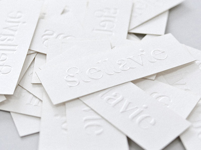
Today I received my sample pack from London-based printers, Benwells in the post, and was really amazed by the outstanding quality and print finish on the variety of printed media that was sent, from foil blocked letterheads to wedding invitations, to blind embossed Chanel business cards, which have proved to be a great research sample to pitch to Carys for the next Ballet Society meeting in regards to considering it as a print finish for the printed media, which I feel would work wonderfully with the elegance and femininity of ballet, whilst still ensuring it looks contemporary, clean and minimal.

Similar to Team (Impression) print in Leeds, which I was fortunate enough to visit in the second year, the quality of the print would undoubtedly come at a high price, but from a design perspective, I can see how it would be great value for money. Throughout the design production stage, it'll certainly be something to consider, contacting printers and ensuring that I receive a specified number in terms of the budget limit for the society print outcomes.


Friday, 12 October 2012

Design Practice III//Existing Ballet Logos.


Image Source

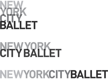
Researching various existing typographic logos for ballet society and professional ballet groups throughout the world. Throughout my branding for the University of Leeds Ballet Society (developments of which can be found on my Design Practice blog), one of the most challenging things I've found, especially within my image-influenced designs is in creating an original and conceptual logo, that doesn't look too cliche or obvious as some of the existing vector-based silhouette ballerina logos.

Shown above and below, some examples of strong, type- focused logo designs- I particularly like the design for the 'Flintwick' ballet school, which has a really cool American Apparel- esque look about it, in a really contemporary, simple and very effective outcome which really stands out from it's ballet school branded contemporaries.


Thursday, 11 October 2012

Design Practice III//Ballet Society//Benwells Print.


www.benwells.co.uk

Thanks to a tip off from friend and fellow BAGDer, Baljeet, this morning I sent off for a sample pack from Benwells printers, who specialise in print finishes such as die cutting and embossing- the later of which I'm looking at potentially developing in a blind emboss print finish for the printed stationary for the University of Leeds Ballet Society designs.

Really looking forward to getting the pack through and seeing the potential outcomes I could produce with them.

Wednesday, 10 October 2012

Design Practice III//Printers//Glasgow Press.


Considering the design and print outcomes for my briefs, and, in particular, for the University of Leeds Ballet Society brief, I have started to research commercial printers to hopefully achieve a high-quality, professional standard in my design outcomes.
One of my initial ideas, and something I hope to explore through the University facilities on Friday, is embossing (blind) for a subtle and tactile effect.
Whilst I was at the design studio, Glad, in Gateshead over the summer, (see my PPD blog or link above for more details) I really admired their business cards, and the junior designer, Sam, lead me to Glasgow Press where they were professionally printed.
Inevitably, the cost of printing per unit is high due to the processes, but prices are reduced with an increased number of units. Something to experiment with and consider at a later date (for potential discussion with Ballet Society President, Carys). Looking forward to testing the lasercut and print facilities at Uni later on in the week.


Monday, 8 October 2012

Design Practice III//Ballet Society Blind Embossing.


Throughout my initial logo and design developments on the University of Leeds Ballet Society branding today, I have been considering print methods/effects/production that would be most effective in the finalised design outcomes, and feel that blind embossing would look really great with a typographic logo and brand identity for a clean, minimal and contemporary design outcome- with an off-white or cream stock reflective of the elegance and classic nature of the dance form.

Really excited to discuss this as a potential design outcome once the brand identity has been approved with Carys (the President of the society) and to hopefully try out some of my own mock ups and blind emboss print tests before committing to a commercial order.

For future design developments, see my Design Practice blog.


Image Source


Image Source


Design Practice III//University of Leeds Ballet Society//Art Deco Ballet Posters.


Today, whilst considering potential design direction(s) for my University of Leeds ballet society outcomes, I started to experiment with typographic design, and, in particular, looking at Art Deco design- with the classicism of the traditional ballet but the sans serif style of contemporary graphic design.

Sourced here, a selection of Art Deco, vintage poster designs for potential inspiration. For future design developments, see my Design Practice blog.


Tuesday, 2 October 2012

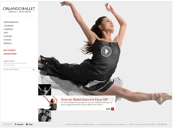
Design Practice III//Existing Ballet Branding.


For my live University of Leeds Ballet brief, at the core of the project, it's fundamentally a branding and promotional brief. Therefore, I've decided to look at some existing ballet branding projects online for sources of contemporary design inspiration.

As discussed with Carys, I'm looking at creating a design which is contemporary, and reasonably gender neutral (as they try to introduce more males to the ballet society)- I'm hoping to explore typographic design as the basis of the branding with photographic visuals throughout my promotional media.

Throughout the examples below I particularly like the bold, geometric typographic design used in the brand identity for the Melbourne Dance Company, which adds real contemporary character and movement, reflecting positions of the ballerinas, and I'm a big fan of the tactile poster designs for the Dutch National Ballet (shown at the bottom of the page) with a really interesting weaved texture, again, showcasing the intricate movements of the dance.

Some really interesting ideas to potentially explore, all my design developments will be featured on my Design Practice blog. 


behance.net/gallery/Melbourne-Dance-Company/2437569
Josip Kelava, Melbourne Dance Company


Olga Gaze, Bolero


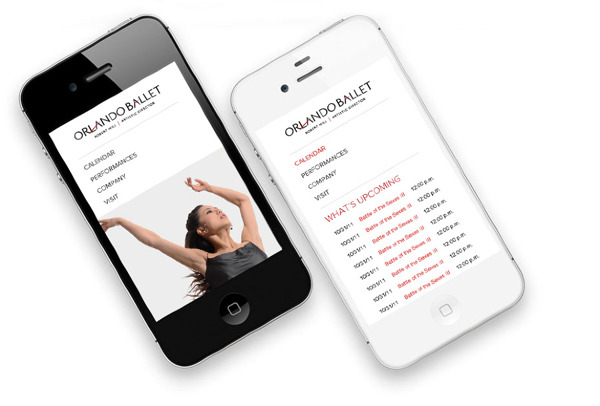
behance.net/gallery/Orlando-Ballet/5281811
Jonelle Chandler, Orlando Ballet


behance.net/gallery/22-International-Ballet-Festival-of-Havana/3777674
Naná Ramírez, International Ballet of Havana


Martin, Dutch National Ballet Posters