Showing posts with label Negotiated Briefs. Show all posts

Friday, 16 November 2012

Design Practice III//Jessica Hische.


jessicahische.is

Documenting research and imagery for the unequivocal queen of hand-rendered type, Jessica Hische.
For a long time I've been a great fan of her work, and it has proved to be a constant source of enjoyment and inspiration through my personal and professional design practice.
For my UK Greetings/YCN 2012-13 brief, I will undoubtedy be returning to her design portfolio as a source of inspiration, particularly looking at the influence of colour, weight of line and the character of the letterforms which are visually communicated.

For my own, personal design developments throughout the brief, see my Design Practice blog.


Design Practice III//Sparrow Nest Script.


A quick research post paying homage to an Etsy seller and calligraphic designer, simply known as 'Sparrow Nest Script', whose work I have admired for some time.

Throughout my product and design developments in the UK Greetings/YCN 2012-13 brief, I hope to produce a range of printed cards and gift wrap outcomes with hand-rendered, calligraphic type that reflect sweet and unique sentiments that I feel will particularly appeal to my female target audience of 18-30 year olds for their reflection of spontenatity, playfulness and genuine sentiment, as well as being stylishly and subtly designed (unlike many of the sickly-sweet or garish cards that are currently available in the retail market).

Really excited to start designing, and hopefully having some resolved outcomes by this time next week. For future design work, see my Design Practice blog.


Design Practice III//Alex Trochut Typography.


Always a source of inspiration in regards to my typographic work, and, in particular, throughout research contemporary calligraphy for my UK Greetings/YCN 2012-13 brief (see my Design Practice blog for design developments), Alex Trochut is, clearly, a master of his art. 

The consistency of weight of line and render of his type is absolutely immaculate, and looks beautifully finished in the vector version (something I will definitely be looking to develop for production values within my own work). Some beautiful examples of work and inspiration, looking forward to getting started.


Design Practice III//Calligraphuck.


Recently I discovered the wonderful world and designs of 'Calligraphuck', which have proven to be a particular inspiration for my UK Greetings/YCN 2012-13 brief, though perhaps a little less lewd...

Whilst working on design developments (see my Design Practice blog for more info and visual examples), I started to thinking about themes of love and simple, sweet messages that could be written to a loved one, and started exploring typographic outcomes with my naturally cursive style which evolved into something calligraphic. What I love about Calligraphuck is the ability to take a simple sentence  or something quite tongue in cheek and make it extraordinarily elaborate (particularly loving the embossing- something I definitely want to try out with my own designs!).

Now I've purchased a beginner's calligraphy set online, I'm really going to try and push this brief as one which is skills-driven, and see how professional my production levels can really be. Really looking forward to getting started.


Tuesday, 13 November 2012

Design Practice III//Qubik Print Samples.


On Friday, whilst working on a day placement with Joe Gilmore at his home studio, 'Qubik', I was lucky enough to leave with lots of printed goodies and samples that Joe himself had designed for a range of clients and project briefs in more recent months.
As well as all I learnt in just one day, the printed samples have given me a great source of inspiration in regards to the range of printed outcomes I hope to produce for my brief- particularly as I look to develop the A/W 2012 Magazine/Portfolio for Jessie Leong Photography as well as the gig programme for the 2013 Orange Juice hypothetical 'Rip it Up' tour. As I start to develop these briefs, I will be sure to return to these samples, along with the others I have collected over the duration of this brief. 

For design developments, as specified above, see my Design Practice blog.


Monday, 12 November 2012

Design Practice III//Gig Ticket Research.


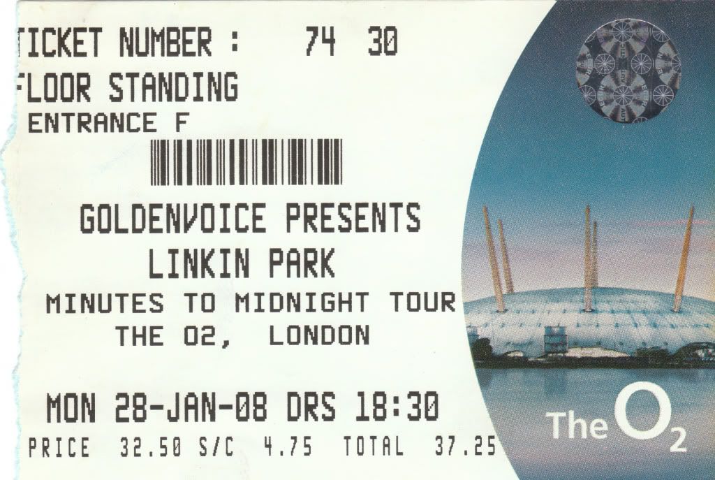
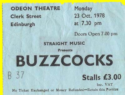
Doing a quick spot of research in regards to the development of my gig ticket designs for the hypothetical 2013 Orange Juice 'Rip it Up' reunion tour.
At this point, with a very basic ticket design, having determined my use of type and colour scheme, I'm looking largely at the individual print finishes which help to define the gig tickets and make them unique, and consistent with one another- such as foil blocking, perforations (on ticket stubs), barcodes, and foil stamps with demonstrate it's authenticity.
Over the next few days I'll look at the various print processes and outcomes to be applied to the design. For design developments over the next couple of days and weeks, see my Design Practice blog.


Image Source


Image Source


Design Practice III//Lookbook.


http://lookbook.nu

Researching the fashion blog/website 'Lookbook', as a potential source of inspiration in regards to the development of the Jessie Leong Photography A/W printed and digital magazine portfolio for 2012.

Lookbooks works by members of the site posting up images of their creative outfits and daily fashion for feedback from others within the online community. The website itself, simple, bold, and effective uses a monochromatic colour palette to let the images ~do the talking~ with a contemporary minimalism within the use of bold, sans serif typefaces and with hover-over links, something I really hope to explore and develop the design of within Jessie's own website/portfolio.

For more design developments, see my Design Practice blog.


Design Practice III//Vogue Magazine Layouts.


As cited in my last, most recent post on my Design Context blog, I have continued to research high fashion magazine DPS' and editorial design in the hope to start work on the A/W 2012 Jessie Leong Photography portfolio within the next couple of days, to be sent to print by the end of this week/the start of next. 

Credited as a particular source of inspiration within her work, and aspiration for the future, the Vogue style is very well aligned to Jessie's existing work with bold, empowered women being interview and photographically documented, often in a high contrast B&W with a spot colour bolding running throughout- such as with the 'Rosie' interview, shown above and below.

Although I will have a little more of a graphic design influence in regards to information and layout, I'm really keen to use the high fashion magazines as a source of inspiration and development within the publication outcome.

For future design developments, see my Design Practice blog.


Sunday, 4 November 2012

Design Practice III//Baltic Branding & Print Media.


During my week working in Gateshead earlier on this week, I was fortunate enough to have an evening free to go and visit The Baltic on The Quayside, which, unfortunately, I hadn't managed to do before in my past weeks spent in the city. 
Working for Founded in the past (the design studio who designed the branding for the gallery), I was particularly interested in going for a visit knowing a little bit of the back history and working relationship between The Baltic and the designers within the studio.
I managed to pick up a few printed items which showcase the custom-made type design in situe with gallery content and photographic imagery. A really great, and consistent range of design and printed media, and some great inspiration in regards to the development of my consistent printed branding within my Design Practice project- more examples of which can be found on my Design Practice blog.


Friday, 26 October 2012

Design Practice III//Comma Branding.


A great branding project, which is so inspiration in terms of what I hope to achieve in both my Design Practice III module and personal and professional practice within the branding design industry. Comma is a design proposal pitch for a semen quality test manufacturers which covers a wide range of both digital/screen- based and printed collateral in a high-quality, professional design outcomes with clear visual communication of health care and pharmaceutical products, but with it's own distinct design and brand identity throughout.

A great project and source of inspiration for my own various brand projects throughout my final year (within both my Design Practice III and FMP projects), particularly looking at the effectiveness of marketing and product range. For design developments for this module, see my Design Practice blog, and more information about the project source below (with link shown above).


Made by
-
Caroline Rosenkjær, Casper HoldenChristina Stougaard
Nicolai HenriksenThorbjørn Gudnason

"

Client: A small entrepreneurial company from Denmark is currently preparing to launch a new innovative mens product, a semen quality test for home use which indicates the semen mobility with 98 % accuracy! The appearance and use of the product is similar to a pregnancy test.

Brief: The company’s CEO asked the students at the School of Visual Communication in Denmark to analyze the scandinavian market, find a target group, design and name the product, create a complete visual identity and to introduce the market for a hard-hitting advertising campaign.

Strategy: We will introduce the product and its features, and prove to the target group that the test is reliable. And be the target groups first step towards the solution of problems with conceiving.

Concept: The concept behind Comma works just like a regular typographic comma, the only difference is that we replace the typographic comma in our sentences with the Comma package. That explains visually why Comma is the break in the pregnancy process when having trouble conceiving.

We have decided to not only design a visual identity for the product, but to create an online community where involuntary childless can learn and share with equals, send readers letter to a professional semen analytics and read the latest articles about fertility. Then Comma will not just be a semen quality test, but a compassionate company which care and helps invulentary childless further against conceiving.

This is project is made as a pitch.

"