Showing posts with label Branding. Show all posts

Saturday, 24 November 2012

Design Practice III//UK Greetings & YCN 2012-13 Market Research.


paperchase.co.uk/page/home

Researching the existing market for greetings cards as part of my UK Greetings/YCN 2013 brief.
For my range, I have decided to work around the themes of love, with the target market of 18-30 year old women, who are either in relationships or newly weds/with young families. As the female target market for card purchasing is by far the largest, I felt this would be a great audience, and to celebrate love in all it's forms, as it is, of course, so universal- be it friendship love, marital love, an unconditional love or the first signs of love in romance. 
Whilst researching various high street and online retailers such as Paperchase, Clinton cards and Funky Pigeon (see links and screenshots above and below) I found that the majority of cards, to put it bluntly, weren't very tasteful (Paperchase being the particular exception) and often very gimmicky and cliche, which I don't feel necessarily represents the variants of love and it's personal meaning to each individual. 
I have decided through my initial design development (see my Design Practice blog for more details) that I would like to focus on create a boutique range of designs with a focus on the mid- high-end price range/market, and develop a range of cards that fit into the themes of "love for any occasion" (be it an anniversary, valentines, just to say... etc), with a calligraphic style of text in quirky and heartfelt messages that run throughout with a minimal, graphic style, which can also be applied to gift wraps and gift bags respectively.

Really excited to get well and truly started with the design outcomes, going to be a busy weekend!


whsmith.co.uk


clintoncards.co.uk


hallmark.com


funkypigeon.com


moonpig.com


Tuesday, 13 November 2012

Design Practice III//Qubik Print Samples.


On Friday, whilst working on a day placement with Joe Gilmore at his home studio, 'Qubik', I was lucky enough to leave with lots of printed goodies and samples that Joe himself had designed for a range of clients and project briefs in more recent months.
As well as all I learnt in just one day, the printed samples have given me a great source of inspiration in regards to the range of printed outcomes I hope to produce for my brief- particularly as I look to develop the A/W 2012 Magazine/Portfolio for Jessie Leong Photography as well as the gig programme for the 2013 Orange Juice hypothetical 'Rip it Up' tour. As I start to develop these briefs, I will be sure to return to these samples, along with the others I have collected over the duration of this brief. 

For design developments, as specified above, see my Design Practice blog.


Monday, 12 November 2012

Design Practice III//Gig Ticket Research.


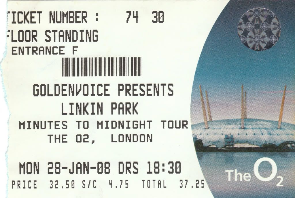
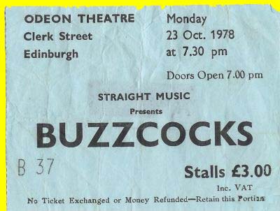
Doing a quick spot of research in regards to the development of my gig ticket designs for the hypothetical 2013 Orange Juice 'Rip it Up' reunion tour.
At this point, with a very basic ticket design, having determined my use of type and colour scheme, I'm looking largely at the individual print finishes which help to define the gig tickets and make them unique, and consistent with one another- such as foil blocking, perforations (on ticket stubs), barcodes, and foil stamps with demonstrate it's authenticity.
Over the next few days I'll look at the various print processes and outcomes to be applied to the design. For design developments over the next couple of days and weeks, see my Design Practice blog.


Image Source


Image Source


Design Practice III//Lookbook.


http://lookbook.nu

Researching the fashion blog/website 'Lookbook', as a potential source of inspiration in regards to the development of the Jessie Leong Photography A/W printed and digital magazine portfolio for 2012.

Lookbooks works by members of the site posting up images of their creative outfits and daily fashion for feedback from others within the online community. The website itself, simple, bold, and effective uses a monochromatic colour palette to let the images ~do the talking~ with a contemporary minimalism within the use of bold, sans serif typefaces and with hover-over links, something I really hope to explore and develop the design of within Jessie's own website/portfolio.

For more design developments, see my Design Practice blog.


Design Practice III//Elle Magazine Layouts.


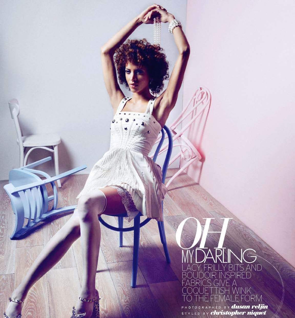
Researching existing Elle magazine layouts as a source of inspiration for the design developments of the proposed Jessie Leong Photography A/W 2012 portfolio magazine- looking at the use of type, balanced with image, colour and themes throughout.

In the past, Jessie has cited that her ambition within her photographic personal and professional practice is to see her fashion portraiture work in the acclaimed magazines, such as Elle, and from my research, I feel that her work would be perfectly suited here- highlighting bold, graphic imagery (often in monochromatic or romantic colour palettes) with images of empowered career women, which is a real focus within Jessie's existing image portfolio, often littered with bright bursts of colour.

In regards to type, I aim to go on to research existing typefaces that balance with with Jessie's brand type, Avenir, for a visually engaging and consistent design outcome.

Really excited to get started! For design developments, see my Design Practice blog.


Image Source


Image Source


Image Source


Image Source


Monday, 5 November 2012

Design Practice III//Architectural Branding Research.


A few project examples of sourced Architectural Branding projects that have proved to be a source of inspiration throughout my time working on the personal branding for Interior Architecture student, James Maxwell, (more information of which can be found on my Design Practice blog)- with innovative use of brand marks, colour palettes and type, along with a variety of printing methods and stocks which add to the interest and character of both the print and digital outcomes throughout the variety of project outcomes.


Sites, Fausto Baena Garcés

I love the bold red, white and black colour palette used in the branding design for 'Sites', along with the subtle use of iconography throughout which adds a playful and innovative character to the design, ensuring that it also isn't too rigidly formal or corporate.
Again, also applied over a range of print and digital collateral and outcomes, showcasing the strength of the simplicity of the iconography, type, and use of colour throughout the brand/product outcome range.


A3 Identity, Cecília Pletser
I love the bold use of monochromatic colour palette and geometric form within the brand identity design for A3, similar to my design intentions for my Design Practice III project, in which I hope to develop the brand identity for Interior Architecture student, James Maxwell- with a great example of how a brand mark can be applied in various ways, including a repeat pattern print for the back of a letterhead. Really interesting use of type/letterforms as image.