Showing posts with label ougd102. Show all posts

Tuesday, 15 February 2011

Photographic Moustache Inspiration.


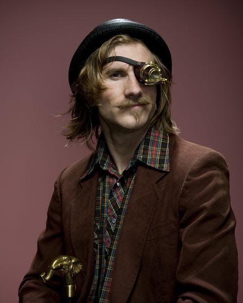
Although I have found that seems like a lifetimes worth of internet-scouring sources of wonderful mustachioed inspiration for the completion of my designs, my favourite source, undoubtedly, is the range from photographer, Dave Mead found on:
 

brilliantly clear and colourful images which really express the style of each of the moustache wearers- a style of which I hope to have portrayed through my designs- really caricaturing, emphasising and exaggerating the moustaches for a playfully interactive design product.

Sunday, 6 February 2011

Wednesday, 2 February 2011

What Is Design for Screen?: Miscellaneous.


An enchanting paper- cut adventure, bringing a pop-up book to life, creating a theatrical experience, using light and motion to manipulate the magical scene.
A really creative, innovative idea. I've seen many papercut animations but something to this scale and whimsy is completely new to me- i love seeing how such an every day object can be transformed in such a playful and magical way.


I love this South Park 'World of Warcraft' kinetic typography piece found on youtube. Admittedly, as a not-so-secretly-huge South Park fan, I may be a little bias, but I really like the hierarchy of text used in this piece, in a subtle, yet very effective way. With many kinetic typography and motion graphics videos with dialouge, they tend to be very dramatic- the manipulate of text, therefore, being naturally easier.

Also, I like the way that the imagery has been used in this piece with the typography forming the shape of a clock when Eric Cartman talks about the time they will spend on 'World of Warcraft'- fun, whilst not being too elaborate and over-the-top.


 Bokeh desktop background by '-kol on deviantART.

I've really found myself interested in wallpaper design and designers of late and I really liked this colourful example which comes in several variations: dual and single display, widescreen and fullscreen, PSP version, and iPhone version.

There is a lot of interest in the design, with a mixture of photographic and computer designed textures, with a great gradient and blend of colours running through the screen.

The soft pastel colours also keep the design subtle, and wouldn't interfere with the readibility of any icons, files, etc, already exsiting on screen.


 Adobe Designer Series by Keith Brock.

A really great, minimalist wallpaper design displaying the adobe software icons- I really like the amount of negative space and colours used- interesting composition, but I would like to see other possible arrangements? Perhaps closer to the bottom right-hand corner, or centre bottom, or left-aligned vertically, in the style of a mac desktop.


Really creative used of type as image using after effects 7 software- this motion graphics typography piece has really changed my perceptions of how type can be manipulated in this skillfully crafted video. 


I really like this child-like animation video for the song 'Bubblegum' by band 'Clinic'.
Great concepts in terms of imagery- a cat floating away on a blown balloon of bubble gum (as you do...), ladybirds disguising themselves as mushroom tops...etc... really quirky and full of imagination.

I also really like the textures used in the design, a charmingly aged aesthetic- almost as if it were pulled out from a classic children's story book. 

Wonderful and just the right side of mad.


A brilliantly fun, interactive site- great for designers and the comic sans crimefighters of the web. 
I really like the layout of this website- an usual scroll downwards, almost refreshing the page to a new tablet image- really inventive- and it certainly maintains interest with the variation of type and colour used.

Monday, 17 January 2011

100 Book Covers: Existing Product Research.


Almost certain that I would like to create a book (or some other very similar form of publication- a pamphlet, fanzine, etc) for my final product, I went out to Waterstone's today to research exisiting products- collecting some of my old and new favourites.

I looked for many different aspects, largely focusing on design and arts books, as I knew the design consideration would be a necessity for the front cover.

Points of focus included:

*orientation of the book
*layout of the book
*colours used
*typography used
*images used
*methods and techniques used
*photography used
*printing methods used


In every book cover or design I found something that inspired me and made me think "wow! i can't wait to try that out when I'm desiging!"...now it's just having the time to squeeze them all in...

Really, there were no limits to the preference of the designs- some were cluttered, some where completely minimalist, but I know that it is a truly inspiring feeling that at this stage I really have no limits (other than time, of course), so, as soon as possible, I will begin sketching and desigining my product.

Keep Calm...


...a wise word for any hour of need...

100 Barbershops: Mailshot Research.


Taking my promotion and advertising of my product into consideration, I have started to compile further mailing lists, this one being a list of 100 (to fit the theme of the 'Collection 100' project!) barbers or babershops in the United Kingdom...


1. The Barber Shop, 16a, Albion Parade, Kingswinford, West Midlands, DY6 0NP.

2. FINCH, 61, The Hundred, Romsey, Hampshire, SO51 8BZ.

3. ESSENTIAL BARBERS, 1, Pimlico Court, Monkston Park, Milton Keynes, Buckinghamshire, MK10 9RH.

4. Solutions Barbers, 44, Woollards Lane, Great Shelford, Cambridge, Cambridgeshire, CB22 5LZ.

5. ANDY'S HAIR STUDIO, 204-208, Church Rd, Northolt, Middlesex, UB5 5AE.

6. AJ'S UNISEX HAIR SALON, 1, Woodgrove Parade, Catton Grove Rd, Norwich, Norfolk, NR3 3NS.

7. The Barber Shop Long Melford, 2, The Posting House, Hall Street, Long Melford, Sudbury, CO10 9JA.
8. JAKE'S BARBERS, Studio 7, 50-54, St. Pauls Square, Birmingham, West Midland, B3 1QS.

9. Parkers Barber Shop, 35, Regent St, Cambridge, Cambridgeshire, CB2 1AB.

10. Charlie Browns, 5, Riverside Walk, Bishop's Stortford, CM23 1QQ.

11. A Cut In Time, 13A, Raynor Road, Wolverhampton, West Midland, WV10 9QY. 

12. Sweeney Todds, 11 Church Street, CREWKERNE, TA18 7HU.

13. The Barbers 2, 86, Front St, Newbiggin-By-The-Sea, Northumberland, NE64 6QD.

14. Blades, Unit 29, Halesfield 8, Telford, Shropshire, TF7 4QN.

15. The Market Barber, The Hampden Building, High Street, Kidlington, OX5 2FN.

16. Antonios, 11, Station Approach, Hayes, Bromley, Kent, BR2 7EQ.

17. Creations, 26, Southgate, Chichester, West Sussex, PO19 1ES.

18. Mix 'N' Blend Mobile Barbers, 144, Wilmot St, Long Eaton, Nottingham, Nottinghamshire, NG10 3DQ.

19. Rodneys, 3, Church Walk, Colchester, Essex, CO1 1NS.

20. Plymstock Barber Shop, 250, Dean Cross Road, Plymstock, PL9 7AZ.

21. Carmelo, 11 Jesus Lane, Cambridge, Cambridgeshire, CB5 8BA.

22. Barbuzz Ltd, 235a, Finch Lane, Knotty Ash, Liverpool, Merseyside, L14 4AE.

23. Prince Hair Salon, 12, Randal St, Blackburn, Lancashire, BB1 7EG. 

24. Parkers Barber Shop, 35, Regent St, Cambridge, Cambridgeshire, CB2 1AB.

25. Alan Jones Mens Grooming, 105, London Rd, Sevenoaks, Kent, TN13 1BH.

26. iz Barber Shop, Bakers Court, Paycocke Road, Basildon, Essex, SS14 3EH.

27. The Barber Shop, 5, Costly St, Ivybridge, Devon, PL21 0DB.

28. Simon Foxen Barber Shop, 19, Hart Road, Benfleet, Essex, SS7 3PB.

29. Headgardeners, 17, Union Street, Maidstone, Kent, ME14 1EB.

30. Hair By David, 4, Hebron Road, Clydach, Swansea, West Glamorgan, SA6 5EJ. 

31. F Flittner, 86, Moorgate, London, EC2M 6SE.

32. TUZIOS BARBER SHOP, 88, Hillfoot Avenue, Liverpool, Merseyside, L25 0PF.

33. Slick Kutz, 5, Kingsland, Arleston, Telford, Shropshire, TF1 2LB.

34. Eds Barbers, 26, Merton High St, London, SW19 1DN.

35. Shades of Green, 13, The Qaurterdeck, London, E14 8SH.

36. Bewdley Cutting Room, 29, Load Street, Bewdley, Worcestershire, DY12 2AS.

37. Arcade Barber Shop, 9, Olympia Arcade, High Street, Kirkcaldy, Fife, KY1 1QF.

38. The Men's Room, 98, Wellington Rd, Liverpool, Merseyside, L15 4JN.

39. Justin Lord Barbers, 586, London Road, Dittom, Aylesford, Kent, ME20 6BX.

40. Duke Street Barber Shop, 15, Duke Street, Reading, Berkshire, RG1 4SA. 

41. Spiki's Barber, 91, Commercial Road, Bournemouth, Dorset, BH2 5RT

42. Shape 'N' Style, 64, Justice Mill Lane, Aberdeen, Aberdeenshire, AB11 6EP.

43. The Barber Shop Henlow, 270 Hitchin Road, Henlow Camp, Henlow, Bedfordshire, SG16 6DP.

44. The Cutting Room, 44 Middlesex Street, London, E1 7EX

45. Marino Capelli-Grooming, 87 Victoria Street, Windsor, Berkshire, SL4 1EH.

46. Neal Anthony Hair Design, Black Chapel Lane, Gorleston, Great Yarmouth, Norfolk, NR31 6NY.

47. Bristol Barbers, 137, Whiteladies Rd, Bristol, Avon, BS8 2PL.

48. The Barber Shop, 21a Guildhall Shopping Centre, Exeter, EX4 3HG.

 49. THE CUTTING CREW, 139, London Rd, Sheffield, South Yorkshire, S2 4LE.

50. Cranium, 52, Stranmillis Road, Belfast, BT9 5AD.

51. Tom, Dick & Harry's, 4, Downsland Parade, Basingstoke, Hampshire, RG21 8TX.

52. Southwells Shaving Salon, 9-11, Shoe Market, Pontefract, West Yorkshire, WF8 1AP. 

53. Neil Smith Mens Hairdressing, 10, Ashfield Road, Liverpool, Merseyside, L17 0BZ.

54. Blades, 74, New Street, Burton, Burton-On-Trent, Staffordshire, DE14 3QY.

55. Equinox Hair Artistry & Male Grooming, 19, Oxford St, Southampton, Hampshire, SO14 3DJ.

56. Creations, 26 Southgate, Chichester, PO19 1ES.

57. IL BARBIERE & PARKERS BARBER SHOP, 1011 Barbier- 22 Magdelene St., Parkers- 35 Regent St.

58. AMEN BARBER SHOP, 7, Station Parade, Victoria Rd, Romford, Essex, RM1 2JA.

59. Elio's Barber Shop, 84, The Street, Ashtead, Surrey, KT21 1AW.

60. Clint's Barbers, 91, Victoria St, Stoke-On-Trent, Staffordshire, ST4 6EH.

61. Domenic the Gentleman's Hairdresser, 45, Newnham Rd, Cambridge, Cambridgeshire, CB3 9EY.

62. Crown Cuts, 25, Hart St, Maidstone, Kent, ME16 8RQ.

63. RJ's Barbers, 28, Hockley St, Birmingham, West Midlands, B18 6BL.

64. Len's Gents & Ladies Barber Shop, 86, High St, Whitstable, Kent, CT5 1AZ. 

65. Headhunters, 160, High St, Watford, Hertfordshire, WD17 2EG.

66. The Hair Taylor, 13 East Street, Crowland, Peterborough, PE6 0EN.

67. Jacqueline Kennedy Hairdressing & Grooming For Men, 3A. Fenaghy Road, Galgorm, Ballymena, BT42 1HW.

68. Walters & Co, 9-11 Turl Street, Oxford, OX1 3DN.

69. MOBILE BARBERS- RJ & LJ Harrison Hairdressing Services, 46, Avebury, Bracknell, Berkshire, RG12 8SQ.

70. Premier Barbers, 475, Beake Avenue, Coventry, West Midlands, CV6 2HT.

71. Turnstyles The Football Barber Shop, 57, Station Road East, Oxted, RH8 0AX.

72. Tapers Hairdressing, 32, Martin Square, Larkfield, Aylesford, Kent, ME20 6QJ.

73. Jeffery's Barbers, 171-172, Sidwell Street, Exeter, Devon, EX4 6RH.

74. Mezo Barbers, 5c, Thames St, Staines, Middlesex, TW18 4SD. 

75. HAIRPORT, Unit A, 18, Hurts Yard, Nottingham, Nottinghamshire, NG1 6JD. 

76. Arthur Mitchell Barbers, 18, High St, Chislehurst, Kent, BR7 5AN.

77. NUTS, 4, Park Rd, Kenilworth, Warwickshire, CV8 2GF.

78. Giovanni's Barber Shop, 89, Magdalen Rd, Oxford, Oxfordshire, OX4 1RG. 

79. Braid Barbers, 74, Warwick Street, Leamington Spa, Warwickshire, CV32 4QG. 

80. Kerry Roberts, 4, Alexandra Court, Wokingham, Berkshire, RG40 2SL. 

81. Il Barbiere, 22, Magdalene Street, Cambridge, Cambridgeshire, CB3 0AF. 

82. A-Cut-Ahead, 79a, Front St, Chester Le Street, County Durham, DH3 3BJ. 

83. Jude's Barbers, 1, Fairoak Avenue, Newport, Gwent, NP19 8FX. 

84. CHAPLINS HAIR COUTURE, 71, Braunstone Gate, Leicester, Leicestershire, LE3 5LH. 

85. VIVALDI, 67, London Rd, Waterlooville, Hampshire, PO7 7EX. 

86. GRADE ONE, 434, West Bromwich Rd, Walsall, West Midland, WS5 4NS. 

87. PRIMO STILE BARBERS, 3, Park Place, Stevenage, Hertfordshire, SG1 1DU. 

88. HYDE PARK HAIR SHOP, 70, Hyde Park Rd, Plymouth, Devon, PL3 4RG.

89. The Barbers Chair, 70, Railway Rd, Coleraine, County Londonderry, BT52 1PG. 

90. ALEXANDER JAMES HAIRDRESSING, 1a, Chandos St, Leamington Spa, Warwickshire, CV32 4RP. 

91. Stellify, 37, Queen St, Blackpool, Lancashire, FY1 1NL. 

92. Illusions, 6, Lavender Rd, Cambridge, Cambridgeshire, CB4 2PU. 

93. Murdock Ltd, B, 5, Stafford Street, London, W1S 4RR. 

94. BASE HAIR CO, 279, Speke Rd, Woolton, Liverpool, Merseyside, L25 0NN. 

95. YIANNIS OF LONDON, 180, Rainham Rd, Chatham, Kent, ME5 7EN.

96. ELEMENTS, 57, High St, Teddington, Middlesex, TW11 8HA. 

97. David's, 6, Langton Place, Hatter Street, Bury St. Edmunds, Suffolk, IP33 1NE.

98. WHISTON GENTLEMENS HAIRDRESSER, 30, Slimbridge Rd, Tuffley, Gloucester, Gloucestershire, GL4 0NB.

99. Jon Richard, Northgate, Cleckheaton, West Yorkshire, BD19 5AA.

100. The Hair Studio, 40, Brook St, Raunds, Wellingborough, Northamptonshire, NN9 6LP.


Friday, 14 January 2011

Typestaches...


...And finally, I discover the ultimate design that I wish I had thought of first...

What a great way to find out the personality of a font- personally, I am quite partial to a bit of Mr. Oxford!

Mailshot Inspiration...


I really love the idea of creating a fun, interactive mailshot- to give a promotional preview into my product and all the quirky wonderment I aspire it to offer. 

Although not necessarily original, I like the idea of the "cut out and keep moustache"- almost a free gift and an instant smile inducer, thus creating a positive connection to the idea of moustaches from the start.


I quite like the idea of designing the moustache around a postcard- contained within, looking quite ordinary to begin with, but charming and fun when you discover the "cut out and keep" element.
Perhaps with a tag line such as "reason #1: Because you've got one too"... leading onto text with directions to find out more... (perhaps a link to a web page, or title of the book?)

Designs coming soon!

Got Milk (Moustaches)?


...Because nothing's sexier than a glass of cool milk.

Tuesday, 11 January 2011

What Is Design For Screen?: Organisations.


A really clear, concise website- laid out simply but with just enough eye-catching detail- such as the highlighted bars when hovering over the links on the left-hand side of the page in bright, contrasting colours.

I believe the website communicates very effectively. The Association of Illustrators organization was completely new to me before visiting their site, but along with the aforementioned clarity of the homepage, the key header bar reads:

"The AOI was established in 1973 to advance and protect illustrator's rights and encourage professional standards. The AOI is a non-profit making trade association dedicated to it's members' professional interests and the promotion of illustration."

- a simple, obvious and effective way to introduce themselves to the viewer.


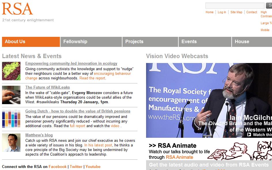
Like the website for the Association of Illustrators, above, the Royal Society for the encouragement of Arts' website is logically laid-out, clear and easy to navigate and communicate, once more, with a well co-ordinated colour scheme used in hyperlinks and headers in blocks of text.

The two-hundred-and-fifty-year, well-established history of the association is clear in the presentation of the website- heavy with informative text and particularly using a serif, classic font for their logo- communicating a cultural and social history within the organization.


Give Blood- a bright, consistent design throughout the website with just three colours (plus photographs) used. Also really easy to navigate with drop-down bars and hyperlinks- also, many short cuts to important information, signing up as a donor, etc. Informative and concise.


Easy to navigate with useful links to "sister school" Universities in the top right-hand corner, yet I feel the layout is a little too cluttered for what you would expect to be a minimalist and cutting-edge design with the photographs seemingly thrown together on the page.


The London College of Fashion, website, a sister site to Chelsea College of Art and Design with a very similar page layout, however, very slight alterations, I believe make a big difference.
There appears to be a far more structured griding system, all links and text aligned and organised, and the pink and grey colour scheme looks far more organised and stylishly designed than that of Chelsea's contrasting blue and orange colour palette.

What Is Design For Screen?: Websites.


Danny Brito's updated website.
Danny is an American fine artists/illustrator who creates fantastical, colourful and magical portraits- not to mention rather wonderful website headers.
Danny's web header and logo really reflect both his work and his personality- with rainbow hyperlinks to further information, portfolio work and projects, etc.

I really like the unusual typeface that Danny uses for his logo- and this really effectively communicates the sort of work you can expect- a great example of graphic design, whereupon the audience feel instantly aware of the purpose or style


Richard Talbot- art, drawings, sculpture, writing.

Whilst Richard Talbot's website is clear, and easy to navigate, I sadly cannot find many other redeeming features. Whereas the silvery-grey pallette is surely easy on the eye, and not in any way illegible in terms of font, the page is simply dull and dry- both Richard Talbot and his work are clearly sophisticated, educated and well-established, however, I do not think that this site represents that well, and could certainly benefit from further visual aides and either a higher contrast of monochromatic tones or a splash of colour for vibrancy.
As aforementioned, although it is clear, navigates well, and communicates his portfolio of work, the viewer's interest would undoubtedly be sustained with the help of the points above.


I really love Lissy Elle's website. I originally sourced it through curiosity after following her online photographic blog with my admiration, and loved how expressive the simple yet very effective design- perfectly balancing the technical mastery and modernism, with the child-like fantastical imagery in her work.
Aswell as easy nagivation through hyperlinks in bold reversed-out text at the top of the page, my particular favourite element of the website is the top header bar- which reads 'LISSY ELLE' (see image above) in animated stars- turning from a cream to a yellow ochre tone- a really playful and creative design- i'd love to find out how to do something like this myself!


Pointed in the direction of Tim Burton's website by a friend at University, I have been really inspired by the creativity and characters that Burton uses to interactively guide the audience through his online portfolio.
The viewer acts as 'Stain Boy' (a character from Burton's acclaimed poetry novel 'The Melancholy Death of Oyster Boy and Other Stories')- controlling the small super-hero like character around the site using the arrow keys on your keyboard- walking through doors, climbing stairs, trapsing through galleries.

Really fun interaction, and the style is quintessentially Burton- monochromatic, sketchy, eerie and more than a bit out-of-the-ordinary, you would instantly know that this was his work- a sign of a great artist or designer. 

Already a huge fan of Mr Yen (aka, Jonathan Chapman)'s work- his style sucessfully translated through to his website- with clean and crisp lines, in a bold black and white, which reflects his papercrafts work. Although flash animations and bright hyperlinks are, undeniably lively and fun, I always find myself favouring the more subtle impact of monochromatic tones- and I feel that Mr Yen portrays this very well- any more would could potentially take away the impact from his delicately crafted designs.
I love this interactive icon on the homepage of artist kelly thompson's homepage of her website- transforming with subtle curves from 'kelly' to 'hello'. I really like how the flow of her typography reflects her natural and organic lines in her work, with natural feminine colours (as shown by the circle on the vector).

The Australian women's magazine 'Frankie' is another wonderful examples of great visual communication and design translated through both screen and print with great consistency and continuity in styles and layout.
The soft colours and light grey text are really appropraite for the feminine style, and the header bar is co-ordinated in a grid- like pattern, styled enough to be legible, but with enough variation to achieve the homley, hand-made collaged appearance that the magazine, and it's website style themselves upon.


Gemma Correll's illustrative website homepage is full of life, playfullness, and her own quirky style- again, a great example of introducing the viewer to your work before they even have chance to view your online portfolio.
On this page Gemma uses the colour and tone palette that she uses throughout her diary series- a grayscale of white to black, and the occasional burst of red- as a fan prior to viewing her website, i appreciate the link between her work and this homepage, though i feel new viewers may not be as captivated with her work as they could be- with a great deal of her portfolio in bright and pastel tones, using these colours on the introductory page may be more appealing and attention grabbing, tempting viewers to delve further into her work.


I can't believe I haven't seen this site sooner! The Design Agency, Music, in Manchester, reknowned for their innovative, creative and highly-desirable work show no signs of holding back in regards to their promotions and online gallery  (portfolio, awards, etc.). I really love the unconventional layout of the page- the left-aligned text of which you have to scroll down the entire page to see fully, and the negative space around it- really clean, modern design.
The images on the site can be found from scrolling through the webpage both vertically and horizontally- despite their being such a vast collection of work and show, this method of structured layout keeps it looking spacious enough, with all of the wonderful designs they have for the viewer to delight upon!


A really simple, clear website design- easy to read and navigate and consistent tones and colour palette used throughout don't detract any attention away from the bright, exciting design from Mark Howe's online portfolio.
Although a very small feature, I really like the way that grid stock-like paper is used as the web background- a style I've never seen on any design websites before but a really unique touch- adding interest to an otherwise quite neutral and sparse page.


I love Julia Fullerton-Batten's website- a really elegant and simple exhibition of her work online in beautiful photographic imagery- again, like many contemporary websites- good use of colour through hyperlinks- the orange is bold and bright whilst the thin, small point size of the text doesn't detract from her work.