Showing posts with label Lulu and the Lens. Show all posts

Saturday, 22 September 2012

Design Practice III//Negotiated Briefs//Lulu & The Lens Photography & Wedding Photography Branding.


Continuing with my research for the development of the Lulu & The Lens Photography branding project, I decided to look at existing branding for wedding photographers, of one Lulu's areas of speciality within her portfolio.

Generally speaking, although some very professional and high-end, the images which I sourced, all seem to have a similar theme, (see examples as shown below) with a very traditional style- using serif type, light, feminine colours and often quite tactile print finishes. Although, of course, it wouldn't be appropriate to alienate clients with something too disimilar from the traditional style of wedding photography branding, for Lulu's own printed and digital media, I aspire to create something truly memorable, that would stand out against other designs and to stand apart from other photographers. Continuing with the research and design development process will help me to develop an understand for both Lulu's portfolio and industry, and, hopefully, the most effective means of visual communication for it.

All design and concept development can be found on my personal Design Practice blog.


Image Source


Image Source
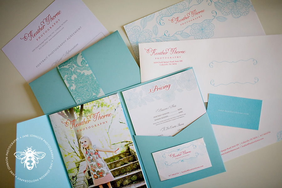

Image Source


Image Source


Design Practice III//Negotiated Briefs//Emma Case Photography.


emmacasephotography.com

Through discussions with Lulu (of Lulu & The Lens Photography), and reading her responses in the given questionnaire, I've begun to understand both her portfolio aspirations, and her own personal taste a lot more clearly. Cited as one of her particular brand/website inspirations, Emma Case's Photography (link as shown above) is a beautifully vintage- inspired, scrapbook- esque website, aesthetically, quite like a blog, with a lot of visual interest and quirky type and image combinations that, as aforementioned, perfectly suits Lulu's own style and portfolio.

Inspired by Emma's website, I'd really like to explore print finishes such as letterpress and blind embossing for Lulu's stationary and print- based branding, which I think could look really professional, striking, but, perhaps most importantly, adhere to her feminine and delicate portfolio and style.

Really anticipating getting started with the project, all future design developments will be found on my Design Practice blog.


Design Practice III//Negotiated Briefs//Lulu & The Lens & Lavanderia Type.


losttype.com/font/?name=lavanderia

After developing the research for potential concept for Lulu & The Lens branding today, and considering a potential Parisian aesthetic and influence within the design, I remembered, 'Lavanderia', a lost type typeface that I was introduced to earlier in the summer, which I think illustrates the sort of style and elegance that would be well suited to portray the style of Lulu's portfolio, as well as reflecting her own personality.

Although the design development stage is still a little way off, I look forward to exploring potential designs using this, and other script- based, or possibly even hand- rendered styles of type that would visually communicate the brand of Lulu & The Lens Photography, design developments of which will be available to view on my Design Practice blog.


Design Practice III//Negotiated Briefs//Lulu & The Lens Questionnaire.


At the start of my research process, when working with each of the proposed clients on live branding briefs, I sent each a short questionnaire to try and get an initial overview of both their view of their portfolio, their design taste, as well as their own personality.

Below, the initial responses from photographer, Lulu Peddar of 'Lulu & The Lens', offering an insight into her professional practice, and helping to kick start some of the research I have been posting in the past couple of weeks.

From this, I'll explore potential design and concept developments, all of which will be posted on my Design Practice blog.


//

QUESTIONNAIRE


1. How would you describe your style of photography?

I would describe it as reportage, fly on the wall, vintage/fresh.

2. What first made you interested in pursuing photography as both a hobby and a career?


I studied it at Uni and started to practice it 3yrs ago. It was a way of processing my feelings and how I perceive the world. It 

3. What are your ambitions for the future of your photography practice?

I would like to be a successful portrait/lifestyle photographer (with flexible work & travel) mainly booked for portrait sessions, shoots and the odd wedding (say 6-7 a year). 

4. In your portfolio, which images are your favourite, and why?


The images that convey pure emotion, where the subject is unaware of me being there.

5. From a brand perspective, which company brand aesthetics do you admire?


I love Cath Kidston & Belle and Boo from a company/brand perspective.

6. Which photographic designers do you particularly admire?


I'm not very savvy with photographic desginers but I love the people who designed Emma Case Photography's website!

7. How would you summarise your attitude to your design portfolio and professional practice?


Vintage, notebook style, thoughtful and romantic.


ALSO TO DO...

- Please could you send links to all existing networking/online portfolio sites.

http://lululocketphotography.tumblr.com/
https://www.facebook.com/pages/Lulu-Locket-Photography/287663461263604


- Please send a list of all branding/products (print/digital) that you would like to be produced for further discussion (business cards, stationary, etc.)

I would like a logo with incorporated with the name of my business 'Lulu and the Lens', business cards and cards to leave a note with my logo for clients when sending them their photos/products.

Design Practice III//Negotiated Briefs//Lulu & The Lens & Belle & Boo Branding.


booboobelle.com

Whilst discussing potential design and branding inspiration with Lulu of Lulu & The Lens Photography for her print and digital branding outcomes, she cited 'Belle & Boo' as a particular inspiration. 
Although unaware of the brand name and identity, when I went onto the site I instantly recognised the famed children's illustrations and the Parisian- inspired typographic brand design, which, to me, is so reflective of Lulu's sophisticated, elegant and traditional portfolio and personality.

Looking through some of the branding and products, as well as the detailed illustrative designs by author Mandy Sutcliffe, and learning a little more about the background of characters, 'Belle & Boo', I've learnt that the design style was inspired by her time in Paris, much like Lulu's influence upon Parisian-chic style photography, undoubtedly inspired by her family in Northern France and her own bob haircut. With a personality and portfolio so reflective of this elegant, romantic French style, it's an avenue I'd be really keen to explore and potentially develop further, gaining inspiration from both the nation's typographic and overall branding design outcomes.  

After a little more research development and writing out the initial brief and rationale, I'll go on to develop some initial design ideas and concepts, all of which will be found on my Design Practice blog.


Friday, 21 September 2012

Design Practice III//Negotiated Briefs//Lulu & The Lens Photography//Categories.


lululocketphotography.tumblr.com

Conituning my research for the brand development of Lulu & The Lens Photography as one of my ten negotiated briefs for Design Practice III, I have decided to (and will, of course, ask Lulu's consent) present the identity as a 'Lifestyle and Wedding' Photography brand, which encompasses the vast majority of Lulu's existing portfolio work. Below, I've categorised a small selection of her latest works into both of the aforementioned photography styles, and it could be quite interesting to use this "double" as a concept for the furthering of the design outcomes- perhaps as a reversed business card, or double- sided portfolio. The potential variations to explore are really exciting, and I look forward to the design development stage, all evidence of which will be posted on my Design Practice blog.

//

PHOTOGRAPHIC PORTFOLIO

WEDDING


LIFESTYLE


Design Practice III//Negotiated Briefs//Lulu & The Lens Photography & Cath Kidston Website.


cathkidston.co.uk

As I continue to develop my research and consider potential design developments for the Lulu & The Lens Photography brand identity project, I've returned to the Cath Kidston website to look for design potential. 

From researching existing photography branding (particularly business cards), in the more wedding/lifestyle photography genre, there seems to be little variation in terms of style- usually quite classic, serif typefaces with the "stand out" photograph from the portfolio being used as the brand image. However, from the print and pattern nature of the items from the Cath Kidston retail brand range, pattern is used throughout the website in a look- book way quite cleverly, and a hand-rendered pattern could work quite effectively to accompany Lulu's existing work.

A lot more research and experimentation before I settle on any ideas, but very interesting to see the mix of pattern, photography and type, and something that I will certainly look at exploring further at a later date.