Saturday, 14 January 2012

Image/Existing Editorial Covers from The Guardian.


A selection of past covers for the newspaper suppliment 'G2' (the culture and lifestyle suppliment) found within 'The Guardian' newspaper. Famed for it's eye-catching and unique cover designs, I decided to look a variety for inspiration of the paper's existing design, and to find any particular style which may be a reacurring feature- more reviews and annotations of the images featured below.

With these examples, at least, the most common re-occurrences are type- both informative and illustrative, vector illustration and photography- certainly something to consider when creating my own editorial images for the brief.


Really simple- and really effective... the reversed out 'wow' type on this solid-block orange background speaks volumes. This is the minimalistic style of design that just gets me every time- wish I'd done it first.


LOVE this cover design- creative vector illustrations, clean, crisp, with a high-impact colour palette on the cover. The illustrative type works wonderfully with the fluidity of the liquid-like illustrative detailing it sits within.


A great example here of how the G2 suppliment  combines methods of delivery and design outcomes creatively to make a well-rounded and fitting design- here, type, vector illustration background layer and photography are all applied in this bright and eye-catching design with high-impact, engaging colour palette.


A wonderful example of capturing a "moment in time" for editorial photography. In my mind, photography for print-based publication design such as magazines or newspapers works best with either complete spontaneity, or complete control- and the spontaneity in this shot is remarkable- staged or not, it really captures a moment in time, and is a strong example of visual communication- with a clear, direct narrative.


In response to the last example image- this being an example of editorial imagery with complete control- studio shot photography, and edited afterwards in computer-aided software for a bold, poignant and eye-catching design. In my own design practice, along with illustration, photography is a particular strength and "preference"- I'd definitely like to try out more studio-based work throughout this module, if appropriate to the given outcome.

Wonderfully simple use of block colour and logo/iconography in this design-a great example of graphic design as visual communication- bold, strong, and effective design- instantly recognisable, and instantly understood.


A little more creative this time (in relation to my usuaul design practice)- I love the way that the material used as photographic imagery has also been translated as illustrative type- really subtle, yet totally creative- I'd love to try out more photographic hand-rendered/3D type within the module.

Image/Existing Editorial Images from The Guardian.


A selection of secondary editorial images searched from online source links to 'The Guardian' newspaper, as a reference point for my own design development for the week-long editorial image week (images which will be placed in context alongside articles from 'The Guardian Weekened' newspaper).

A really great variety of design styles and outcomes, and a really inspiring range of methods of delivery, which will ensure that I push myself to be more experimental with my own designs. More information and a short review of each of the designs are written below.


Great eye-catching, bright vector style- very fitting for the "pop culture" context it sits next to (within the article) due to the repeat print/varying colour application style. Crisp, unique and very well formatted alongside the text and griding structure of the newspaper spread.


Difficult to interpret this out of context (not alongside it's original article), though, according to the image source, it's origins in context are alongside a piece of text discussing parent/teenager relationships. I like the sketchy, hand-rendered style, which is quite uncommon in editorial print- gives a great sense of originality and character.


A beautifully intricate monochrome design from "The Papa of Papercraft", Rob Ryan- where, in context of editorial design, prints, and surface pattern design, his original papercraft creations are cut and then scanned (and photoshopped for lighting purposes, if necessary)- a really unique and creative design which blends hand-rendered illustrative, typographic, and cutting techniques effortlessly.


A unique style of illustrative rendering- looks almost more like a painting with it's texture daubs and strokes- an interesting application for a more tactile appearance, which adds interest without "cluttering" the overall design.


Again, more great use of texture within an illustrative outcome- love the way the sea has been styled in this image with the two-tones colour strips, which ensure that the colour palette is kept minimal, yet far from a flat image, and full of interest.


I really like this zine-like style of illustration, bold, sketchy and a minimal colour palette- works well to distinguish seperate features within the newspaper, as well as keeping the page eye-catching without risk of being a little too overwhelming for the reader, and consequently, keeping them away from reading the entirety of the article.


The image above is one that I would regard as quite typical illustration within an editorial context/newspaper publishing- solid block colour (digitally finished) with a hand-rendered aesthetic- crisp and clean, but still with plenty of character which ensures it stands out from images of advertising, and draws the reader into the article.


Quite an abstract image for editorial imagery- very expressive and full of detail- a great reminder that I don't have to- and shouldn't- stick to my "style", but embrace experimentation in methods of delivery and outcomes- this module demands it, and is a great opportunity to embrace it.


A great selection of DPS spreads from various pages of an edition of 'The Guardian Weekend'- the specific newspaper which I will be generating my editorial images in proposition to be printed alongside- really interesting to see so much more photography in '...Weekend' as opposed to 'The Guardian'... might be worth checking that this isn't a standard format, otherwise it might be worth considering applying a little more B&W photography to my designs to make it fit more comfortably within the newspaper's existing designs.

Enterprise//Zines I own.


Blogging and researching a  couple of examples of hand-crafted zines I own, bought from two Leeds-based craft fairs, The 2011 International Book Fair at Leeds University, and Reetsweet at the Corn Exchange- a great example of work produced in the local area (potential client connections for contacts within our business proposal?) and the variety of work that is produced (in terms of style, message, content, colour scheme, stocks, formats, folds, and so on)- more annotation and review(s) written below the images.

From these examples, I will go on to search for print makers and designers in Leeds who may be potential contacts for our proposed company, and whose work we can promote, as if we were retailers in Leeds (supporting the work of student and young professional designers).


This hotdog fold zine was created by friend and fellow BAGDer, Beth Yates for part of our group sale at The Leeds International Book Fair 2011. As a big fan of repeat image prints and hand-rendered work, the illustrative style of the zine really appealed to me. The simplicity of printing the monochrome pattern onto the block colour stock works really well as a low-cost, bulk print item.


Again- bought at the Leeds International Book Fair 2011, I really liked this colouring book style zine- a really unique, reversed out, illustrative narrative running throughout, and great for it's target audience of children to help keep them engaged by originally selling with a pack of miniature colouring pencils too! A really great idea. Usually, I feel people associate zines with more of the "trendy teen" market, but printed publications and zines have a lot of potential to expand outside this audience, and to open up other key demographics.


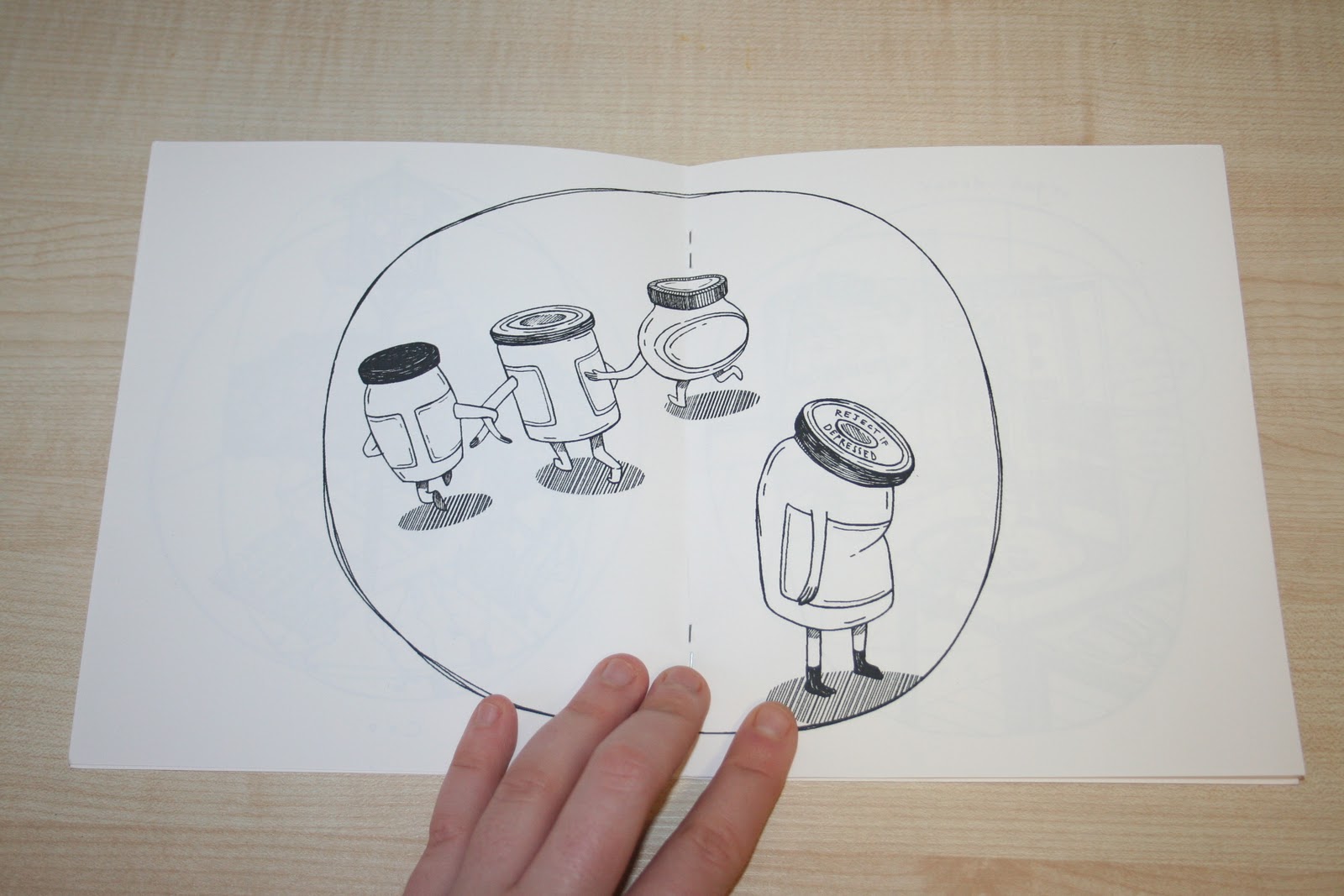
Love this tongue-in-cheek play on words book which is certainly more suited for an adult audience! Again, purchased at The Leeds International Book Fair 2011, this zine publication shows how simply illustrations can be applied, and how effectively, when in a humourous or entertaining context. In my mind, I think that this is the kind of work that would sell really well- low cost, but fun and engaging.


This zine, 'Bruges in famous for it's buzzers', was bought just after I returned from a winter break in Bruges in 2010/11 at 'Reetsweet' in Leeds' corn exchange. Again- quite different in style and content. In my experience, photographic zines don't tell to sell as well as illustrative/typographically driven publications, but there's certainly a niche market for them- and appeal particularly to our company's target market of students, as they often appear to be much "trendier" with unedited, "raw" street-style photography.


'Everybody's book of kittens' in a hand-rendered illustrative and typographic zine created by Norwich-based illustrator Gemma Correll, and sold at Leeds' 'Reetsweet' by one of her stockists and friends, Helen Entwistle (aka 'Memo'). I love the textured, monochrome, hand-rendered style that Gemma is so famous for- a really distinct child-like style that creates a sense of nostalgia, whilst still appearing sharp, edgy and fun- a great all-rounder.

Tuesday, 10 January 2012

Design Production for Digital//Top 10//DVD Interfaces.


Blogging existing sources of motion graphics in DVD Interfaces for inspiration of my own design developments in the 'Top 10' Design Production for Digital brief (more information of which can be found on my Design Practice blog). Some great examples shown here, particularly for animation films (in which visual communication is a MUST- not dependent on the characteristics, emotions and acting skills of actors)- all of which are very representative of themes, character or the overall style of the film- great examples of how to exploit existing content for shorter design sequences- a possible consideration for my title sequence and idents to be produced at a later stage?


Thursday, 5 January 2012

Design Production for Digital//Top 10...//Title Sequences.


Blogging a few more examples of motion graphics title sequences (as I did earlier in the 'Design Production for Digital' module with the 'Silent Movie' brief) to inspire my potential storyboard development and visual communication of my ideas for the proposed 'Top 10 things you need to know about...penguins' programme for children aged 5-11 on the CBBC channel. Below are a few examples of motion graphic title sequences from film.


Here, illustrator and designer David Shrigley uses his quirky and humorous style of drawing to convey a unique take on the title sequence for film 'Hallam Foe'. Complete with the 1980's soundtrack of Edwyn Collin's band, 'Orange Juice', the combination of the soundtrack and style create an "indie hip" look for the title sequence- clear from the start that the film will be a little tongue-in-cheek, and something out of the ordinary- full of whimsy and surprises along the way.


A clearly communicated and cleverly crafted title sequence for the film 'Thank You For Smoking', which utilises existing design in the form of cigarette box packaging to tie in with the central themes of the film- a wonderful blend of both contemporary and more traditional typefaces used in a creative mix, with a strong colour palette throughout. A simple idea, but one that works incredibly well.


The title sequence for the film noir- esque film is perhaps the most vivid communicator of a narrative throughout the design- with a clear style and message which tells the audience what to anticipate from the main feature itself. Again, a really strong colour palette is used, which helps to ensure an overall aesthetic consistency between the fast-paced, multiple key frame, busy action of the motion design throughout the sequence.

Tuesday, 3 January 2012

Design Production for Digital//Top 10...//CBBC Idents.


Researching the idents of children's television channel, CBBC, as an alternative to the Nat Geo Wild Channel I had previously been considering, but disregarded due to poor engagement links with my chosen target audience of 5-11 year olds. In my initial research, the CBBC Channel was a strong contender, so I decided to revisit some of their existing idents to see how my illustrative vector style could fit into their existing designs.


The original CBBC ident- or, as the channel was then known 'Children's BBC'- very different to some of the more iconically branded and styalised idents of the new millennium 
(existing examples posted and analysed below).


Personally, I'm not a huge fan of the "bug" ident range from the CBBC channel, though I can see how it certainly brings character and a sense of identity to the channels programmes. In the examples above, motion effects are used to great effect within a short space of time to effectively achieve the true purpose of an ident- to tell an engaging, and often fast-paced story in a very short amount of time.


Again, more example of the bug(s) character which for several years became a distinct feature of the CBBC channel- with varying motion graphics effects and designs, varying visual communication and application of colour- with always with the same character in green, which helps to prevent inconsistencies, as well as providing the channel with the aforementioned "branded" visual outcome and design communication to it's viewers.


In more recent years, the channel has adopted a slightly more mature style of motion graphics animation, perhaps to engage an older target market? Still with the same, distinctive colour palette of black, white and green, CBBC utilise typography in short bursts of varying motion effects to communicate the energy and liveliness of the channel in a bold, vector-like way. Fun and engaging- great way to simply
but effectively engage an audience.

* Although my chosen colour palette (for my 'Top 10... Things You Need To Know About Penguins'- more information of which can be found on my Design Practice blog, and that of the BBC aren't a brilliant match, I feel, now looking back at existing idents and show reels, that my proposed programme would be much more suited to the CBBC channel (as opposed to Nat Geo Wild, as I had originally concluded). Not only is the target market for my programme "spot on" 5-11 years, but also frequently showcases animated programmes along with nature shows such as 'The Really Wild Show', and, in more recent years, 'Deadly 60'.

Design Production for Digital//Top 10...//Nat Geo Wild Idents.


Looking at the existing Nat Geo Wild idents, on reflection from my decision yesterday to go ahead with choosing this channel as the broadcaster for my proposed 'Top 10 Things... You Need To Know About Penguins' programme, I feel that it may not be entirely appropriate for my visual outcomes/target audience.
These idents are very photographically heavy/dependent on software such as Cinema 4D for a highly realistic visual outcome, however, I feel that my programme would be most effectively communicated through vector-based illustration, suited to my penguin subject matter as well as my target audience of 5-11 year olds.

I will still keep the channel in mind, but at the moment, I will look for other, more suitable alternatives.