Showing posts with label Zines. Show all posts

Saturday, 14 January 2012

Enterprise//Zines I own.


Blogging and researching a  couple of examples of hand-crafted zines I own, bought from two Leeds-based craft fairs, The 2011 International Book Fair at Leeds University, and Reetsweet at the Corn Exchange- a great example of work produced in the local area (potential client connections for contacts within our business proposal?) and the variety of work that is produced (in terms of style, message, content, colour scheme, stocks, formats, folds, and so on)- more annotation and review(s) written below the images.

From these examples, I will go on to search for print makers and designers in Leeds who may be potential contacts for our proposed company, and whose work we can promote, as if we were retailers in Leeds (supporting the work of student and young professional designers).


This hotdog fold zine was created by friend and fellow BAGDer, Beth Yates for part of our group sale at The Leeds International Book Fair 2011. As a big fan of repeat image prints and hand-rendered work, the illustrative style of the zine really appealed to me. The simplicity of printing the monochrome pattern onto the block colour stock works really well as a low-cost, bulk print item.


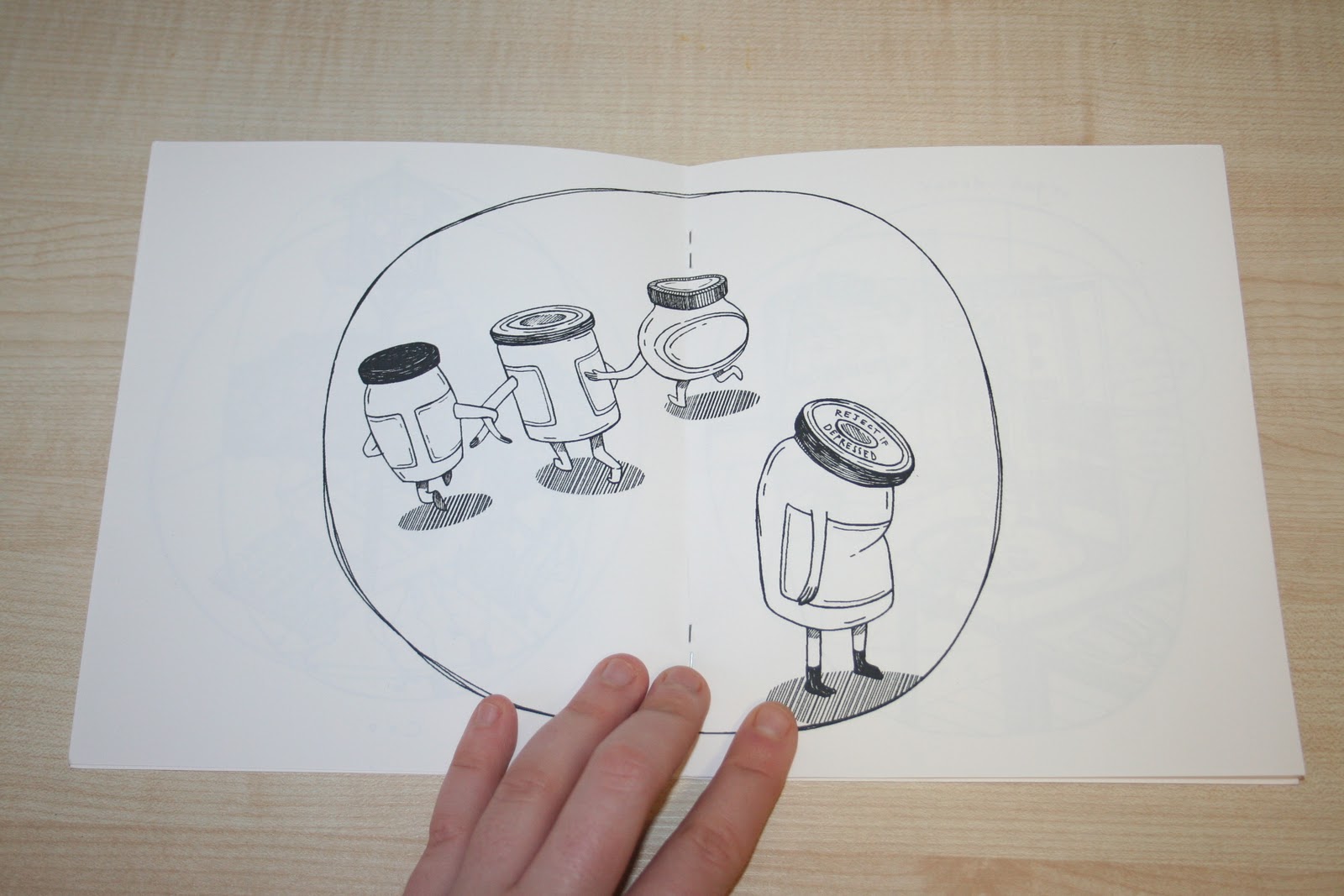
Again- bought at the Leeds International Book Fair 2011, I really liked this colouring book style zine- a really unique, reversed out, illustrative narrative running throughout, and great for it's target audience of children to help keep them engaged by originally selling with a pack of miniature colouring pencils too! A really great idea. Usually, I feel people associate zines with more of the "trendy teen" market, but printed publications and zines have a lot of potential to expand outside this audience, and to open up other key demographics.


Love this tongue-in-cheek play on words book which is certainly more suited for an adult audience! Again, purchased at The Leeds International Book Fair 2011, this zine publication shows how simply illustrations can be applied, and how effectively, when in a humourous or entertaining context. In my mind, I think that this is the kind of work that would sell really well- low cost, but fun and engaging.


This zine, 'Bruges in famous for it's buzzers', was bought just after I returned from a winter break in Bruges in 2010/11 at 'Reetsweet' in Leeds' corn exchange. Again- quite different in style and content. In my experience, photographic zines don't tell to sell as well as illustrative/typographically driven publications, but there's certainly a niche market for them- and appeal particularly to our company's target market of students, as they often appear to be much "trendier" with unedited, "raw" street-style photography.


'Everybody's book of kittens' in a hand-rendered illustrative and typographic zine created by Norwich-based illustrator Gemma Correll, and sold at Leeds' 'Reetsweet' by one of her stockists and friends, Helen Entwistle (aka 'Memo'). I love the textured, monochrome, hand-rendered style that Gemma is so famous for- a really distinct child-like style that creates a sense of nostalgia, whilst still appearing sharp, edgy and fun- a great all-rounder.

Saturday, 5 November 2011

Design Production for Print//Fucking Wonderful Zine.


Great zines discovered through Tumblr (also available to follow on their Facebook page!)- 'Fucking wonderful' (it's all in the name) showcases new, eccentric art and design work, poems, writing, and other creative outlets. Really cool publication design- love the spot colour used on the cover- it would great to be involved 
in a collective networking team like this.

Design Production for Print//Festival Promotion.


Researching existing examples of printed design which have been created in order to promote festivals (in particular, film) to inspire my own design developments for my Wes Anderson hypothetical film festival (more information and developments of which can be found on my Design Practice blog).


The LuckyRice 2011 Festival Promotional Design, created for the annual LUCKYRICE culinary event in New York City which promotes Asian (and, in particular, Chinese) cooking. A great, simple colour palette with a very kawaii-esque Asian style of vector illustration, accompanying portraiture photographs- sweet, simple printed media- works great throughout the range, and very visually communicative and eye-catching. 


A design for Guidance 2011 contemporary dance festival, as designed by Portuguese Designers Atelier Martino&Jaña. A great used of the four colour CMYK printing process used throughout- particularly on posters and the front and back cover of the book- designed in such a way that it appears as if, in the printing process, the printing plates have not been aligned- giving this great allusion of mis-aligned overprinting, which adds real character and a sense of movement and energetic dynamic in the design.


Some incredible portrait photographs taken by Matt Carr for the Toronto Film Festival- wish that I could work with photographs like these- they are truly amazing. So simple, but the light and emotion portrayed captures the personalities of the actors so well. If only I could have been on set for Wes Anderson's films in production!


This design is, frankly, BRILLIANT- just the sort of thing I'd love to make for my Wes Anderson film festival promotion. This hypothetical promotional design by German Designer Florian Feiter for the famous Sundance Film Festival encapsulates the mood of the Festival so well- wittty, tongue in cheek- with a wonderfully bold, considered design. Just super- also covers a multitude of promotional and merchandise products- just like I want to do. Totally inspiring.


Love this simple, though well- considered designs for a Sci-Fi Film Festival. The design and consideration visually communicates in a successfully styled way- love the use of the blue spot colour, simple vector illustration and griding used on the printed publication. Just up my street- to create something this simple, yet so visually bold and, ultimately, effective is my goal for this project.


Branding and design for the Argentinian Mountain Film Festival by Designer Horacio Lorente. Here, Horacio has combined several different design outcomes to create a really edgy and high-impact design- combining vector illustration with crisp photography, overlays, type and, all-in-all, creating a bold and memorable portfolio of work to promote the event- all working well with one another due to consistent visual communication and imagery.


One of my personal favourites! This design for a French Film Festival by Hungary-based Designer Áron Jancsó uses repeat pattern and cleverly constructed typography wonderfully well. The cute pattern print utilises commonly-loved French foods, along with the nation's flag colour scheme for a fun, playful design. Perhaps would have changed the original brown poster to black though- to ensure consistency throughout the range.
I'm definitely going to try and apply repeat pattern to my designs- it works so well here- not too childish, but not too grown up- perfect for my Wes Anderson film target audience (young adults).


More festival design by Atelier Martino&Jaña- this time, using exquisitely considered layout, composition, type, spot colours and imagery to create an edgy, sophisticated design that whilst keeping consistent with it's colour palette still keeps you guessing with a well varied design style.