Showing posts with label Publishing. Show all posts

Tuesday, 14 February 2012

Image//Book Works Research//'Information is Beautiful'.


Through my research and design developments for the Image 'Book Works' brief, I am going to look at infographics, and how statistical data is portrayed through visual communication and graphic design in general. One of my favourite graphic design books, one of which I have used as a source of research for several design projects in the past is 'Information is Beautiful' by David McCandless which acts as a collective showcase for infographic design. Photographed and shown over this blog post are some of my favourite designs in the book- and a great source of inspiration for how I can display my own research into the psychology of the colour yellow- which is my main subject matter for the 'Book Works' project- of which design developments can be found on my Design Practice blog.


Monday, 13 February 2012

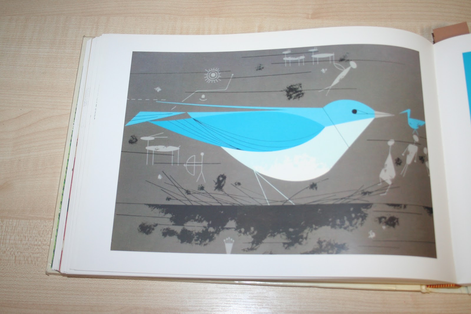
Inspiration//Charley Harper.


For a long time, I have been a huge fan of Charley Harper's illustrative and Graphic work- and been meaning to buy his book, 'An Illustrated Life' for quite some time. However, when I came across the book in the library, it was a great opportunity to swipe it up for a quick look before I committed to purchase- and I wasn't at all disappointed. 
The book shows over 400 pages of illustrative plates of Harper's distinctive modernist style throughout various chapters including 'The Ford Years' and 'Animal Kingdom', the latter being a personal favourite.
To me, Harper's style embodies everything I want to achieve in my own design practice- a clear, distinctive, crisp, modern style, but with it's own personality and tactile design. A real inspiration, and work that I will certainly been looking even more closely at in the future.


Tuesday, 17 January 2012

Image//The Guardian//Existing imagery for articles.


Before going on to create the final outcomes and design development for my editorial image work, I went on again to finalise my research for this weeks brief by looking at past examples of designs on the Guardian website (URL linked below) to inspire any new ideas or methods of delivery- looking at the particular columns we have been given (which are regular columns within the printed newspaper and online source)- and to see whether my designs and design concepts would be at home alongside these existing images.


DOCTOR, DOCTOR


Really bright, colourful and inventive imagery- love the combination of well-light studio photography and hand-crafted paper cut designs- really giving me food for thought as to whether my new concept for illustrative type is the right way to go? Definitely need, and want, to experiment with a few more design ideas (time permitting).

RELATIONSHIP MATHS


A slightly unusual combination for this column- a combination of hand- rendered illustration alongside (what looks a little like stock...) photography- unusual mix, which makes me feel that my own representation will work just fine in the eclectic variety of images from live brief designs, and published within both the newspaper and online.

THIS COLUMN WILL CHANGE YOUR LIFE


Definitely the sort of work I was expecting to see in this column- wonderful, crisp illustrative vector style, with added character and a tactile- quality with textured stock overlays and opacities. The vibrant colours work wonderfully to attract the reader to what may otherwise be a slightly heavy and dense column of text- bold, solid colour is a sure- fire way to grab attention- some brilliant designs- really inspired to get started now!