Showing posts with label Orange Juice. Show all posts

Monday, 12 November 2012

Design Practice III//Gig Ticket Research.


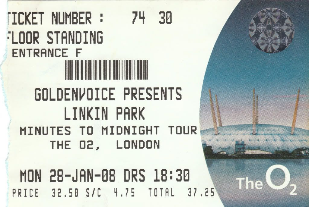
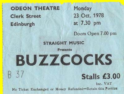
Doing a quick spot of research in regards to the development of my gig ticket designs for the hypothetical 2013 Orange Juice 'Rip it Up' reunion tour.
At this point, with a very basic ticket design, having determined my use of type and colour scheme, I'm looking largely at the individual print finishes which help to define the gig tickets and make them unique, and consistent with one another- such as foil blocking, perforations (on ticket stubs), barcodes, and foil stamps with demonstrate it's authenticity.
Over the next few days I'll look at the various print processes and outcomes to be applied to the design. For design developments over the next couple of days and weeks, see my Design Practice blog.


Image Source


Image Source


Sunday, 21 October 2012

Design Practice III//Branding Consistency.


Whilst searching for branding projects on Behance, I came across this wonderfully innovative design for The National Museum in Warsaw (Poland), by designer Dawid Cmok. Although perhaps a little commercial and industrial for the individual arts- lead briefs I'm currently working on, this project showcases the flexibility and creativity from a simple, yet innovative brand mark/logo idea that can be effectively applied over a range of both digital and print- based collateral. Throughout the developments of my various branding briefs (which can be found on my Design Practice blog), I will certainly refer back to this project for inspiration in terms of professionalism and the variation of products which can be produced.


Monday, 15 October 2012

Design Practice III//Orange Juice Printed Media Inspiration.


Today I picked up this gorgeously tactile printed booklet from the University hallway, showcasing the exhibitions for the academic year to come- printed with a spot varnish/letterpress spot varnish typographic slip cover against B&W photographic imagery, which was something that really drew my attention, and familiar to the style I started to investigate last year within my Wes Anderson film festival project, and hope to develop with the Design Practice III module within my promotional design for the hypothetical reunion of 1980's Indie band, 'Orange Juice', design developments of which can be found on my Design Practice blog.

I love the balance of the flooded page photography and bold, sans serif type used throughout the editorial publication- certainly something to return and refer to at a later stage of my design development throughout the project outcomes.


Wednesday, 10 October 2012

Design Practice III//Mark Ronson & Tom Darracott.


Yesterday, during the crit session, it was suggested by fellow BAGDer to look at the design for Mark Ronson's album cover, 'Version' for inspiration for my Orange Juice 'Rip it Up' promotional designs.
After an initial search, it was instantly recognisable from when it was realesed several years ago, though never really realised how great it was. The combination of photographic materials and type is so perfectly balanced, and the heavy custom uppercase type is exactly like what I was hoping to achieve for the orange juice brand design, so a really great source of contextual inspiration.

It's got me really inspired to play around with different materials and textures- looking at shredding, ripping and perforation as potential methods of visual communication. Some really great work- see my Design Practice for future design developments.

Originally created and designed by Tom Darracott for Sony to emulate street flyposters.


Tuesday, 2 October 2012

Design Practice III//Negotiated Briefs//Orange Juice and Shredded Poster Designs.


Image Source

Going on to look at potential design outcomes for the 'Orange Juice 'Rip it Up' 2013' hyperthetical tour I will promote and brand as one of my projects in the OUGD301 module, I've had an idea, for quite a while, to look at tactile forms of design to visually communicate the 'Rip' in 'Rip it Up', as well as communicating the cut-n-paste style of the 1970's/1980's of Graphic Design with a punk influence in Britain, of which Orange Juice were such a part of.

One of my initial ideas is to explore paper shredding to visual represent the 'Rip' on a bold colour palette of orange and black (bold, uppercase serif typeface) for the brand identity of the tour and the proposed identity of the band itself. On this post, I've shown a few examples for inspiration, the top image ('Graphic Design Portfolio Review') being a particular favourite, and something that I'm really keen to start experimenting with throughout the range of product outcomes.

For future developments, see my Design Practice blog.


Image Source


Image Source


Image Source


Image Source


Image Source


Tuesday, 18 September 2012

Design Practice III//Negotiated Briefs//Orange Juice & Belle and Sebastian.


Whilst going on to research, in more detail, about the band Orange Juice, for the brief which I will be writing at the end of the week, which proposes that I design the promotional branding for a hypothetical reunion tour, I have also decided to look at contemporary influences that the band have made upon other musicians, and how I can potentially use marketing research and analysis to see how effective the design, music and fan base are for artists and musicians which are claimed to have taken influence from the indie-rock 1980's band.

Along with Franz Ferdinand, one of the most commonly cited bands that have been influenced by Orange Juice are, once again, fellow Scots, 'Belle and Sebastian', of which more information can be found below, having been previously sourced from the independent Wikipedia source page link.

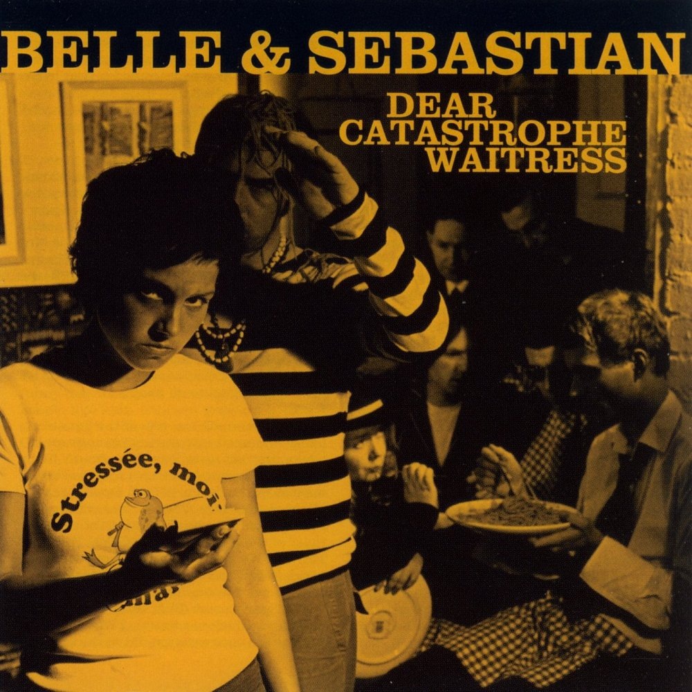
In terms of design, much like the album cover artwork that I previously researched from Franz Ferdinand, Belle and Sebastian's album artwork is very 1960's and often reminiscent of the 1961 film 'A Taste of Honey', and it's contemporaries, for it's grainy, black and white imagery and monotone overlay. The albums have a really distinct and consistent look, which will certainly be a point to consider when working on my own design developments for the Orange Juice tour promotion, work of which will be later found on my Design Practice blog.

//

BELLE AND SEBASTIAN BIO

Belle and Sebastian are an indie pop band formed in Glasgow in January 1996. Belle and Sebastian are often compared with acts such as The Smiths, Bob Dylan and Nick Drake. The name Belle & Sebastian comes from Belle et Sébastien, a 1965 children's book by French writer Cécile Aubry, later adapted for television and anime. Though consistently lauded by critics, Belle & Sebastian's "wistful pop" has enjoyed only limited commercial success.
After releasing a number of albums and EPs on Jeepster Records, they are now signed to Rough Trade Records in the United Kingdom and Matador Records in the United States.

MEMBERS

The current members are:
  • Stuart Murdoch: 1996–present, vocals, electric and acoustic guitar and keyboards
  • Stevie Jackson: 1996–present, vocals, electric and acoustic guitar
  • Chris Geddes: 1996–present, keyboards
  • Richard Colburn: 1996–present, drums
  • Sarah Martin: 1997–present, violin, keyboards, electric and acoustic guitar, and vocals
  • Mick Cooke: 1998–present, trumpet and bass
  • Bobby Kildea: 2000–present, guitar and bass
Past members:
  • Isobel Campbell: 1996–2002, vocals and cello
  • Stuart David: 1996–2000, bass

DISCOGRAPHY

  • Tigermilk (1996)
  • If You're Feeling Sinister (1996)
  • The Boy with the Arab Strap (1998)
  • Fold Your Hands Child, You Walk Like a Peasant (2000)
  • Storytelling (2002)
  • Dear Catastrophe Waitress (2003)
  • Push Barman to Open Old Wounds (2005)
  • The Life Pursuit (2006)
  • Belle and Sebastian Write About Love (2010)


Image Source


Image Source


Image Source


Image Source


Image Source