Monday, 12 November 2012

Design Practice III//Vogue Magazine Layouts.


As cited in my last, most recent post on my Design Context blog, I have continued to research high fashion magazine DPS' and editorial design in the hope to start work on the A/W 2012 Jessie Leong Photography portfolio within the next couple of days, to be sent to print by the end of this week/the start of next. 

Credited as a particular source of inspiration within her work, and aspiration for the future, the Vogue style is very well aligned to Jessie's existing work with bold, empowered women being interview and photographically documented, often in a high contrast B&W with a spot colour bolding running throughout- such as with the 'Rosie' interview, shown above and below.

Although I will have a little more of a graphic design influence in regards to information and layout, I'm really keen to use the high fashion magazines as a source of inspiration and development within the publication outcome.

For future design developments, see my Design Practice blog.


Design Practice III//Elle Magazine Layouts.


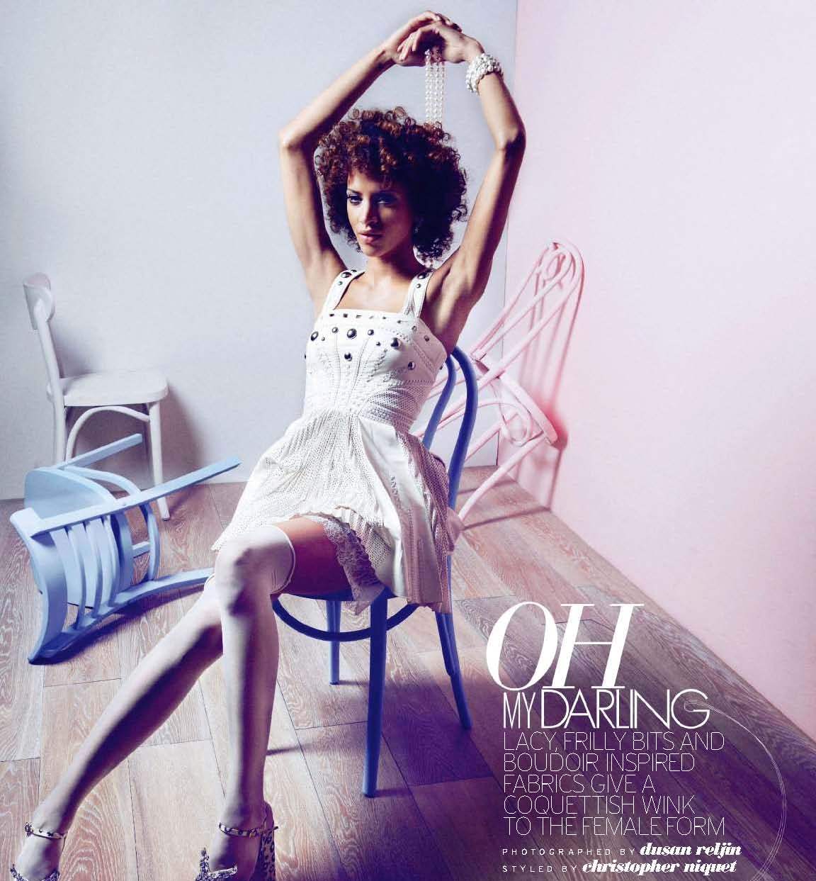
Researching existing Elle magazine layouts as a source of inspiration for the design developments of the proposed Jessie Leong Photography A/W 2012 portfolio magazine- looking at the use of type, balanced with image, colour and themes throughout.

In the past, Jessie has cited that her ambition within her photographic personal and professional practice is to see her fashion portraiture work in the acclaimed magazines, such as Elle, and from my research, I feel that her work would be perfectly suited here- highlighting bold, graphic imagery (often in monochromatic or romantic colour palettes) with images of empowered career women, which is a real focus within Jessie's existing image portfolio, often littered with bright bursts of colour.

In regards to type, I aim to go on to research existing typefaces that balance with with Jessie's brand type, Avenir, for a visually engaging and consistent design outcome.

Really excited to get started! For design developments, see my Design Practice blog.


Image Source


Image Source


Image Source


Image Source


Design Practice III//Intelligent Clashing.


On Friday, whilst on a day placement with tutor Joe Gilmore at Qubik, I met his wife, Rhiannon again for a second time (after a brief meeting when I went for a studio visit in the summer), and after some conversation about work and careers, I found out, whilst also looking after their daughter, she runs a very popular blog site named Intelligent Clashing, which I went on later in the day, and just found brilliant. 

For me, it's proved a real inspiration to look outside of Graphic Design for sources of research and inspiration within my design developments, and something that I'd be really keen to pursue throughout the New Year, potentially setting up a new "lifestyle" tumblr blog to maintain and track alongside my personal and professional development blog which exists outside of my University work. Keen to get started!


Monday, 5 November 2012

Design Practice III//Architectural Branding Research.


A few project examples of sourced Architectural Branding projects that have proved to be a source of inspiration throughout my time working on the personal branding for Interior Architecture student, James Maxwell, (more information of which can be found on my Design Practice blog)- with innovative use of brand marks, colour palettes and type, along with a variety of printing methods and stocks which add to the interest and character of both the print and digital outcomes throughout the variety of project outcomes.


Sites, Fausto Baena Garcés

I love the bold red, white and black colour palette used in the branding design for 'Sites', along with the subtle use of iconography throughout which adds a playful and innovative character to the design, ensuring that it also isn't too rigidly formal or corporate.
Again, also applied over a range of print and digital collateral and outcomes, showcasing the strength of the simplicity of the iconography, type, and use of colour throughout the brand/product outcome range.


A3 Identity, Cecília Pletser
I love the bold use of monochromatic colour palette and geometric form within the brand identity design for A3, similar to my design intentions for my Design Practice III project, in which I hope to develop the brand identity for Interior Architecture student, James Maxwell- with a great example of how a brand mark can be applied in various ways, including a repeat pattern print for the back of a letterhead. Really interesting use of type/letterforms as image. 


Sunday, 4 November 2012

Design Practice III//Baltic Branding & Print Media.


During my week working in Gateshead earlier on this week, I was fortunate enough to have an evening free to go and visit The Baltic on The Quayside, which, unfortunately, I hadn't managed to do before in my past weeks spent in the city. 
Working for Founded in the past (the design studio who designed the branding for the gallery), I was particularly interested in going for a visit knowing a little bit of the back history and working relationship between The Baltic and the designers within the studio.
I managed to pick up a few printed items which showcase the custom-made type design in situe with gallery content and photographic imagery. A really great, and consistent range of design and printed media, and some great inspiration in regards to the development of my consistent printed branding within my Design Practice project- more examples of which can be found on my Design Practice blog.


Friday, 26 October 2012

Design Practice III//Comma Branding.


A great branding project, which is so inspiration in terms of what I hope to achieve in both my Design Practice III module and personal and professional practice within the branding design industry. Comma is a design proposal pitch for a semen quality test manufacturers which covers a wide range of both digital/screen- based and printed collateral in a high-quality, professional design outcomes with clear visual communication of health care and pharmaceutical products, but with it's own distinct design and brand identity throughout.

A great project and source of inspiration for my own various brand projects throughout my final year (within both my Design Practice III and FMP projects), particularly looking at the effectiveness of marketing and product range. For design developments for this module, see my Design Practice blog, and more information about the project source below (with link shown above).


Made by
-
Caroline Rosenkjær, Casper Holden, Christina Stougaard, 
Nicolai Henriksen, Thorbjørn Gudnason

"

Client: A small entrepreneurial company from Denmark is currently preparing to launch a new innovative mens product, a semen quality test for home use which indicates the semen mobility with 98 % accuracy! The appearance and use of the product is similar to a pregnancy test.

Brief: The company’s CEO asked the students at the School of Visual Communication in Denmark to analyze the scandinavian market, find a target group, design and name the product, create a complete visual identity and to introduce the market for a hard-hitting advertising campaign.

Strategy: We will introduce the product and its features, and prove to the target group that the test is reliable. And be the target groups first step towards the solution of problems with conceiving.

Concept: The concept behind Comma works just like a regular typographic comma, the only difference is that we replace the typographic comma in our sentences with the Comma package. That explains visually why Comma is the break in the pregnancy process when having trouble conceiving.

We have decided to not only design a visual identity for the product, but to create an online community where involuntary childless can learn and share with equals, send readers letter to a professional semen analytics and read the latest articles about fertility. Then Comma will not just be a semen quality test, but a compassionate company which care and helps invulentary childless further against conceiving.

This is project is made as a pitch.

"