Beginning to research standardised sizes for tea towels- what is commonplace and would suit my own designs. Of course, this will be partly determined by the composition and layout of my photographic images- though will particularly focus at creating a design which is 48x78mm printed onto a white background- with either the cotton satin or cotton upholstery fabric (and, if feesable getting printed onto a cotton canvas base with another print source outside of the University).
Friday, 17 June 2011
Thursday, 16 June 2011
Royal Academy Summer Exhibition 2011.
After just watching the Culture Show Special: The Royal Academy Summer Exhibition 2011 (BBC2) I have decided that I would really like, if possible with my busy timetable, to get down to see the London exhibition before it closes in August.
From my art & design BTEC, a great deal of the intensive teaching and direction was in a fine art background. Whereas it is not my primary interest, this gave me a great deal of knowledge and fascination for a wider variety of art forms, as well as my Graphic Design and Illustration focus. The 243-year established exhibition houses hundreds of works of art, including work from famed artists such as Jeff Koons and Tracey Emin, as well as the work of amateur artists with an admission fee of £25 per art work.
One of the main interests for me is the architecture room. With an architect partner, it is something I have developed a more focused interest upon in the past five years, and am fascinated by the render designs and meticulous model-making process.
Definately do my best to get to the show- I love exhibitions, and with a keen interest in the history of art and curating, this is certainly something I would like to get myself more involved in in the near future.
The Trustworthiness of Beards.
Really love this pictogram design highlighting the trustworthiness of beards- using simple imagery and symbolism (green= good, red= bad) to highlight the low-high scale. They're pretty spot on, no matter how God-like John Water's films are, he is one freaky character.
Wednesday, 1 June 2011
Olly Moss.
Love the Resevoir Dogs refrencing- so simple and so effective. Cameo Silhouettes are great- currently designing some for my cousins wedding gift/invitations.
At some point in my life, I have been symbolised through all of these pencils. Currently flambouyant.
Cheeky- and making the door hangers above look ever-so-slightly more sinister...
More minimalistic work, this time from a Graphic Designer I have only just become aware of- Olly Moss. Great designs, and again, really simple, clean cut and communicating well. Love the humour of his designs too. Playful, fun, and bold- everything I aspire to with my designs.
Fontface.
Taking "typeface" to a whole new level. Though I love what computer-aided design can produce, and appreciate how much I have already learnt from them, to me, there's nothing quite like hand-rendered work. Here's a perfect example- fun film too. Visual media is certainly something I'd like to experiment more with next year.
Noma Bar.
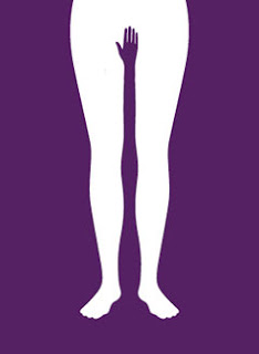
Recently I've been following the work of Israeli Graphic Designer, Noma Bar. Really love the symbolic simplicity in his designs- has really inspired me to try and push for a far more minimal and uncluttered style (I have been far too elaborate in the past).
Again, the style channels back to my love of Swiss simplicity- to experiment more with pictograms and symbols. One to try out over the summer- perhaps for my 'Filmography' project?
Inspiration for the Day.
Browsing the web for some GD gems- lots of inspiration for the path I would like my own practice to follow, and to learn from these designers (when I've quite finished drooling)...
End of year poster for the Graphic Design show at Portland University. Fun use of negative space which can be applied to lots of different backgrounds and textures for versatility. Graphic design should be fun, and it's an amazing job- I shouldn't forget that as often as I do.
Love the gradient blend- yellow is irresistable. Actually impossible to feel unhappy when looking at the colour yellow- unless it's mustard-toned, naturally.
Sweet and simple- subtle infographics blend with the venn diagram. I like the colour blends- but perhaps the red in the centre is a bit too close to the pink? Perhaps change the 'you' to an orange shade for more definition.
Subscribe to:
Posts (Atom)