Tuesday, 7 February 2012

Design Production for Digital//Top 10//Vector character design inspiration.


Looking at a few existing examples of vector-based character design for inspiration and development throughout the Design Production for Digital module, and creating my own penguin vector-based designs. 
For  a long time I have wanted to put a crisper, more minimal vector-based style, and this project and subject matter offered the perfect opportunity to execute this with a fun, distinctively bold illustrative geometric style which is aimed to appeal to my target audience of 5-11 year olds (more design development of which can be found on my Design Practice blog).
The examples below show styles I have been influenced by, either at the time of design, or later on throughout the design process.


A great example of how vector-based design can be used completely minimally and discreetly but still prove and effective visual communication tool with the correct consideration of context, and, in this case, the colour palette used in the design (very similar to that of my own design outcomes). The reversed out logos look great- really unique and eye-catching.


Again, this design by Loulou and Tummie is really pushed by the innovative use of colour in their designs to make a "family swatch selection" over this series of designs (images featured above) which help to ensure consistency and a sense of familiarity among each individual design, along with fun, rounded shapes that don't depend too much upon realism- definitely something to remember in my own designs- I don't have to be 100% anatomically accurate, as long as visual communication is still effectively taking place.
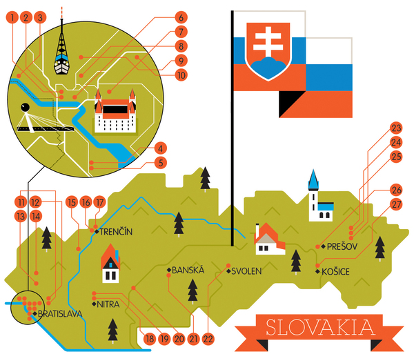
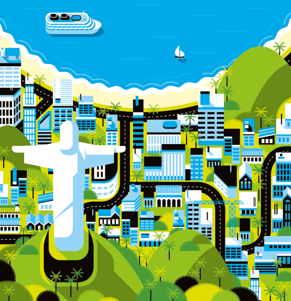


Again, more evidence that colours really do make or break a vector design in these detailed map illustrations, which detailed and considered colour palettes create a real atmosphere and character within each design- each image working as part of a series, and well as it's own separate entity. 


A wonderful combination of light and shadow in this design, combined with a fabulous consideration for texture which really helps bring the piece to life in an incredibly realistic rendered design- showing just how detailed vector-based character design can be, as opposed to the great deal of minimalist work I have been looking at so far, and a reminder to always explore various outcomes to see which is best suited to the project and the client's needs.

Monday, 6 February 2012

Design Production for Digital//Top 10//Video Type.


Saw this video for the first time a couple of weeks ago, and it has provided me with a late, but great, source of inspiration for my title sequence (the development of which, and final, can be found on my Design Practice blog). Looking at the current stage of my title sequence, I realised one fundamental thing- the lack of titles! Sure, my designs are mainly illustrative to appeal to my target audience, but there is absolutely bare minimal text- and I think it would really benefit from it- perhaps highlighting my 'Top 10' without having to illustrate all of the ten through motion sequences? I really liked the style in the video above, with the text draw to the image in a diagrammatic way with the straight line- really simple, but clean, crisp and informative- I will definitely try adding this to my design. 
On another note, must do more photography and video soon- work like this makes me miss it too much!

Design Production for Digital//Top 10//Innovative Packaging.


Research general packaging sources to act as inspiration for my own DVD case design. Whilst it is, by no means, the fundamental basis for this 'Design Production for Digital' project, I felt it was important to still give a good amount of focus and development to the design to make the outcome work as a whole "package" (please excuse the pun)- really looking to push the innovation of the design. I could just make a simple DVD sleeve, though I felt that my penguin subject matter, and my youthful target audience (children aged 5-11) warented something a great deal more fun, playful and "special"- something that, in the retail sector, would stand out against other products as something unique and memorable. The designs (with linked sources) posted below are a few examples of the inspiration I had in creating my own design (which can be found on my Design Practice blog).


http://www.123-labels.co.uk/faq/wp-content/uploads/2010/11/7-Great-Product-Packaging-Design-Inspirations-using-Round-Labels-011.jpg


Love the simplicity of these designs and the really bright, eye-catching colours in contrast to the white base of the design- and, of course, the round shape of the box structure itself, which has proved to be a major inspiration for the geometric shape and development of my own packaging design- which can be found on my Design Practice blog.


http://www.inewidea.com/wp-content/uploads/2010/02/201002151001.jpg


Too cute! love the fun kawaii- style children's character design for this fennel (vegetable)- like character for this Asian food packaging- sweet, friendly and a great novelty item which would suit my own design's age of target audience, 5-11 year olds, perfectly.


http://blog.pentawards.org/?p=1956


Again- great simplicity in these lightbulb box designs, but it works really well- a crisp sort of minimalism that I aspire for in my portfolio and designs in general, but perhaps didn't quite achieve in my final motion graphic designs- making them a little more decorative than I would of initially liked... however, I feel that my own ident, title sequence and packaging designs are an affective visual communication of my chosen subject matter to my chosen target audience.


http://homepage.mac.com/thebecker/iblog/B533212817/C626155530/E20061118095112/index.html


Amazing (and very simple) idea- this sort of novelty and innovation is something I really want to push within my own design practice- this DVD special edition boxset from the series 'Six Feet Under' using turf on the top of the box to visually communicate the subject matter of the funeral director dark comedy. Again, really simple, but really effective nonetheless.


http://www.packaging-films.com/gifs/innovative-packaging3.jpg

Brilliantly simple and minimal- not so hot on the green, but I'll let it slide where the designers made up for it on sheer innovation and wit. My kind of design. 


http://www.cornerofthecircle.com/wp-content/uploads/2012/01/innovative-packaging4.jpg


Brilliant use of iconic shape and net design- this would really suit my own character design- perhaps utilising the outline shape of a penguin itself, or perhaps just the head- really fun and simply made- a great form of visual communication and humor. 


http://www.cornerofthecircle.com/wp-content/uploads/2012/01/innovative-packaging4.jpg

LOVE this design- seen it a few times before in the past and always found it really smart and fun- a really subtle yet effective use of type and colour- as well as being a great talking point and novelty item- this sort of design would work really well within my own packaging, but perhaps making it a little more character based to suit the fun, novelty needs of my target audience.


http://www.flickr.com/photos/miadcommunicationdesign/3170827550/sizes/o/


One of my initial ideas for packaging was to create a mountain- peak design, a square-based pyramid which would fold out to reveal a compartment for my DVD to be held. A fun idea, but not very visually connected to penguins themselves- more the habitat in which they live- not as visually representative as I would like- though I really like this hinge design mechanism- a great source of inspiration, although not actually pursued in terms of design direction.

Design Production for Digital//Top 10//Russell Howard's Good News Title Sequence.


Whilst watching an episode of Russell Howard's Good News (whilst working, promise...) the other day, I noticed the unique and quirky 25 second title sequence- which really caught my attention. I love the really hand-made, yet slick feel to the design which combines a wide variety of assets, video and photographic imagery to create a really thrifty- looking, original design- definitely something that I would have liked to explore more within my own designs- using a variety of different assets and styles of working for my own design outcomes (which can be found on my Design Practice blog), which may have proved a successful choice for my own title sequence and ident series- definitely something to write about and refer to in my own evaluation. 

Saturday, 4 February 2012

Design Production for Print//Top 10//DVD Packaging Net.


http://www.instructables.com/id/How-to-make-a-pretty-round-box/


After traipsing through various packaging design and template books, I was really surprised to find (or not, as the case was...) that there were no nets for round boxes (with lids), which was quite disappointing. There were a few other shapes I had considered (a square based pyramid, for example, as a "mountain lanscape" (to fold out) though I didn't think this was very visually communicative.
Though I was lucky to find this basic step-by-step guide online (see link above for direct source)- although I could have worked it out for myself with a little mock-up session, it was good to have a quick go-to guide to help with dimensions, etc, for a quick and easy solution so that I can use the time I may have otherwise spent experimenting on working on my motion graphics outcomes instead. For the design development and final outcome for my packaging, see my Design Practice blog.


Friday, 3 February 2012

Design Production for Digital//Top 10//BBC One penguin ident.


Another little bit of ident inspiration- this time, with penguins! Featured on the BBC One channel with their distinctive logo and identity- and (as shown at the end of the video sequence above) the distinctive circle shape which appears in all of their idents to represent the 'O' in 'One'. A clear, consistent branding that works really well for the company and is widely recognised- I aim, in my idents to also keep this consistency in terms of character design, colour palette, audio, etc- for more design developments see my Design Practice blog.

Wednesday, 1 February 2012

Design Production for Digital//Top 10//DVD cases.


Just researching a few sources for further inspiration and design development for my DVD packaging case- one of the requirements to go alongside our digital work on Wednesday's module hand in- taking particular inspiration from existing designs targeted at my proposed age target audience, of 5-11 year olds.


From my initial designs (which can be found on my Design Practice blog)- I wanted to emphasise the rounded, geometric vector shapes in my motion graphics designs by using the spherical shape of a standardised CD/DVD round case as a surface for a vinyl sticker/print of my penguin character's face- though perhaps a little too simple and not interactive and fun enough- would need to be part of a larger design to add any real interest.


Perhaps a little too young (more ages 3-7?) though I like the idea of the handle- that a child can carry it to and from places, with a sense of authority- making it that little more special and tactile- will try and incorporate this into some designs.


There's some really jazzy stuff out there! Perhaps a little impractical for shelf-stacking in your standard video and DVD rental store or retailer, but a great novelty item- I really like this idea- perhaps it could work with a spherical shape for my penguin head, with the DVD case inside? Interactive, fun, playful, and not too difficult to construct either... bingo.


LOVE this presentation- simple, but the fold detail and the foil blocking on the box sleeve/jacket add a real sense of prestige to an otherwise quite basic design- makes it look as if it's a special addition, without being too excessive/over the top.


Again, two more examples of great "fold-out" designs- interactivity and informative text, yet considered in it's layout, form, colour palette and general design- the Muse set (two images above) has great consistency- if I were to make several DVD designs (a series/range) this would be a definite source of inspiration- clean, 
crisp and minimal.