Sunday, 30 October 2011

What is design for print?//Spot Colour VS Process Colours.


Researching information for the content of my ISSUU- based online publication and OUGD201 module brief outcome, my design for print handbook. In researching the differences between spot colours and process colours I hope to translate this fluently into my work with a full and accurate written text, as well as writing about the necessities to print spot colours in a professional print environment due to their specialty.

http://www.pantone.com/pages/pantone/Pantone.aspx?pg=19890&ca=1
spot vs. process color
recognizing the differences
Spot Colors
Colors created without screens or dots, such as those found in the PANTONE MATCHING SYSTEM®, are referred to in the industry as spot or solid colors. From a palette of 14 basic colors, each of the spot colors in the PANTONE MATCHING System is mixed according to its own unique ink mixing formula developed by Pantone. You probably mixed yellow and blue paint to get green in your youth. Creating a PANTONE Spot color is similar in concept, but with the added need for precision.


Inks being mixed using the PANTONE® formula guide
Mixing inks to create a PANTONE Color
 
The precision begins with the printing ink manufacturers who are licensed by Pantone to manufacture inks for mixing PANTONE MATCHING SYSTEM Colors. To retain their license, they must annually submit samples of the 14 basic colors for approval by Pantone. Printers can then order the colors by number or mix it themselves according to the ink mixing formula in a PANTONE® FORMULA GUIDE. A PANTONE Chip supplied with the ink and/or job ensures that the printer achieves the color desired by the customer.

FORMULA GUIDE coated, uncoated
The PANTONE® FORMULA GUIDE with 1,114 PANTONE MATCHING SYSTEM Colors on coated and uncoated stock
.


Each color in the System has a unique name or number followed by either a C, U or M. The letter suffix refers to the paper stock on which it is printed: C for Coated paper, U for Uncoated paper and M for Matte paper. Also created without screens, PANTONE metallic and pastel colors are considered part of the PANTONE MATCHING SYSTEM.

Due to the gamut of the 14 basic colors, some spot colors will be cleaner and brighter than if they were created in the four-color process described below. Spot colors are commonly used in corporate logos and identity programs, and in one, two or three-color jobs.

Process Colors
 

This method of achieving color in printing is referred to as CMYK, four–color process, 4/c process or even just process. To reproduce a color image, a file is separated into four different colors: Cyan (C), Magenta (M), Yellow (Y) and Black (K).

4 color horizontal view
 

A color image is separated into CMYK. When printed on paper, the original image is recreated.

During separation, screen tints comprised of small dots are applied at different angles to each of the four colors. The screened separations are then transferred to four different printing plates, one for each color, and run on a printing press with one color overprinting the next. The composite image fools the naked eye with the illusion of continuous tone.

Formula Guide coated chip
PANTONE 4–COLOR PROCESS guide set. Displays 3,010 CMYK combinations with screen tint percentages. A guide on uncoated paper is included in the set.
Process colors are represented as percentages of cyan, magenta, yellow and black. Varying the percentages offers thousands of color possibilities. When four-color process printing is used to reproduce photographs, decorative elements such as borders and graphics can be created out of process colors. This helps to avoid the added expense of an extra plate needed to print each spot color.
Converting spot colors to process colors.
Often times, a spot PANTONE MATCHING SYSTEM Color is requested when creating a four–color process piece. To save money, the spot color should be evaluated to see how it will look if printed in CMYK. While some colors can be simulated well, there are many that look quite different. As the quality of the resulting color conversion is very subjective, the designer can make decisions using the PANTONE® COLOR BRIDGE™ guide.
color bridge chip


The PANTONE® COLOR BRIDGE™ guide displays each PANTONE MATCHING SYSTEM Color and its corresponding simulation in CMYK.
                                                                           

What is design for print?//Hexachrome.


Specific research about the Hexachrome printing output- CMYKOG (Cyan, Magenta, Yellow, Black, Orange and Green), to establish and build my own knowledge for content for my ISSUU- based publication design for print manual- which can be seen developing on my Design Practice blog over the forthcoming days and weeks.

DEFINITION OF HEXACHROME

Web definitions
  • Hexachrome was a six-color printing process designed by Pantone Inc. In addition to custom CMYK inks, Hexachrome added orange and green inks to expand the color gamut, for better color reproduction. It was therefore also known as a CMYKOG process.

  • A version of hi-fi (high fidelity) printing involving six color separation.

  • The set of six process colors (cyan, magenta, yellow, orange, green and black) designed to widen significantly the color combinations possible when compared to the combinations available with the standard four process colors (cyan, magenta, yellow, black).

  • A proprietary color separation process, developed by Pantone, that uses six (6) instead of four process colors.

  • Where two extra colours are added to CYMK to expand the gamut possible, green & Orange.

  • The Hexachrome printing process uses a a colour model based on six primary colours as opposed to the traditional four colour process. As well as cyan, magenta, yellow and black, Hexachrome also adds orange and green into the range. ...

Hexachrome

Hexachrome was a six-color printing process designed by Pantone Inc. In addition to custom CMYK inks, Hexachrome added orange and green inks to expand the color gamut, for better color reproduction. It was therefore also known as a CMYKOG process.
Hexachrome was discontinued by Pantone in 2008 when Adobe Systems stopped supporting their software. While the details of Hexachrome were not secret, use of Hexachrome was limited by trademark and patent to those obtaining a license from Pantone.

Software

In order to use the Hexachrome process in a digital printing process, Pantone produced a plugin for Adobe Photoshop that allowed the designer to work in an RGB color space more typical of computer work. Using a six-channel ICC profile, this was then converted to the Hexachrome gamut as part of raster image processing.
The plugin was discontinued by Pantone in 2008 because Adobe Systems no longer supported Pantone's Rosetta (legacy) plug-in format.

All About Colour — A Guide to Commercial Colour Printing

How does commercial colour print work?

We use four main printing processes, depending on the requirements of your job. This article gives you the basics of commercial colour printing so you can appreciate why we suggest the processes we do when quoting for your job.

Full colour process printing (also known as CMYK)

Example of using CMYK process inks to produce a composite image

Process colour uses just four colours of ink – cyan, magenta, yellow and black – to produce a very wide range of colour possibilities, ideal for printing photographs. Because we specialise in process colour printing, and we batch jobs together for economy, it can often be cheaper to print even a simple two-colour design using process colour rather than spot colour.

Spot colour printing

A spot colour is simply an exact colour of ink, mixed to your precise requirements. Firms with a recognisable colour brand (EasyJet orange; DynoRod fluorescent red) would always specify spot colours to ensure consistency of their brand.
It often comes as a surprise to customers to find spot colour printing is more expensive than full colour printing. This is due to the labour involved with spot colour printing – first the ink has to be mixed from 14 'ingredient' colours; then the press is loaded with the ink; the job is printed; then the press has to be washed down afterwards ready for the next spot colour job. This labour requirement makes spot colour printing, especially in smaller quantities, disproportionately expensive.

Example of a Pantone® swatch bookSpot colours are most often specified in Europe and North America using the Pantone system. Swatch books like the one shown here are used to select colours, and the 'ingredients' for that colour of ink are shown underneath.
Where the four-dot symbol appears underneath the colour (as in the example on the right here), the colour can be printed almost exactly using the four-colour process described above, saving money.

Hexachrome printing

Hexachrome gamut diagramAs the name suggests, Hexachrome printing uses six colours of ink, rather than the basic four colours used in process (CMYK) printing. Hexachrome uses purer cyan, magenta, yellow and black inks, supplemented with Pantone Hexachrome Orange and Pantone Hexachrome Green to give a dramatically increased range of colours, as shown in the diagram to the right.
By using six colours instead of four, Hexachrome can, in effect, reproduce a vast number of spot colours. Consider a range of ten over-the-counter pharmaceutical products where each outer package within the brand is printed using two unique spot colours. To print all these packages using standard spot colour (see above) would require 20 plates to accommodate all the spot colours used, ten separate press runs and wash-ups, and 20 spot colour inks.
Using Hexachrome, the ten packages are arranged on one sheet and printed at the same time, thereby requiring only one extended press run, six plates and six Hexachrome inks, all without loss of colour integrity. The resulting savings by printing in Hexachrome can be substantial.

MetalFX® printing

Example of how MetalFX printing worksMetalFX® works on the basis that CMYK (see above) inks are transparent – so when printed on top of specially modified silver ink (MFX Base Silver), it will allow the silver to show through the CMYK, and thus create the illusion of unlimited metallic colours. The MFX Base Silver has special qualities that allow the CMYK inks to adhere to it.
The MFX system enables you to create eye catching designs by enabling you to integrate metallic colours into photographs and create unlimited metallic colours on the same job, by only using one extra colour. Ever wanted to have Gold, Silver and a Bronze on the same job, but never had the budget to use more than one metallic colour? Well now with MFX you can have all three – and 612 others as well – just by using the MFX system and its special silver ink.
If you would like to incorporate metallic colours in to your next design simply design in CMYK as normal. Please supply us with a printed proof, accompanying your file, detailing the areas to be metallised and the colours to be used.
Only licensed printers can print using MetalFX. Any printer using the system without a licence would be breaking copywright, patent and IP rights of MetalFX. A printer that has not run the MetalFX print trials and been approved will not know the specification for the print process and the job will not output correctly. Always use a licensed printer if you are intending to use MetalFX in your next design.
IMAGES OF HEXACHROME


http://edliveshere.com/assets/issue05/5_chart_2.gif


Saturday, 29 October 2011

What is design for print?//Registration & Print Marks.


Research information to develop the content for my Issuu publication and design outcome for the 'What is design for print?' guide book. This particular section of research features print marks, crop marks, and registration- all useful tools for ensuring high-quality printed outcomes. Development and content of this research can be found on my Design Practice blog in the forthcoming days and weeks.

DEFINITION OF CROP MARKS//REGISTRATION//REGISTRATION BLACK

http://en.wikipedia.org/wiki/Crop_mark

Crop mark may refer to
  • in printing, marks placed at the corners of a form to indicate where the page is to be trimmed
http://www.google.co.uk/search?hl=en&client=firefox-a&hs=yYK&rls=org.mozilla:en-US:official&biw=1280&bih=635&q=registration+marks&tbs=dfn:1&tbo=u&sa=X&ei=WZ6sTriMEIm38gP83d2VCw&ved=0CBsQkQ4
 
Web definitions
  • (Registration mark) In color printing, registration is the method of correlating overlapping colors on one single image. There are many different styles and types of registration, many of which employ the alignment of specific marks.

  • (registration mark) A mark added to a document for color printing to aid the commercial printer in lining up copies of the same page.
 

Registration black


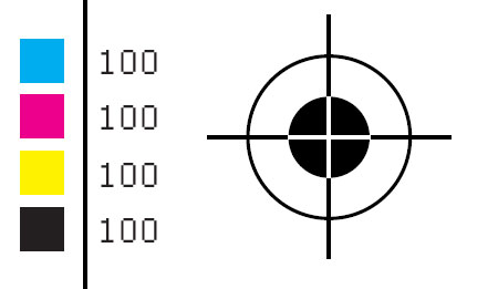
A registration mark showing a slight misalignment of the printing heads, resulting in subtle color hues visible around the edges of the black area (click image to zoom in).
 
In CMYK printing, registration black refers to 100% coverage in each of the four process colors: cyan (C), magenta (M), yellow (Y), and black (K). More generally, if a different mixture of colors is being used, registration black marks in each of the colorants (inks) used.
It is therefore not correct to simply define registration color as 100% of C,M,Y,K, since it will rather be 100% of whichever colors are used in reproduction.
It is a special purpose color, and as such is not generally used to print black text or grayscale graphics.
Instead, registration black is used for printing crop marks, or "registration marks". When proofs for each color are generated on separate pieces of film, use of registration black makes crop marks visible on all channels, providing a useful reference for alignment. A thin line printed in registration black can also be used to check whether the printing plates are lined up.

PostScript

The PostScript printer description languages supports registration black, starting with PostScript language level 2. This is done by referring to a spot color with the special name All. This never generates a spot plate. Instead it marks all of the plates that are there. The All color space can be used with a tint value between 0.0 (no mark) to 1.0 (full intensity). Generally, only 1.0 would be used.
The name "All" might not be used in the user interface of a design program, especially outside English language speaking areas. However, the spot color must have the exact name "All". As a side effect, it is impossible in PostScript to create a normal spot plate with this name.

PDF

The Portable document format (PDF) also includes a spot color called All, with the same restrictions, starting with PDF 1.2. Note that a PDF spot color must also include a "tint transform" which translates spot values into a different color space for viewing on screen, or printing to printers without spot color support. There is no special rule for the name "All", so PDF creators must include a tint transform that converts to black in some color space, in order to maintain the same appearance as the final printed piece.

http://en.wikipedia.org/wiki/Printing_registration

Printing registration


Exaggerated example of a mismatch of registration
 
In color printing, registration is the method of correlating overlapping colors on one single image. There are many different styles and types of registration, many of which employ the alignment of specific marks.

Purpose

When printing an image that has more than one color, depending on the method of printing, it is necessary to print the image one separate time for each separate color. Each one is called a "color run," and they can be pulled from the same surface, inked differently, or from a completely different surface. So that the final image is consistent, and so each of the colors lines up correctly, a system of registration is necessary. Different printing devices have different methods of creating separate color runs.

Types of (stone) lithography registration

There are many different styles of registration for many different types of printing. These deal with stone lithography, as used in fine arts printmaking.

T-bar

This method, using small measured registration marks on both the stone and the paper, is very accurate and simple to do. The printer measures the exact size of the paper and the desired margins. Then marks are made at both ends of the sheet of paper, and corresponding marks (usually in the shape of a "T") are made on the stone. Then the printer matches the marks on the paper to those on the stone. This way many runs of different colors can be pulled exactly in line with one another, each of them measured from the same system of marks.

Pin-hole

This method involves laying the paper on the un-inked surface, and making a pin-hole through both the bottom and top of the paper, being careful to make a mark in the stone's surface. Then the locations of the holes are transferred to each sheet of paper to be printed. When printing, one should place pins in each hole of a sheet of paper, and lower it onto the inked stone, placing each pin in its respective hole in the stone. This method can ruin paper by creating holes. And if the holes get too large, they lose their function as registration devices.

Eye-balling

This method relies solely on hand-eye coordination. The printer places the paper over the stone-image, measuring and judging registration by eye. This is not very consistent, depending on the person.

IMAGES OF CROP MARKS//REGISTRATION//REGISTRATION BLACK


http://coreldraw.com/cfs-filesystemfile.ashx/__key/CommunityServer.Components.ImageFileViewer/CommunityServer.Discussions.Components.Files.246/4214.Registration-Marks.png_2D00_680x1000.png


 http://www.minutemanbristol.com/images/Registration.jpg


 http://ak-main-blog.andrewkelsalldes.netdna-cdn.com/wp-content/uploads/2009/01/registration-black-color.png


http://www.blog.spoongraphics.co.uk/wp-content/uploads/2008/02/registration-black.jpg


What is design for print?//Halftones.


Researching HALFTONES for content source and inspiration for my own designs in 'What is design for print?' project (a print-based ISSUU published manual)- developments of which can be found on my Design Practice
blog in the upcoming weeks.

THE DEFINITION OF HALFTONE
http://www.google.co.uk/search?hl=en&client=firefox-a&hs=iAK&rls=org.mozilla:en-US:official&q=halftones&tbs=dfn:1&tbo=u&sa=X&ei=eZisTpfIDsi28QON8Z2vCw&ved=0CBwQkQ4
Web definitions
  • (halftone) a print obtained from photoengraving

  • (halftone) an engraving used to reproduce an illustration

  • Halftone is the reprographic technique that simulates continuous tone imagery through the use of dots, varying either in size or in spacing.Campbell, Alastair. The Designer's Lexicon. ©2000 Chronicle, San Francisco. ...

  • (halftone) Half the interval between two notes on a scale; A picture made by using the process of half-toning; To reproduce a photograph or other continuous tone image by the use of dots of various sizes

  • (Halftone) Converting a continuous tone to dots for printing

  • (Halftone) Tone graduated image composed of varying sized dots or lines, with equidistant centers.

  • (halftone) A picture in which the gradations of light are obtained by the relative darkness and density of tiny dots produced by photographing the subject through a fine screen.

  • (halftone) The process of converting images into a regular array of dots of various sizes with equal spacing between centers. Also the process of reproducing an image as a series of dots of various sizes within a fixed grid.

  • (halftone) Picture with varying shades of tone created by varying size dots.

  • (Halftone) A reproduction of a continuous-tone photograph by simulating gradiations of tone using dots of varying size, shape, or proximity.

  • (Halftone) in traditional publishing, a continuous-tone image photographed through a screen in order to create small dots of varying sizes that can be reproduced on a printing press. ...

  • (Halftone) The process by which a continuous tone image such as a photograph is reproduced and simulated using a pattern of printed or silkscreened dots of varying size and equal spacing. At a normal viewing distance the reproduced image appears continuous in tone.

  • (Halftone) an illustration reproduced by breaking down the original tone into a pattern of dots of varying size. Light areas have small dots and darker areas or shadows have larger dots. Simulating a continuous tone photograph using dots.

  • (Halftone) Printing process that expresses itself in the form of colored patterns of dots.

  • (Halftone) The reproduction of a continuous tone original, such as a photograph, in which detail and tone value are represented by a series of evenly spaced dots of varying size and shape.

  • (Halftone) The method by which photographs and other images are printed by using cells of dots to simulate the tones between light and dark. A printing press is not able to change the tone of ink, therefore dots of colour are used to trick the eye into seeing a continuous tone image. ...

  • (Halftone) Refers to a method of representing the colors of an image with dots of varying sizes. If the dots are small enough, the colors of the image appear continuous. Halftones are created to prepare photographic images for reproduction across various print media.

  • (halftone) n. A printed reproduction of a photograph or other illustration, using evenly spaced spots of varying diameter to produce apparent shades of gray. The darker the shade at a particular point in the image, the larger the corresponding spot in the halftone. ...

  • (Halftone) Black and white dots that vary in pattern to simulate shades of gray in an image.

  • (Halftone) The result of a process by which a photograph is changed into a system of dots of varying size and shape allowing the accurate printing of various tone values in the photograph. Usually printed in one color.

  • (Halftone) a tonal gradation made up of dots of varying sizes.

  • (Halftone) A technique most often used in newspaper pictures -- a series of fine (black) dots, that when viewed from a distance, give the appearance of varying shades of grey. This process is relatively cheap-- you only have to run one color through your offset press.

  • (Halftone) An irregular pattern of tiny dots that can be used to print a full range of tones. Halftone screens are used to print reproductions of photographs and artwork that are not line art. Multiple halftones are combined in process color to give the illusion of a full-color image.

  • (Halftone) A photomechanical reproduction process of a photograph made on a printing press. An original photographic image is re-photographed through a screen that transforms the continuous tones of the image into a series of dots, relative to the amount of darkness in the original. ...

  • (Halftone) Screened reproduction of an original made up of dots varying in size to create the illusion of a variation in tone. Can be done in various colors.
 

Halftone

Halftone is the reprographic technique that simulates continuous tone imagery through the use of dots, varying either in size, in shape or in spacing. "Halftone" can also be used to refer specifically to the image that is produced by this process.
Where continuous tone imagery contains an infinite range of colors or greys, the halftone process reduces visual reproductions to a binary image that is printed with only one color of ink. This binary reproduction relies on a basic optical illusion—that these tiny halftone dots are blended into smooth tones by the human eye. At a microscopic level, developed black-and-white photographic film also consists of only two colors, and not an infinite range of continuous tones. For details, see film grain.
Just as color photography evolved with the addition of filters and film layers, color printing is made possible by repeating the halftone process for each subtractive color—most commonly using what is called the "CMYK color model". The semi-opaque property of ink allows halftone dots of different colors to create another optical effect—full-color imagery.

 History

William Fox Talbot is credited with the idea of halftone printing. In the early 1850s, he suggested using "photographic screens or veils" in connection with a photographic intaglio process.
Several different kinds of screens were proposed during the following decades. One of the well known attempts was by Stephen H. Horgan while working for the New York Daily Graphic. The first printed photograph was an image of Steinway Hall in Manhattan published on December 2, 1873. The Graphic then published "the first reproduction of a photograph with a full tonal range in a newspaper" on March 4, 1880 (entitled "A Scene in Shantytown") with a crude halftone screen.
The first truly successful commercial method was patented by Frederic Ives of Philadelphia in 1881. Although he found a way of breaking up the image into dots of varying sizes, he did not make use of a screen. In 1882, the German Georg Meisenbach patented a halftone process in England. His invention was based on the previous ideas of Berchtold and Swan. He used single lined screens which were turned during exposure to produce cross-lined effects. He was the first to achieve any commercial success with relief halftones.
Shortly afterwards, Ives, this time in collaboration with Louis and Max Levy, improved the process further with the invention and commercial production of quality cross-lined screens.
The relief halftone process proved almost immediately to be a success. The use of halftone blocks in popular journals became regular during the early 1890s.
The development of halftone printing methods for lithography appears to have followed a largely independent path. In the 1860s, A. Hoen & Co. focused on methods allowing artists to manipulate the tones of hand-worked printing stones. By the 1880s, Hoen was working on halftone methods that could be used in conjunction with either hand-worked or photolithographic stones.

Traditional screening

The most common method of creating screens—amplitude modulation—produces a regular grid of dots that vary in size. The other method of creating screens—frequency modulation—is used in a process also known as stochastic screening. Both modulation methods are named by analogy with the use of the terms in telecommunications.

Resolution of halftone screens

Typical Halftone Resolutions
Screen Printing 45–65 lpi
Laser Printer (300dpi) 65 lpi
Laser Printer (600dpi) 85–105 lpi
Offset Press (newsprint paper) 85 lpi
Offset Press (coated paper) 85–185 lpi
The resolution of a halftone screen is measured in lines per inch (lpi). This is the number of lines of dots in one inch, measured parallel with the screen's angle. Known as the screen ruling, the resolution of a screen is written either with the suffix lpi or a hash mark; for example, "150 lpi" or "150#".
The higher the pixel resolution of a source file, the greater the detail that can be reproduced. However, such increase also requires a corresponding increase in screen ruling or the output will suffer from posterization. Therefore file resolution is matched to the output resolution.

Multiple screens and color halftoning

 
Three examples of color halftoning with CMYK separations. From left to right: The cyan separation, the magenta separation, the yellow separation, the black separation, the combined halftone pattern and finally how the human eye would observe the combined halftone pattern from a sufficient distance.
 

This close-up of a halftone print shows that magenta on top of yellow appears as orange/red, and cyan on top of yellow appears as green.
 
When different screens are combined, a number of distracting visual effects can occur, including the edges being overly emphasized, as well as a moiré pattern. This problem can be reduced by rotating the screens in relation to each other. This screen angle is another common measurement used in printing, measured in degrees clockwise from a line running to the left (9 o'clock is zero degrees).
Halftoning is also commonly used for printing color pictures. The general idea is the same, by varying the density of the four primary printing colors, cyan, magenta, yellow and black (abbreviation CMYK), any particular shade can be reproduced.
In this case there is an additional problem that can occur. In the simple case, one could create a halftone using the same techniques used for printing shades of grey, but in this case the different printing colors have to remain physically close to each other to fool the eye into thinking they are a single color. To do this the industry has standardized on a set of known angles, which result in the dots forming into small circles or rosettes.
The dots cannot easily be seen by the naked eye, but can be discerned through a microscope or a magnifying glass.

Dot shapes

Though round dots are the most common used, there are different dot types available, each of them having their own characteristics. They can be used simultaneously to avoid the moiré effect. Generally, the preferred dot shape is also dependent on the printing method or the printing plate.
  • Round dots: most common, suitable for light images, especially for skin tones. They meet at a tonal value of 70%.
  • Elliptical dots: appropriate for images with many objects. Elliptical dots meet at the tonal values 40% (pointed ends) and 60% (long side), so there is a risk of a pattern.
  • Square dots: best for detailed images, not recommended for skin tones. The corners meet at a tonal value of 50%. The transition between the square dots can sometimes be visible to the human eye.

Digital halftoning

Digital halftoning has been replacing photographic halftoning since the 1970s when "electronic dot generators" were developed for the film recorder units linked to color drum scanners made by companies such as Crosfield Electronics, Hell and Linotype-Paul.
In the 1980s, halftoning became available in the new generation of imagesetter film and paper recorders that had been developed from earlier "laser typesetters". Unlike pure scanners or pure typesetters, imagesetters could generate all the elements in a page including type, photographs and other graphic objects. Early examples were the widely used Linotype Linotronic 300 and 100 introduced in 1984, which were also the first to offer PostScript RIPs in 1985.
Early laser printers from the late 1970s onward could also generate halftones but their original 300 dpi resolution limited the screen ruling to about 65 lpi. This was improved as higher resolutions of 600 dpi and above, and dithering techniques, were introduced.
All halftoning uses a high frequency/low frequency dichotomy. In photographic halftoning, the low frequency attribute is a local area of the output image designated a halftone cell. Each equal-sized cell relates to a corresponding area (size and location) of the continuous-tone input image. Within each cell, the high frequency attribute is a centered variable-sized halftone dot composed of ink or toner. The ratio of the inked area to the non-inked area of the output cell corresponds to the luminance or graylevel of the input cell. From a suitable distance, the human eye averages both the high frequency apparent gray level approximated by the ratio within the cell and the low frequency apparent changes in gray level between adjacent equally spaced cells and centered dots.
Digital halftoning uses a raster image or bitmap within which each monochrome picture element or pixel may be on or off, ink or no ink. Consequently, to emulate the photographic halftone cell, the digital halftone cell must contain groups of monochrome pixels within the same-sized cell area. The fixed location and size of these monochrome pixels compromises the high frequency/low frequency dichotomy of the photographic halftone method. Clustered multi-pixel dots cannot "grow" incrementally but in jumps of one whole pixel. In addition, the placement of that pixel is slightly off-center. To minimize this compromise, the digital halftone monochrome pixels must be quite small, numbering from 600 to 2,540, or more, pixels per inch. However, digital image processing has also enabled more sophisticated dithering algorithms to decide which pixels to turn black or white, some of which yield better results than digital halftoning.

IMAGES OF HALFTONES


http://upload.wikimedia.org/wikipedia/en/f/fa/Color-halftone-demo.png


http://www.capitalpoly.com/images/Halftone_separations01.jpg


http://www.astutegraphics.com/images/blog/halftones/halftone_zoom_detail.png


http://www.zarbeco.com/fullsizedimages/MiScopeIR/HalftoneWhite1.JPG