Hipster logos designed by Dave Spengeler, which I found yesterday whilst browsing through Tumblr- obviously reminding me of the logo that I designed for our branding and identity outcome for the Graze brief- really like the concept behind the rebranded styles- and I'm obviously more hipster than I ever thought (of course)- to see our logo design in context, see work on my Design Practice blog.
Showing posts with label YCN. Show all posts
Wednesday, 21 March 2012
Tuesday, 20 March 2012
Design Practice II//YCN/Graze//Cutlery.
http://www.elki.com/ecom_crop/crop-original-97-320-1916---olive-picks.jpg
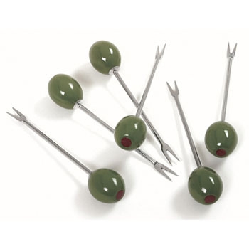
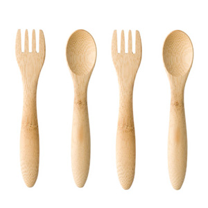
A small, but reasonably significant part of our design development for the Graze brief outcomes, that Charlie and I have gone on to develop and propose, is cutlery. Due to the formal working environments that we are proposing for the boxes to be largely eaten in (offices) we want to ensure that the food products can be enjoyed without risk of getting office equipment, paper, etc, dirty or spoilt.
In my initial Graze box, I was given a skewer for the olives, and this gave me the idea to work with Bamboo- and paint dip the ends of the cutlery to, once again, ensure branding consistency- found some good ideas online- Charlie and I have proposed that we create both a spoon and a spork to fulfil all necessary actions for eating the contents of the box (olives can be scooped the the spoon relatively easily). Found a few good examples online- will be using these to trace around and propose for the meanwhile before we hopefully (at the weekend) can purchase some bamboo cutlery to then go on to paint dip ourselves.
http://d3vd8b39huo1pd.cloudfront.net/static/uploads/products/images/processed/bamboo-cutlery-multicolor-set-16x9_jpg_537x302_crop_upscale_q85.jpg
Design Practice II//Diet plan research//Low cholesterol.
Whilst generating the hypothetical "set menus" for the Graze ingredient list/nutritional information, I felt that for one particular subject, "healthy heart", a little more research was needed into the specific foods that lowered cholesterol, or helped to maintain a low level. Fortunately, after finding some useful information from a website (link source above) I found that vast majority of products listed (such as oats and nuts) are ones that Graze are currently producing, so still, fortunately fit wonderfully into our designs! Bingo.
Monday, 19 March 2012
Design Practice II//YCN/Graze//Packaging Inspiration.
Stuck in a bit of a rut with the current design process and proposed outcomes for our Graze/YCN design, I decided to search for more ideas for packaging design, hopefully with a little more focus and direction than I would have previously got. I started searching on Behance for design ideas and I found some great sources of inspiration, as blogged below.
I really love this bold, high-impact brand and identity for the 'Good Food' range. A varying colour palette has been used subtly to distinguish the separate products from one another. The bold, pictogram style icon imagery works really well to help simply illustrate the products further. Crisp, minimal, modern and contemporary- this would fit really well into our working environment, but could perhaps benefit from a little more humour or a sense of fun for our Graze rebrand.
http://www.behance.net/gallery/UPTOWN966-Mediterranean-caf-in-KSA/3070333
A great range of designs and design-applied products for the 'Uptown' Cafe brand, with added interest in the monochrome colour palette with illustrative type. Again, the simplicity is what makes the branding and identity truly effective and work well together as a range of products, as well as on a variety of stocks.
Branding is something that Charlie and I really need to work on and develop to for a successful project outcome.
Love the designs for this bold and "sweet" packaging for "cookies for dogs"- a simple, illustrative brand identity with subtle changes through the ages of the dog (the progression of life shown through a moustache and then glasses!) for a fun, memorable design. The colours also help to distinguish the different flavours of the treat for an easily visible and recognisable brand identity. Really fun and distinctive character design, utilised very well in this brand.
Great use of texture and combination of type and colour is this simple label design- with influence from South American signage, this design is bold, visually communicative and full of fun and character.
Design Practice II//YCN/Graze//Allotinabox.
http://www.ilovedust.com/project/view/allotinabox/product
I was sent a link today by friend and fellow BAGDer, Sarah, who was reminded of the Graze box and the brief that Charlie and I are working on for the YCN competition brief. Although a slightly different contents and subject matter, this design has really inspired me. I love the combination of typefaces and the bold, vibrant branding and colours inside the box which really bring it to life when opened- and with inspiration to perhaps adopt a few of the elements of the box within our own designs (see the progress of which on our Design Practice blog)- such as the sticker, as oppossed to the cellophane wrap, which is a much more subtle "security tab", and with our products (boxes) being distributed by hand or bought through vending machines, we need not worry about the security element quite as much as we may of otherwise had to.
This has made me really re consider what we are doing and where we are at with the project. I don't think it's a big secret that I'm not all that happy with the outcomes at the moment, and feel that our current five boxes idea may not be really answering the brief- and too far detached from the original requirements. Hopefully, when Charlie is around, I will be able to show him this and we can make a quick turn around, or mutual decision on what we are going to do. I propose that we incorporate all elements (chosen such as 'energy', 'sweet tooth', etc) into one box for a balanced meal that can appeal to all- creating much more of a brand identity in the process.
Friday, 16 March 2012
Design Practice II//YCN/Graze//Product list.
A full, extensive list and screenshot collection of all of the products that Graze provide in their delivery box range (in some circumstances, where overlapping in categories the products have been repeated in terms of images and information). A really useful source for all the products that could fit into our specific x5 working lunch box range that Charlie and I are promoting for the new Graze campaign- of which I shall develop set menus as soon as possible (more information and design developments of which can be found on my Design Practice blog).
DIPS & DIPPERS
GUILT FREE HIGH TEA
BREADS
CRACKERS
FLAPJACK
OLIVES
NATURAL TREATS
DRIED FRUIT AND NUTS
NUTS
DRIED FRUIT
SEEDS
Thursday, 15 March 2012
Design Practice//YCN/Graze//Graze Health.
http://www.graze.com/health
Researching and sourcing screenshots from the series of 'Graze Health' pages on the Graze website which will give Charlie and I good insight into the nutritional information and benefits of each of the food products to help generate a "set menu" for our working lunch promotion campaign (five boxes). Definitely need to look more into each of the individual products to see which would be most suited for our set health/taste benefits.
Design Practice II//YCN/Graze//Graze Reviews.
http://mesluxes.blogspot.com/2011/04/graze-nibble-box.html
http://www.glitzngrime.com/2012/01/graze-box-review-and-get-your-free-box.html
http://www.theunluckydip.com/Blog/?p=634
http://www.ciao.co.uk/graze_com__Review_6025279
Doing a quick bit of online researching- sourcing reviews online for the Graze brand and Graze boxes themselves.
Overall, I was unsurprised to see an overwhelmingly positive response as Graze has a dedicated and reasonably loyal fan base (particularly with introductory offers on the Graze boxes). However, there are a few cases where the responses and feedback are particularly negative responses- as we have found when "brainstorming" the problems with Graze and their business- the cost of the product, the product portions, etc.
These responses and opinions will be very important when considering our audience and how we promote the product- making the premium product reflect the cost in how it is branded and marketed, most importantly.
Wednesday, 14 March 2012
Design Practice II//YCN/Graze//Existing Graze rebrands.
Whilst working on the concept development of the Graze brief, Charlie and I have been having a bit of a snoop around the web to see what other designers have been up to with his Nationally-available brief.
Unsurprisingly, various designer's work has been available to view through self promotion and publishing sites, as well as University blogs like our own, so it's been pleasantly easy to see the work of others.
In the text and images below I have begun to look at a few of the designer's work to analyse what they have done well, and what we could do differently.
One of the major differences is the depth of the brief for our own practice. As a course, we have all been encouraged to work beyond the brief and to THINK BIG, which, after seeing what other designers have produced, I am really excited about. In our circumstance, I feel that we'll be able to produce a much broader scope of designs, which, in the real world, would be very relevant in terms of branding and identity design.
behance.net/gallery/Graze/2786197
Laura Milton, Year III Graphic Design, Huddersfield Uni.
Sweet, simple design- very focused on the natural aspect through the colour palette and printed stock chosen. Originally, Charlie had consisered the idea of a seed mailout, like the basil leaves in Laura's design. Although I think she has made it work effectively visually and in terms of her media and message, I didn't think (and still don't) it would be appropriate to our own "working lunch" concept development and ideas.
http://stecav.co.uk/graze.html#grazebox
Steve Cavanagh, Graphic Designer, Manchester.
A colour palette similar to the Autumnal shades that Charlie and I have chosen, I really like the vibrancy the addition of these tones have added to the printed designs in Steve Cavanagh's approach to the brief. Personally, for me, despite the logo (which reminds me of 'The Guardian' logo) the style of branding (particularly in terms of colour) isn't as consistent as what I feel is appropriate, again, for our specific target market and promotional concept. Different strokes for different folks! (Or, in this case...design outcomes...)
http://www.chrismizen.co.uk/index.php?/university-work/graze-brief-year-3/
Chris Mizen, Year III, Cambridge School of Art
Perhaps my favourite of all of the existing Graze briefs from designers posted and sourced in this blog post, Chris Mizen certainly has the most consideration in terms of colour palette (or lack of!... minimal white and stock gets my vote!) and brand consistency. The product still has the natural, environmental appeal whilst certainly looking more like a premium product with design consideration. A couple of personal taste elements for myself that I would change (A little less prominence of the QR codes and serif type for sans serif to look a little more contemporary!) but overall, a good execution that answers the brief well.
http://the-goodship.com/
Tom McQuillan, Graphic Design, Huddersfield Uni
I really love the screenprinted effect Tom McQuillan has used in his design approach to Graze- one that Charlie and I were strongly considering at the start of the brief- it really adds to the Earthy, environmental ethos and outlook of the company. However, just a personal choice, I wish the grey was slightly lighter in the designs- it dulls the other colours slightly from what could have been a really vibrant and warm colour palette- something that Charlie and I, hopefully, are really going to hone on into.
Subscribe to:
Posts (Atom)